Saturday, January 31, 2009

Styling Kitchens

Remember in my post ‘Styling for Photo Shoots’ I said that most kitchens look ‘contrived’ when they are styled and photographed? Well this week I was hired by Revision Custom Home Renovations to style a kitchen they just completed, so I had an opportunity to prove that I could do something uncontrived :)

image

My photographer Anna Beaudry referred me to her client after she shot the homes I had decorated and styled for my website.

Colour me Happy Blog 107

The challenge here was to bring this primarily espresso brown kitchen to life with some colour!

Colour me Happy Blog 108

My inspiration for the entire palette started with the orchid (below) so I plucked one, matched it to some colour chips (as shown above) and that’s what I used to pick everything else.

Colour me Happy Blog 114

Colour me Happy Blog 116

image 2092-20

Colour me Happy Blog 115

image2167-20

image

Colour me Happy Blog 118

These of course are taken by my little point and shoot and don’t look nearly as great as the professional ones. . . I’ll have to link those later to this post (here they are!).

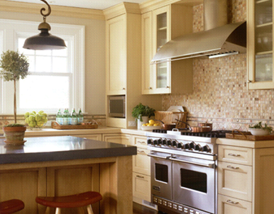
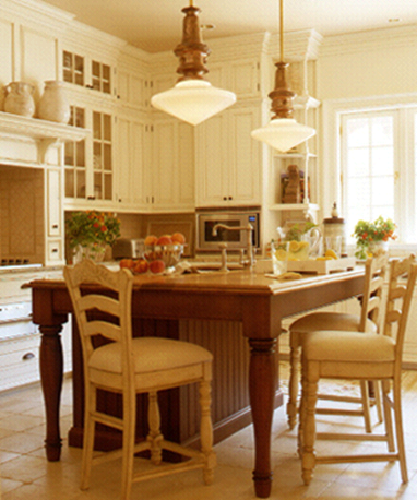
The kitchen site I used for inspiration is Lindy Weaver Design Associates. I found her site from this fabulous post on Things that Inspire. I think these are some of the best styled kitchens I have ever seen, all in one website, so beautiful!

image

Of course it helps that most of the kitchens on her site are white or cream (which are my favourite).

image

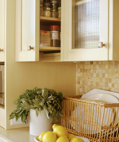
I love the way she showcases the little storage details that make a kitchen work like this spice cabinet right next to the stove.

image

image

I especially loved this image with the water running on the peaches, I wanted to do that in my kitchen but the water wasn’t on yet!

image

You can see where I got the idea to stick the pears on the counter with the dish towel underneath the strainer.

image

Check out this one below – seriously over the top styling but the colours and vegetables are stunning, Also notice the copper pots that match the upper cabinets!

image

The piece that makes a ‘styled’ kitchen look contrived (in my opinion) is doing something like these big leaves in the urns below (Hopefully Lindy won’t mind my little critique since I’ve raved about every other kitchen on her website) in addition to things like candleholders on the countertops, underneath cabinets. It’s stuff you would NEVER have in a kitchen in the real world, so that's what I mean about being contrived. And kitchens are challenging because is mostly hard surfaces without any of the softness created by drapery, etc.

image

And as always, it’s much easier to be a critic than to come up with something that works. I have nothing but respect and admiration for my fellow designers because it takes something to create from nothing! Well dear readers, thoughts?

Related post:

The 'money shot' for Revision Custom Home Renovations

Thursday, January 29, 2009

Toss Cushions at the Pottery Barn

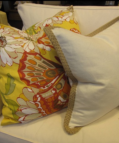
The Pottery Barn is the only store that consistently makes me want to buy all their toss cushions--not to mention other home decor items, I walked in today while sourcing furniture for a client and there was the colour [yellow] for 2009 displayed right in the entrance.

clip_image002

Look at the braided flange on the white one. . . love that!

Colour me Happy Blog 098

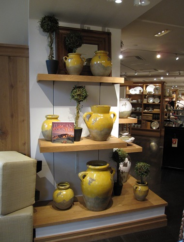
I love these Tuscany inspired urns, I have a client that needs these in her great room!

Colour me Happy Blog 096

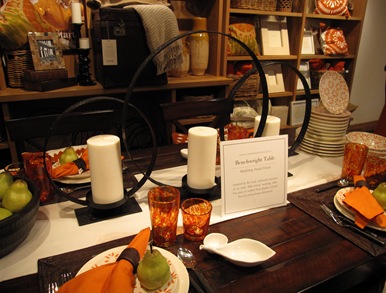
I snapped a photo of this centerpiece candle holder, and then saw something similar later in silver when I got to Paramount Furniture.

Colour me Happy Blog 100

Wouldn’t it be fun if you could just buy the newest, freshly patterned chair every spring for your living room?

Colour me Happy Blog 103

Okay, speaking of hallways [you know I have a pet peeve about them], I stepped into the entry to the elevators [from the parkade]when I got to Jordan’s Furniture and got depressed. Blue gray tiled floors with green gray wall colour [it might be hard to tell from this image but trust me there is no relationship between these colours here]! The door was also a matching charcoal to the floor!

Colour me Happy Blog 094

That little foyer [with the charcoal gray floor] should have been a burst of colour like this terra cotta below:

image

Benjamin Moore 2172-30

The only colours that liven up grays are varying shades of reds, orange, yellows and fresh greens, gray-on-gray just doesn’t cut it!

Simple things

Primroses! They are only available for a limited time but their timing is impeccable. Just when the clouds of winter seem as if they have taken up permanent residence, these little bursts of color and green leaves make their way into the local garden centers, ready to offer a pick-me-up, and for a minimal investment. (Our local Lowes had these for $1.98 each.) My empty cache pot was happy to have some "company". They were welcomed with a wrap of moss and are sitting pretty on my French parquet top table.

Oooh, la, la! Spring is just around the corner!

Wednesday, January 28, 2009

Happiness is. . . Having Amazing Friends!

“Some people come into our lives and quickly go. Some stay for awhile and leave footprints on our hearts. And we are never, ever the same.” Source Unknown

image

I bought this print when I was in Paris 2 years ago, I loved it so much, and here it is again in an email I received the other day!

Here’s to all the wonderful new friends I’ve made in the past year (okay last year) to my old friends, to my new blogging friends, and to the friends I look forward to making in this wonderful world of blogging! Thank you for your comments and your friendship!

Tuesday, January 27, 2009

Rek Bookcase


I love this expanding shelving unit by Reinier de Jong. As your book collection or collection of anything come to that! begins to grow you can simply slide the unit apart to reveal the ideal shelving unit.

The Rek bookcase looks simply stunning closed up with the added intrigue of it opening up to cover virtually a whole wall. Great idea for rented studio flats where space is usually confined or you don’t like the décor in a room!

The other aspect of Rek which appeals to me is the variety of different shapes and sizes of the shelves/cubby holes when the bookcase is open. The long thin ones would be ideal for storing magazines; there is even storage for oversize books which I can never seem to find the right place on a shelf for.

The overall simple clean lines provides the opportunity to use the Rek bookcase in any style of interior. It would look equally at home in either traditional or modern room designs. No over the top fussiness; just a very functional piece of furniture. Being white it will coordinate with any colour scheme, style of furnishings and window dressings such as roman blinds or curtains.

Although Rek has been designed as a bookcase I think any sort of personal collection would look equally as stunning. This bookcase is perfectly in keeping with this year’s interior design themes of no clutter or mess, just be careful that it doesn’t become an untidy dumping ground as that would completely ruin the look!

For further information and image source visit MoCo Loco.

Monday, January 26, 2009

Dreamy Bedroom

I saved this image a while ago because I just loved the feeling of this room. The dramatic blue-green walls, matching silk drapery, and pale blue sculptured headboard. I also loved the design of the chair and ottoman, simple and contemporary, along with the plaid bench and toss cushion.

dreamy dramatic blue green bedroom

Nicholas Haslam

A little plaid is a wonderful accent, too much and you can tire of it too easily. Even though it’s a monochromatic colour scheme and the blue is cool, the richness and drama of the wall colour warms up the entire palette as the corners disappear in this room! The other thing that I like is I think there’s a balance of feminine and masculine qualities here and of course the fuzzy fur throw helps to keep things cozy as well! Just the kind of room we need in January!

Sunday, January 25, 2009

White-on-White-on-White

My two posts on white:  White Kitchen Cabinets and The Best Trim Colours—Not Cloud White are still the most read on my site!  Why is white so big?  Perhaps because it’s so easy to transform the feeling of a space just by changing art, pillows and objects—and the wall colour! 

MH0109_ROSELLA_05_001.jpg

This is Met Home’s – Home of the Month [January].

MH0109_ROSELLA_05_011.jpg

Putting the staircase opposite the front door added drama but ran the risk of blocking a view. The architects engineered the dramatic stair to be as thin as possible, using oak treads to dampen sound and instill warmth.

MH0109_ROSELLA_05_002.jpg

The dining area features stiletto-legged Liz_b chairs from Poltrona Frau and an Urban Hardwoods table topped with a craggy slab of black walnut.

MH0109_ROSELLA_05_013.jpg

Art is everywhere in the home. Here, an architectural fragment hangs in a basement hallway that doubles as a gallery.

MH0109_ROSELLA_05_008.jpg

Love the row of sleek, identical cabinets with the book-matched Carrara marble.

MH0109_ROSELLA_05_010.jpg

A 19th-century gilded chair mitigates the contemporary look of the bedroom sitting area, which is oriented around an existing fireplace reclad in Carrara marble.

MH0109_ROSELLA_05_019.jpg

The following images are form Orrick & Company, a design build firm in Connecticut:

In this dining room, all you’d have to do to change the feeling is paint the walls above the wainscoting.  This is the perfect solution to NOT having your decor boss you around!

How great are these beachy bunk beds?  The built in shelves are perfect for books and a glass of water!

I’m styling a kitchen this week for an interior designer that is having it photographed.  I fell in love with this silver bowl on a pedestal with the grass and grapes!  Maybe I could figure out a way to incorporate this look into that kitchen (stay tuned for photos).

I just love this room with the zebra rug, forced flowering branches, and organic elements such as the stumps and green glass on the bookshelves!

See the white roman shades?  I did white linen roman’s for a client last year and when the south/west sun came shining through them, they had a yellow cast to them!  Has anyone else ever had that happen?

Here the windows have so much architectural detail that they don’t need drapery!  Love the white coral and Ralph Lauren hurricane lanterns on the coffee table!

Just a little white-on-white patio off the living room, next to the water to finish off your Sunday with a glass of  wine!!

The meaning of white: Clean, Hygienic, Simple, Safe, Purity, Enlightenment, Idealism, Indecision, Optimism, Clinical, Joy, Innocence, Hope.  Cool, Refreshing, Sterile, Stark, Open, Expansive, Reflective. 

Related posts:

Beige-on-Beige-on-Beige

Friday, January 23, 2009

Runaway in Vegas

My mom was in Vegas last weekend with my sister and she snapped this photo of my little nephew taking off down the hotel halls!!

image

I’m always analyzing painted hallways because the wall colour doesn’t always [perfectly] match the carpeting. This is because the colours are picked in a designers office instead of in the hall with the lighting installed. What’s your opinion of this one?

Black is the new Brown

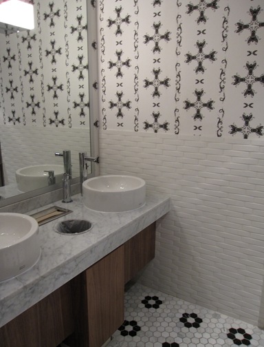
I was at a new ‘Joey’s’ last night on Burrard and Pender and I thought the washrooms were so great! It seems like all the trendy, ‘upscale casual’ restaurants these days are in competition to see who can design the coolest bathrooms so here’s yet another one. I especially liked the floor tile I think because it’s in the shape of a flower and I’m a sucker for flowers. . . what can I say, I’m a girly girl!

Colour me Happy Blog 076

Also I’m tired of chocolate brown, it’s just everywhere and overdone, so I quite liked the the black and white combination with the cherry stained wood.

Colour me Happy Blog 077

I don’t know if I would have picked that wallpaper in combination with the tile if I was the designer here, but I think it works.

Colour me Happy Blog 078

This ‘mushroom lamp’ as I’m calling it, was apparently $125,000 and came from Denmark. The installer had to fly in from Denmark as well to install it!

Colour me Happy Blog 080

Here’s another view of it along with the ceiling detail.

Colour me Happy Blog 087

How great is this very large scale wallpaper at the bar!! I just loved it, along with the gold framed flat screens!

Colour me Happy Blog 089

The gold is the only accent colour in this otherwise ‘black and white’ restaurant. Personally I think they could have introduced a more vibrant colour but it’s easier to be a critic than to create from nothing and the place was packed so obviously people like it!

LinkWithin