Showing posts with label Photo shoot styling. Show all posts

Thursday, March 4, 2010

Photo shoot in Morgan Creek

I have just finished decorating a stunning home in White Rock and I thought I’d share my day with you starting with a picture of the view outside my house at 7:30 am yesterday!

Colour me Happy Blog 494 Spring has arrived in Vancouver and my turtlenecks are suddenly too hot to wear :)

Colour me Happy Blog 4977:45 am - Here I am clipping some leaves from one of the bushes in my front yard!

Colour me Happy Blog 5017:55 am - I’m loading up my car with flowers. The biggest thing I have learned about photographing interiors is how important the flowers are. Pick up any magazine and if you mentally take the flowers out of the image, many times the room is pretty boring without them!

Colour me Happy Blog 499 The trunk of my car!! Can I fit another vase back here? Nope!

Colour me Happy Blog 5028:15 am - My assistant for the day Alexis (one of my former students) volunteered her services a few weeks ago. The cab got lost bringing her to my house so I picked her up at the Starbucks nearby! She confessed she made a point of not wearing any black because she was spending the day with me!! So fun, I loved her purple and blue outfit!

Colour me Happy Blog 035 9:22 am – We arrive at my clients home in White Rock to set up before my photographer arrives!

Colour me Happy Blog 50310:15 – Almost ready!

This is the coffee table that I designed and had custom made with 4 cube ottomans in faux ostrich leather that slide underneath. Since this is my client’s great room and living room combined it's where the TV is as well. I don’t know about you, but I like to put my feet up when I'm watching TV so I designed it so everyone could get comfortable and yet maintain the formality of a living room with the combination of both!

Colour me Happy Blog 50410:30 am – Anna [Beaudry] is here! I ran out to help her and then ran back inside to get my camera to take a picture and then walked away without grabbing her bag, oops!

Colour me Happy Blog 507 My lovely client Laura! She took some action shots of us too, hence the camera!! Since I can’t show the photos right away (because I want to get them published), you’ll just get a sneak peak of her house for now.

Colour me Happy Blog 505 11:35 am – We’ve just set up and shot the living/dining room (the first picture always takes the longest) and now Anna is setting up the next image. It’ll be the full view of this bookshelf that I blogged about last fall when I had finished styling it. (See the golf course in the backyard!).

image12:10 pm - Here we are setting up the next shot in the library. I’m squinting to see inside the viewfinder! Alexis was surprised at how much time professional photography takes! Depending on the angle everything has to be moved, especially if the room is symmetrical and perfectly balanced like this one!

image 12:25 pm – Anna’s moving the chair while I watch through the camera to make sure it’s perfect!

image 1:15 pm - Time for some water!

image 2:20 pm – Anna’s downloaded the next set of images to her laptop so we can see them in a larger format to make sure there’s no stray wires or cats that we missed, etc.

Colour me Happy Blog 508 2:30 pm – I came into the kitchen to get some more water and Alexis snapped this one! Now I’m getting tired.

3:10 pm – It’s a wrap! There is so much running back and forth to look in the camera and then fix and move furniture and accessories and flowers I was totally exhausted!! It was fun though! I bought so many tulips I ended up dancing around the house the night before while I was clipping the ends and placing them in vases! Flowers just make me happy!!

Hope you enjoyed my day as an art director :)

xo

Maria

If you would like your home to fill you with happiness every time you walk in, contact me for on-line or in-person decorating and colour.

Related posts:

Styling for Photo Shoots

What every Designer should know about Photography

How to Style a Kitchen for a Photo Shoot – 3 Rules to Follow

If you are new to this blog, click here to see the Best of Colour me Happy

Tuesday, August 11, 2009

Vancouver stylist - How to style a Kitchen for a Photo Shoot – 3 Rules to Follow

When the cabinet manufacturer saw the photos from this kitchen I styled, they hired me to style all the kitchens (and some built-ins) for their new website. They were interested in the high end look of this kitchen website which they emailed me to review.

image

image

Above images

My first stop for most of the accessories I needed was Fluff. They have a warehouse full of everything you need (furniture, lighting, accessories) to stage any space. There I picked everything I thought was appropriate based on the photos I had been sent (which is all I had to go by as it was a last minute decision for the client). The first kitchen had cream cabinets and the only colour inspiration in the space was the red Kitchenaid mixer (below):

image

1. Choose a colour scheme

I decided on a red and yellow colour scheme, because it’s french country which was perfect for this kitchen;

image

image

imageFluff Rentals

Patti (the owner of fluff) brought up a good point (as I circled around her well stocked shelves waiting for inspiration to strike) I asked her if she had any casserole dishes or pots and she said she specifically doesn’t rent them because she thinks a styled kitchen shouldn’t remind anyone of work (well, cooking is work for some of us :).

Website photos 113

Styled by Maria Killam

When I chose the items I needed for this kitchen, the photos did not include the china cabinet you see now on the left (above). When the first images were downloaded into the photographers computer I realized the left side of the kitchen looked like it was floating because there was so much dark on the bottom right of the photograph; so I ran around this clients home to find every red urn and accessory she had and luckily, she had more, so we were able to visually pull the cabinet into the photo and create balance.

Website photos 114 Styled by Maria Killam

2. Pick a theme for the food; ie. breakfast, wine & cheese, coffee.

Remember how I’ve said in the past that it’s hard to style a kitchen so it doesn’t look contrived? In this kitchen I chose a coffee and cake theme but, I have seen everything from carrots to wine and cheese and coffee all on the same island because whoever was styling it was thinking only of colour instead of choosing a theme; very important!

The next kitchen was contemporary and I didn’t have any colour inspiration (from the photos besides the cabinet) so I selected a wine & cheese theme and brought in white dishes and a branch for a splash of green and drama:

image Before

image

The above platters were the only thing from Fluff in this kitchen, I didn’t know how big this island was because I didn’t have a good picture of it so I rented both sizes. In the end the larger one was perfect and it was the same light colour as the cabinets!

Website photos 130

Styled by Maria Killam

image Before

Website photos 132

Styled by Maria Killam

3. In a perfect world, you keep everything the way it is for consistency. In this case, we broke that rule, as you can see by the fact that the cheese and fruit tray has been moved to this corner of the kitchen. The photographer Anna Beaudry, had the brilliant idea of inserting a light in the drawer and it sure makes this shot (above) fabulous!

image

Before

Since my client builds cabinets, we wanted to display the drawers open with dishes so I found the blue rolling pin and a matching rubber rim from a pressure cooker in some other drawers and managed to pull off a coordinated look with her stainless pots and bowls for this image (below).

Website photos 131

Styled by Maria Killam

The next kitchen we styled was quite dark so I chose an orange and yellow colour scheme to add some colour and pop!

image Before

See the pendant lights in the kitchen (above) when I chose the yellow and orange colour scheme I didn’t consciously pick it based on the colour, it was only when I saw the finished images that I noticed that the colours I chose matched the lights. Whew, I love it when that happens :)

image

Before

I don’t have the full kitchen shot here so I’ll just show the one you already saw in yesterday’s post but here you have the before photos (above) anyway:

Website photos 107

Styled by Maria Killam

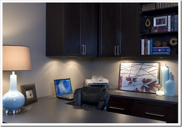
In this home they had installed cabinets in the office and bathrooms as well, so here are the before and after’s:
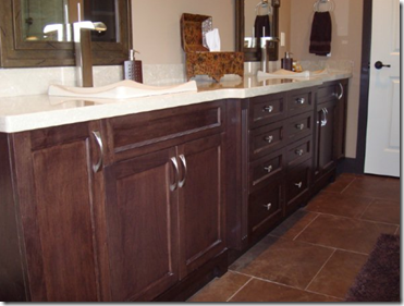
image Before

image Fluff

I only have this view of the styled bathroom but the two green urns above were placed in between the two sinks with the plant that you can see on the left, with this much brown we needed a shot of something fresh!
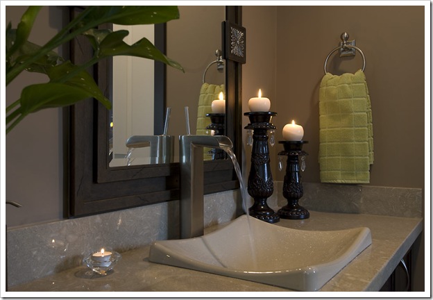
Website photos 108 Styled by Maria Killam

This was the bookshelf in the office, if I had more time I would have colour coordinated the books too, because they had so many great, colourful ones, but it worked out with the accessories I picked up at fluff:

imageBefore

image

Fluff

Website photos 109 Styled by Maria Killam

Website photos 110 Styled by Maria Killam

The books (above) I did coordinate underneath the little piece of art, Anna picked up on that immediately and got a close up shot!

image Before

image

Fluff

When I picked up these urns (above) I took the smallest one and stuck it in a small bag (for the colour) so that I could continue to shop for other items and it immediately fell through the bottom and smashed onto the concrete into a million pieces. Therefore, it is not in the styled image below :)
Website photos 111

Styled by Maria Killam

As you can see by the colour scheme in the bookshelf above, I did chose books to match the artwork and blue theme happening here!

Website photos 112

Styled by Maria Killam

With this much brown everywhere, what is your guess that pretty soon everyone will start painting their cabinets white?

Please contact me to inquire about my styling services!

Related posts:

How to create a Vignette or Tablescape

Styling Kitchens

Styling for Photo Shoots

Staging: Two Day Transformation

White Kitchen Cabinets

Tuesday, May 19, 2009

The Money shot for reVISION Custom Home Renovations

Remember that kitchen I styled in January for this renovation company?  Well here is the professionally taken photograph, by the talented Anna Beaudry (the photographer I hired for my website).

imagePhoto by Anna Beaudry 

See the difference with the images taken by my ‘point and shoot’ camera here, and if you are interested in seeing the rest of the professional photos taken my Anna, click here.

This stunning view of the city of Vancouver was taken at approximately 5:00 pm as the sun was setting.  The photo shoot started at 2:00 pm, but as the light started to change we were all so excited to get this final image of the day!  It would have been even better if water was pouring on the apples--but it was still turned off as the reno was just completed.  Photographers call a magical moment like this the ‘money shot’ in case you were wondering.

Related post:

Styling Kitchens

Styling for Photo Shoots

Saturday, January 31, 2009

Styling Kitchens

Remember in my post ‘Styling for Photo Shoots’ I said that most kitchens look ‘contrived’ when they are styled and photographed? Well this week I was hired by Revision Custom Home Renovations to style a kitchen they just completed, so I had an opportunity to prove that I could do something uncontrived :)

image

My photographer Anna Beaudry referred me to her client after she shot the homes I had decorated and styled for my website.

Colour me Happy Blog 107

The challenge here was to bring this primarily espresso brown kitchen to life with some colour!

Colour me Happy Blog 108

My inspiration for the entire palette started with the orchid (below) so I plucked one, matched it to some colour chips (as shown above) and that’s what I used to pick everything else.

Colour me Happy Blog 114

Colour me Happy Blog 116

image 2092-20

Colour me Happy Blog 115

image2167-20

image

Colour me Happy Blog 118

These of course are taken by my little point and shoot and don’t look nearly as great as the professional ones. . . I’ll have to link those later to this post (here they are!).

The kitchen site I used for inspiration is Lindy Weaver Design Associates. I found her site from this fabulous post on Things that Inspire. I think these are some of the best styled kitchens I have ever seen, all in one website, so beautiful!

image

Of course it helps that most of the kitchens on her site are white or cream (which are my favourite).

image

I love the way she showcases the little storage details that make a kitchen work like this spice cabinet right next to the stove.

image

image

I especially loved this image with the water running on the peaches, I wanted to do that in my kitchen but the water wasn’t on yet!

image

You can see where I got the idea to stick the pears on the counter with the dish towel underneath the strainer.

image

Check out this one below – seriously over the top styling but the colours and vegetables are stunning, Also notice the copper pots that match the upper cabinets!

image

The piece that makes a ‘styled’ kitchen look contrived (in my opinion) is doing something like these big leaves in the urns below (Hopefully Lindy won’t mind my little critique since I’ve raved about every other kitchen on her website) in addition to things like candleholders on the countertops, underneath cabinets. It’s stuff you would NEVER have in a kitchen in the real world, so that's what I mean about being contrived. And kitchens are challenging because is mostly hard surfaces without any of the softness created by drapery, etc.

image

And as always, it’s much easier to be a critic than to come up with something that works. I have nothing but respect and admiration for my fellow designers because it takes something to create from nothing! Well dear readers, thoughts?

Related post:

The 'money shot' for Revision Custom Home Renovations

LinkWithin