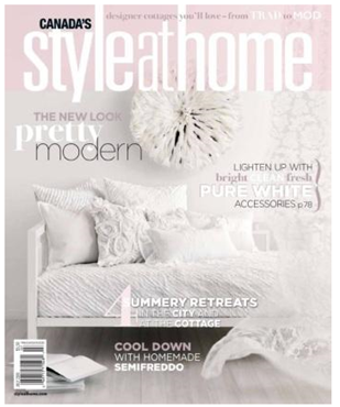
This cover is very pretty and showcases a white kitchen (my favourite). White Cover #1
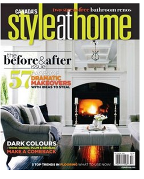
Here we have dark ebony floors and white furniture, and I noticed this cover introduced small photos at the bottom, but that look only lasted for 3 covers. White cover #2
March 2010
Ahhhh, Carrara Marble tiled floors with a claw foot tub and gray walls. The hottest trend in bathrooms right now. White Cover #3
Here a black and white kitchen with a very white-on-white colour scheme in the great room. White Cover #4
May 2010
I was in their May issue with a small mention here. Notice how the two chairs are still white even though I do think this is the prettiest cover of the entire year.
This issue also has lots of white but it does have a sunflower yellow chair so I can’t call it a totally white cover.
This issue is almost completely white and it came up in this article in a google search which stated that this issue sold 6,110 more than the same month in 2009. In went on to say this was a risk that paid off with record high sales (which are usually lower in the summer). And it brings our white tally to cover #5.
August 2010
Here the walls AND the floor are white with barely a hint of colour so I still consider this white cover #6.
Another white kitchen; white cover #7
Here the loveseat in my master bedroom is featured on this gray and white cover.
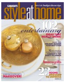
November 2010
White and gold dishes round out this cover for the holiday.

December 2010
And no surprise that the official holiday issue is gray and turquoise the two hottest colours of 2010 and certainly seen on many trees as the holiday decor of choice this Christmas. So that brings the total to 7 out of 12 although you can see that the covers that were not primarily white still had plenty of white left over on furniture or walls.
So lets see how much white is on House & Home covers in 2010:
January 2010
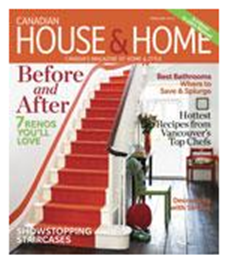
I loved this cover which featured the home of Victoria Webster, read more in my post here.
I was surprised to see this cover as--to my knowledge--magazines like to be first with photos and this stunning staircase had already made the rounds in the blogosphere months before this came out.
March 2010
I would classify this as a white cover because of all the millwork in white. Cover #1
April 2010
This one too is borderline but the charcoal upholstered chairs are the ‘colour here’. Very trendy look with white and gray, however as you know it’s saturated colour that brings gray to life, I think an area rug and cushions with colour would really make this room wonderful (and of course I would say that).
May 2010
This cover gives the illusion of a spring green issue but showcases a white interior. Cover #2
June 2010
Again we have white walls and a white sofa. This cover is cleverly designed to pick up the pink and orange colour scheme amongst all the white.
July 2010
Another space with white floors, outdoor furniture and a white house. I’m calling this white cover #3 in spite of the accessories in colour as the second you remove those you have a white-on-white look.
August 2010
I loved the feeling of this room, I mentioned it in this post. Notice the white chairs and the white rug. It’s an interesting balance of rustic and fresh (which is how you would categorize white).
September 2010
Another room with white walls and 2 white chairs.
October 2010
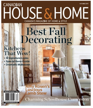
I loved this cover. With the orange wood in the back room drawing you into the image almost like a fire.
November 2010
I thought this cover was also very pretty, traditional Christmas colours.
December 2010
The only thing that makes this cover ‘holiday’ is the masthead and the wreath. But it’s a great way to showcase the second hottest trend besides a white kitchen – gray or charcoal. Masthead online also compared both competing December issues. Officially, House & Home had 3 white covers out of 12 which makes Style at Home’s tally come to more than twice the amount with 7. And as noted, many of the covers still showed plenty of white.
So there are two observations to make here:
1. It’s not necessarily that white covers sell better, it’s perhaps more a sign of the current trends. White is needed with the strong bright colours that are hot which takes us right back to the 50’s. And since black and gray have replaced brown and beige, white keeps those neutrals crisp.
2. White covers do sell better because we secretly wish for white furniture, floors and walls but just don’t create this look in our homes because it’s soooo not practical with kids and pets. Do we buy the magazine for the dream?
Which camp are you in? Love the trend or you just love the idea of white period. I'd love it if you'd post your opinion in the comments!
Related posts:


