Saturday, October 31, 2009

A Matter of Time

As much as I love being able to have a longer amount of daylight, I have to admit I do enjoy the one day, each year, an extra hour is gained!  I know it’s a manipulation of the hands on the clock, (or a digital update), but it still feels like a wonderful luxury, to me.

I’ll also share, I have a weakness for clocks – and not so much for the digital kind.  I think it’s a combination of the form and function as I enjoy the craftsmanship of each case and dial set.  For me, the tick-tock rhythm is like enjoying the presence of a comforting guest. 

lrgclock134I do love Swedish antiques and this clock and cabinet combination is no exception. A clever craftsman must have decided their customer needed to conserve space. What a great bedroom piece!  (You can find this at A.Tyner Antiques in Atlanta.)

clock%20000Mora clocks from Sweden.  No, this isn’t a typo . . . it’s the name of just one of the styles of tall case clocks, which can be found in the town of Mora, near the border of Norway.  Production on the clocks began in the late 18th century.  What a smörgåsbord! 

c494 c492 These French Louis XV clocks have similarities in the use of ormolu, or a method of heating and pounding metal to various shapes and forms, and it is often gilded, as well.  The clock, on the left, is referred to as a boulle design, as it contains inlay or marquetry to its wood case.  The clock, on the right, has been hand-painted with figures, often considered very fashionable, for the time. (King Louis XV of France, 1710-1774)

clockhouse clockhouse-2This English Folk Art Dove Cote with Clock conjures up visions of fairy tales and cottages.  Just look at the detailed carvings.  Don’t let the term “Folk Art” fool you.  This piece stands at 74” high and commands a price tag of $28,000.00!  Should this be your heart’s desire, it can be found at Antiques on Old Plank Road.  Circa, early 20th century.

img_0911(1)_t clock2 CL_000112 These Art Deco Clocks, (circa 1825 – 1940), showcase the use of Vinylite, (Plaskon) and celluloid materials.  This period occurred during a height of an international art and design movement.  Designs were considered to be modern, elegant and functional.  The clock, in the upper left corner, is commonly referred to as a “skyscraper” clock, as it exhibited a popular architectural design, such at that found in the Chrysler Building in NYC. 

Tall Case Clock - English

Copy of IMG_0964

A few years ago, I spied this beauty being advertised at a South Carolina auction.  It’s an English Tall Case Clock, (circa mid 1800’s), with a hand-painted face and simple inlaid details. I loved that the base was shallow so that it wouldn’t take up too much space in my foyer.  Well, a few flips of my auction number and you can see where it landed!  Does it keep the best of time?  Probably not.  Does the chime make me a little crazy at times?  That’s why I sometimes stop it.  Does it make me feel like I’m home, when I walk through the door?  Absolutely!

One extra hour of time? . . . What a gift and a treasure!

Wishing you cheerful moments!  Wanda

Happy Halloween Wishes!

hol010002


Friday, October 30, 2009

Does your Home have Colour Flow? Take the Toss Cushion Test

One of the things I really love about teaching is that I’m always looking for better ways to communicate what I know to my students.  My course is—by the way—not for the faint of heart.  It is more like an advanced colour course than ‘Colour Theory 101’.

image Image Source

Last week when I received the second assignment back from my students I noticed that most had chosen a pale gray shade for the living room of a colour chart that was their homework (I found out later it was because I had talked about how gray was the new brown).  The only gray that existed in this room was  mixed in with the yellows and blues that were in the drapery. 

image Image source

Majority rules when picking wall colours, so choosing a colour in a fabric that you have to be right up close to even see, would not achieve the result that we all want when we paint our walls and that is, your colour needs to pull your space together, if it’s not doing that, it’s probably not the right colour.

So, in the middle of the night (which is when a lot of my best ideas come to me) I thought of an even easier way to determine if you have achieved ‘colour flow’ in your home. 

image

Creating flow and transitioning the colours from one room to another without just taking one colour and going from light to dark is the biggest reason I am hired to choose colour, and ‘colour flow’ generally starts in your living room.   Just like I explained in this post, the strongest accent colour in your living room could potentially be the dining or powder room colour, the next 2 or 3 shades could be used in your kitchen/great room and so on. 

image

 Jamie Drake

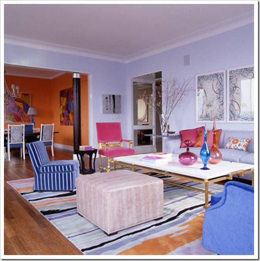
In this dining room (above), the orange in the living room has been repeated on the walls and the blue has been repeated in the dining chairs. If you pulled the dining chair into the living room because you needed extra seating, it would look right at home!

When you are selecting colours for your home, take all the colour chips and put them together on a piece of white paper.  That’s one way to see if you have one that ‘jumps out visually’ as being too clean, or maybe it’s too murky and muddy.  But the best way to know if you have flow is this:

image Image from Simplified Bee

Take the colour chip you have chosen for your kitchen or bathroom and if you could make it into a toss cushion and it would happily sit in your living room without looking completely bad or wrong, it’s probably a good colour for your kitchen.  Whether it actually works with the finishes in your kitchen is another story of course and you might still want some help from a professional but it’s a good guideline to take into consideration.

image

Of course, this is a ‘perfect world’ scenario.  If your 12 year old daughter wants a pink room, she should have one because it’s her personal space—just like your home is your space.  If you have a dated (on the list to be renovated) bathroom (or any other room) that does not work at all with the rest of your home, I like to choose a colour that actually works with the finishes and makes that bathroom look as good as possible in the interim.

Related posts:

The Right way to Create flow using Colour

Clean vs. Dirty Colours

Hiring a Designer; Luxury or Necessity

Happy Halloween!!!


Ok, this is what I wanted to go as for Halloween but I couldn't convince any of my friends to be the rest of the cast. I know, I am shocked too. [For those of you that have better things to do, this is Kim from The Real Housewives of Atlanta.] So instead I will be a cowgirl (Lame! Does anyone watch Modern Family? Well this comment is lame.). Now my dad gets major props on my blog for his artistic talents but my mom deserves a shout-out here because she hand-made all of our Halloween costumes growing up. No plastic KMart cr*p for us! Lucky kids we were. This probably contributed to my brother's obsession with Halloween. He is the guy in the neighborhood who digs fake graves and hides in the bushes wearing a Jason mask. I am not that hardcore but I do enjoy dressing up. Here is a little montage of my favorite former Halloween costumes (too bad I don't have photos of me in them! Or should I say, thankfully, I don't have photos of me in them.)...


This is who my sister-in-law (funny lady) thought I should be last year...


(Yes, that is Brett Michael's from Poison and Rock of Love fame!)

Happy Halloween!!!

Thursday, October 29, 2009

Check Yes, No or Maybe

How are we feeling about bold printed wallpaper in major rooms of the house?

Do these images make you feel...

Dizzy?
Happy?
Excited?
Nauscious?
Fearful of commitment?
Like you are at grandmas's house?
Like you are staying at a Colonial B&B?
Like you are touring a designer showhouse?
Like you are you having a bad Laura Ashley acid-like flashback?

Could you sleep soundly in a room with this much pattern?


Could you have a relaxed meal with this much pattern going on?


Or should we relegate these mammoth prints to smaller spaces like powder rooms, closets and entry ways?


I want to hear your opinion...I really, really do! So leave me a comment.

~Images: 1) Better Homes & Gardens 2) Unknown 3) House Beautiful 4) Elle Decor 5) Designer Ann Coyle 6) Designer Jonathan Adler 7) Elle Decor 8) Country Home 9) Designer Tom Scheerer 10) Quadrille

Wednesday, October 28, 2009

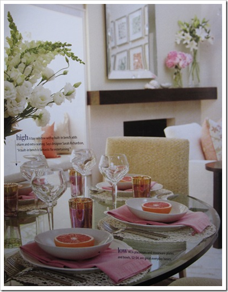
A Pink Tablescape with Sarah Richardson

I saw this table setting in a recent Style at Home Magazine and in the spirit of Breast Cancer Awareness Month I thought I’d post it.

image I’m always drawn to creatively styled tables and I loved the way the napkins were simply folded underneath each bowl of sliced pink grapefruit!  And as you can see by the copy on the image, the placemats were a bargain from IKEA for $2.00.

image

Click here to see all the other beautiful tablescapes at Between Naps on the Porch this week!

Related posts:

How to Create a Tablescape (Washington Post Blog Watch, August 2009)

Tablescape Thursday with Barbara Barry

I Don't Garden


It's no joke. I could kill a cactus. Oh, and did I mention that my father is a landscape architect? What a disgrace! Yeah, I am guessing that is a trait that skips a generation. I have hopes that someday I will enjoy this past-time but as of now, I prefer to pay the kid next door to cut my grass and to buy my vegetables, herbs and flowers from the Whole Foods. But I think if I had a cute little shed like this one (above) or as organized as this one (below), I might reconsider taking up the hobby!


~Images: Better Homes & Gardens March 2009 and Martha Stewart Living

Tuesday, October 27, 2009

Word.


Sometimes you can find old metal letters from vintage signs but it is often hard to find the right letters to spell an actual word. But if you have something you REALLY need to say...try these letters from Ballard or these zinc letters Anthropologie or these galvanized ones (only spelling "cool") from Pottery Barn. Good ol' PB also has many that are better suited for children's rooms.


~Images: 1) via Pinkwallpaper 2) Designer Morgan Harrison 3) Better Homes & Gardens 4) Home Magazine 5) Coastal Living 6) Pottery Barn

Monday, October 26, 2009

The 80/20 Rule also Applies to the most Popular Paint Colours

It’s called ‘The Pareto Principal’ and it means that in anything a few (20%) are vital and many (80%) are trivial. Or 20% of the people own 80% of the wealth or 20 percent of the defects cause 80% of the problems. Project Managers know that 20% of the work (the first 10% and the last 10%) consume 80% of your time and resources. You can apply the 80/20 Rule to almost anything, from the science of management to the physical world.

image And you can also apply it to wall colours. See the sofa above? I walk into a room with this sofa in it and I immediately know which 3 [butterscotch] colours I would pull out to see if they would work:

BM Lady Finger, Sisal, or perhaps Tawny Bisque. And the next time I come across a 'butterscotch colour sofa again, or a tile, it's the same colours. That's it (ok there are 3 others I would also consider but I don't pull them out these days because they are just a little too orange and with the brown trend, no one is responding to them so I've toned them down with the ones I've quoted). Same thing if I need a fresh green, I have three to choose from. The over 2000 colours that are in any given fan deck? We only really use 20% of them over and over again.

Website photos 035 See the colours on the left? Well you can’t see them all that well in the above photo, but mostly they are used for kids room colours or (as I tell my students) those yellows, on pillars in a parkade to signify caution– too screaming bright.

The ones on the right? Way too many pinky beige’s and cold blue grays, so there are a few greens, yellows, purples and blues to choose from.

The ones in the middle that I’m sitting in front of? Those are the Designer Classics and the Heritage Colours, these are the ones we use over and over.

The other day, I decided to paint up some new samples so I thought I’d do a tutorial on my dining room table to show you a good way to do it when you paint yours at home!

Colour me Happy Blog 351First you need a poster board. This one is already cut in half because I’m going to paint 4 colours on it but if you are painting one for your own testing purposes, better to at least paint the entire half of the board. The bigger the better.

Colour me Happy Blog 352 Take some green painters tape and tape it all around. To save on tape I left the 4 outside edges—I’ll cut them off anyway.

Colour me Happy Blog 354Here I am drying them with my blowdryer to speed up the process. I used to use cute little rollers to paint on the colour but they only last for maybe four times and then I have to throw them out so now I just use a paint brush. They dry way quicker. Wash out the paint and then shake it until you don’t see any more water, then it’s ready for the next colour.

Colour me Happy Blog 357Here’s the finished paint sample with the second coat still drying. I’ve taken the tape off (better to do it before it dries so it doesn’t start taking the paper with it!) and now I’m writing the colour names and number on the bottom of each.

Colour me Happy Blog 358 I chose Dove White (I don’t have that one in my collection yet), Abingdon Putty, I rarely specify this colour because I don’t have a bigger sample of it but people rave and rave about it—they say “sometimes it looks gray, sometimes green and sometimes taupe” I know, hard to believe it’s the one on the lower left. Then because grays are becoming the new brown I also selected Stonington Gray and Rockport Gray.

Colour me Happy Blog 368

And here they are the next day. I leave them out to cure a little before I stack them all up and stick them in my sample bag (otherwise they start sticking together if I do it too soon!).

So relax about knowing every single colour already. One day in the distant future, I’ll create a list of large paint samples that everyone should have in their back pocket. If you want the list I have right now, click here to subscribe to my monthly newsletter and you'll get one.

And a tip for the designer’s reading this post? All those paint samples you buy with your client and paint on the wall—don’t do it! Instead, take the extra time and paint out the samples on poster boards and you will have the start of your own collection for the next client!

Related posts:

Insider Secrets to Testing & Selecting Paint Colours

Happiness is. . . Having the Career that you Love

A Day in my High-Heeled Shoes

New to this Blog? Click here ; Subscribe to my Monthly Newsletter; Become a True Colour Expert

LinkWithin