One of the things I really love about teaching is that I’m always looking for better ways to communicate what I know to my students. My course is—by the way—not for the faint of heart. It is more like an advanced colour course than ‘Colour Theory 101’.

Last week when I received the second assignment back from my students I noticed that most had chosen a pale gray shade for the living room of a colour chart that was their homework (I found out later it was because I had talked about how gray was the new brown). The only gray that existed in this room was mixed in with the yellows and blues that were in the drapery.

Majority rules when picking wall colours, so choosing a colour in a fabric that you have to be right up close to even see, would not achieve the result that we all want when we paint our walls and that is, your colour needs to pull your space together, if it’s not doing that, it’s probably not the right colour.
So, in the middle of the night (which is when a lot of my best ideas come to me) I thought of an even easier way to determine if you have achieved ‘colour flow’ in your home.
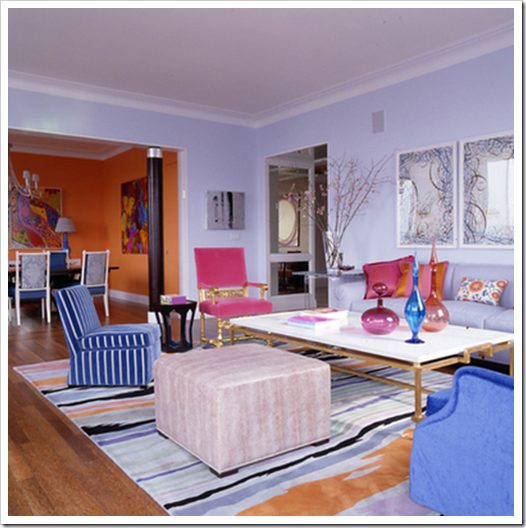
Creating flow and transitioning the colours from one room to another without just taking one colour and going from light to dark is the biggest reason I am hired to choose colour, and ‘colour flow’ generally starts in your living room. Just like I explained in this post, the strongest accent colour in your living room could potentially be the dining or powder room colour, the next 2 or 3 shades could be used in your kitchen/great room and so on.
Jamie Drake
In this dining room (above), the orange in the living room has been repeated on the walls and the blue has been repeated in the dining chairs. If you pulled the dining chair into the living room because you needed extra seating, it would look right at home!
When you are selecting colours for your home, take all the colour chips and put them together on a piece of white paper. That’s one way to see if you have one that ‘jumps out visually’ as being too clean, or maybe it’s too murky and muddy. But the best way to know if you have flow is this:

Take the colour chip you have chosen for your kitchen or bathroom and if you could make it into a toss cushion and it would happily sit in your living room without looking completely bad or wrong, it’s probably a good colour for your kitchen. Whether it actually works with the finishes in your kitchen is another story of course and you might still want some help from a professional but it’s a good guideline to take into consideration.
Of course, this is a ‘perfect world’ scenario. If your 12 year old daughter wants a pink room, she should have one because it’s her personal space—just like your home is your space. If you have a dated (on the list to be renovated) bathroom (or any other room) that does not work at all with the rest of your home, I like to choose a colour that actually works with the finishes and makes that bathroom look as good as possible in the interim.
Related posts:


