One of my on-line clients posted the sweetest comment when I wrote this article asking about the hottest paint colours for 2010, here is what she said:
“Huge thanks to you Maria!! Per our phone consultation, your recommendation is nothing short of genius. Wickham Grey [Living room walls] is beautiful beyond my imagination; ethereal. The other pick, Shale [Kitchen Cabinets], is also brilliant; it's quite dissimilar to any of the typical neutrals and very chameleon, which I love. The consultation was money very well spent. To anyone thinking about it, do schedule a Maria Killam consultation! You will not be disappointed.” Jan

This morning I went out for a run down to the Capilano River (since I live right beside it now), and it was so beautiful, when I got to the riverbank I started thinking about the word ethereal because even the ferns along the path, still new and untouched were such an amazing shade of green! Here’s the definition: Characterized by lightness and insubstantiality; intangible; highly refined, delicate; Not of this World.

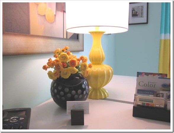
Colour that is defined as ethereal is usually light and found in light-filled spaces. This is why Donald Kaufman says “A light colour will never come to life in a dark room”. I have had that experience in my Tiffany blue office (sneak peak below) since it was painted. Sitting here I often just sit and admire every corner of my office because the colour is so wonderful!

Here are my tips for creating ethereal colour in your home:
1. Choose a light filled room. If your space is dark already, better to paint it a richer colour and install some lighting (not all recessed lighting--although that would add extra dimension--you still need lamps for atmosphere), because a rich warm colour is what’s necessary to bring a dark room to life.
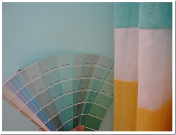
2. Choose a colour that pulls your space together. Which means the colour should relate to the largest furnishings in the room, so the first place to look is at the broadloom, sofa or drapery. One of the reasons I love the colour in my office so much is because it goes so well with the artwork and the turquise in the linen drapes. Click here to subscribe to my newsletter (it’s free) get a list of my go-to colours if you need some inspiration.

3. Pick one of the top two colours in the strip so that the colour stays light, instead of going to a mid-tone which may not give you the same effect. Remember this is just a guideline, ethereal feeling colour certainly exists past the first 2 colour chips, it depends on how dark the colours are in the first place—some are darker than others--in addition to how large the space is. The room below is a darker colour but it’s large and the quality of light is simply stunning (and the lighting at the opposite side of the room certainly enhance the atmospheric lighting here)!
One more thing, there is a big difference between colour that looks ethereal and quite frankly just ‘washed out’. A colour that might seem washed out will happen when it doesn’t relate to anything in the space, like an entry or hallway for example. Colour always looks the best when it either relates to other elements in the room or simply is the perfect pale shade with the correct undertone that makes everything else against it look wonderful!
If you would like your home to fill you with happiness every time you walk in, contact me for on-line or in-person consultations.
Related posts:
The Enchanting World of Atmosphere
New to this Blog? Click here ; Subscribe to my Monthly Newsletter; Become a True Colour Expert


