Brookyln Photos by Maria Killam
After being in the hotel for two days (and not wanting to go outside in the rain) it was nice to get out yesterday and walk around Brooklyn. It was so charming I have some photos to include in this post, especially with the fresh green of Spring all around! So beautiful!
Day two of the conference (Monday) we were discussing the direction colour is moving. Whether it’s going lighter or darker, cleaner or more saturated. What is pushing colour in a particular direction, trends, politics, consumers, what are consumers buying and which demographic is it?
 Grace from Sense and Sensibility was the first to comment on my last post and she said: 'I always feel a bit hoodwinked when all of a sudden I start liking a colour I never liked before because the marketers have decided it is in and we see it everywhere.' I thought this was such a great comment because that is exactly what I thought the Colour Marketing Group was before I became a member. My response was:
The most interesting part of colour forecasting (that most people don't know) is that there is no random "Let's pick this colour, it should be in" forecasting going on in our conferences. I am arriving with colours that I am choosing for my clients right now! The reason they are considered NEXT Colours is because as colour professionals, we are usually on the pulse of what's coming next because this is what we do. Those are consumer colours and then there are Contract colours which are longer forecasts but forecasts are driven by the consumer.
Many people criticize colour forecasting and write it off to "Marketers putting out what's 'in fashion' so that we spend more money" but really it's that people get tired of dark so they want light [colours], there are other drivers too, the economy and empowerment is a really big driver, because of social networking; anyone can create something from nothing (like this blog) and be empowered .
So it's actually consumers that drive where colour is going and colour professionals simply notice it and document it. And that is what we are actually doing in the conferences.
The most interesting part about it is that most designers arrive with the same group of colours.
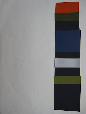
The colour combinations I'm showing were compiled by Janice Lindsay, she agreed that fresh and clear colours were a trend but so was muddy and muted--this is where gray comes in. Colours are grayed, like the combinations shown with a hit of clear and fresh. Some descriptives from the conference were:
Colour Interrupted
Pretty Ugly
Classic with a Twist
A musical chord with a 'wrong' note inserted in it which is then what creates the magic!
Cynthia Cornell said"the Style Story is: Fresh Air, Fresh Food, Screen Fresh, and Earth Bound. We must find the bridge between cartoonesque colour and earthbound colour".
"The balance is Earth, what’s happening is Patina, we are going gold in accessories next but really it’s the patina, the overlay, sculpted, bronzed, the marking. The other side of fresh is dirty. Other side of being hopeful is distressed."
What is the bridge in between, and how do we coordinate all of it?

We are not telling you what you should wear or buy, manufacturing is responding to what the market demands.
 So that's my colour news from the conference! It's a dichotomy of opposites. In order to incorporate fresh colour we need grayed colours to ground them.
If you would like your home to fill you with happiness every time you walk in, contact me for on-line or in-person decorating and colour.
Related posts:
New to this Blog? Click here ; Subscribe to my Monthly Newsletter; Become a True Colour Expert


