Friday, April 30, 2010

The Wisteria Winner Is . . .

But first, an important message from our sponsor. 

Well, isn’t that how all contests are?  You build the anticipation and then cut to a commercial?  In the case of a blog contest, it might not be so dramatic, but I am so excited about revealing the winner as this was my first contest!  Thanks to everyone who commented and shared your thoughts on my “Details In Design” series.  It was great fun to put this together!

The contest ended on April 30th and the winner will be receiving a $75.00 gift certificate from Wisteria.com, to indulge in anything they might like.  I wonder what they’ll choose? . . . .

Will it be a set of jewel topped bottles?

w3931-large

What about a French Country cake stand?

w3520-large Perhaps a set of Tapas dishware?


Maybe some clever book boxes?

I’ll admit, while it’s tempting to go shopping for myself, I do think it’s better to give than to receive, so I’ll share the contest results.

And the winner is! . . . . .Tamara Matthews-Stephenson, of Nest by Tamara!  Tamara is a fabulous blogger and interior designer, from New York, so her win makes this give-a-way very special, indeed.  I’m honored to have her posts, along with all of the others, as I so enjoy her writing and capturing of great design.  Congratulations, Tamara!  Be sure to email me with mailing instructions for the gift certificate, by May 30th.  (icbwbusiness@gmail.com

Thanks, again, to all of the participants.  You are all winners of my heart!

Cheers to you!  Wanda

A Visit with Pure Style Home

After my Conference in Brooklyn I took a short flight to DC to Visit Lauren Leiss at Pure Style Home! I must admit it was a bit surreal.  I am a huge fan of hers (we have become great friends on the phone).  Reading her blog and looking at her beautiful home for months made it all the more special to see it all in person.  I really felt like I had arrived at the home of a celebrity!

image

I got to sit at her kitchen table (above) and have breakfast!

imageAnd to see her kitchen transformed in person from before (above):

imageAnd AFTER (above).

 imageBaby Justin’s nursury was just as fabulous in person too, click here to see the before’s and after’s! And play in it with Christian (below)

Picture 036 

Children are so extraordinary because they cause us to see things we would never notice on our own.  You’ll never guess what Christian is doing here? As the sun filtered in the woven wood blind he decided to catch the tiny dust particles that float in the air.  Christian turned it into pixie dust!

Picture 038Those are my knees, in the way of the photo but I wasn’t paying that close attention :)

Picture 039You know one of the things that make this room work so well?  That she used a higher shelving unit to create an ‘end table’ right beside the crib. She has stunning little vignettes all over her house (as you know if you follow her blog) Lauren is exactly the same in person as the witty and generous person you’ll find while reading her blog and she’s a huge talent! I know we’ll see her name in lights very soon!

laurens guest roomThis was my guest room.  Lauren isn’t finished with it yet so this is a tiny sneak preview.  Love the flowered drapes, 4 poster bed and fabulous decorative toss cushions!

Picture 035Here she is with baby Justin and Christian! Her husband Dave is such a great dad it was great to hang out with the two of them and get to know them better!  I had such a wonderful time and hopefully I’ll have a guest room in my new house that is even remotely as cute as hers when she comes to visit me!

If you want your home to have atmosphere including colours that flow to fill you with happiness every time you walk in. Contact me by email info@mariakillam.com for on-line rates or call me at 604.318.9725 if you are local.

Related posts:

Three things you don’t know about me (but I wish you did)

Happiness is. . . Living Close to the ones you Love

Hot Pink and Kelly Green

If you are new to this blog click here to see the best of Colour me Happy.

I Need Some Girl Time...


Cottage Living


Cottage Living

So if you know me at all or have ever read this blog you know how much I adore my newphews! However every time they are shooting me with pretend guns or asking me to be Princess Lea while we play Star Wars I think "why couldn't my brother give me just one niece so I can do her hair and play dress-up or create a Barbie compound in the playroom!" Several of my friends are having little girls in the next few months and I think that I will just have to rent them out on the weekends for some girl time!

Have a great weekend!

Thursday, April 29, 2010

Mirror, Mirror on the Wall (literally)...


I just love this concept...what a great way to open up a small space and give yourself a full length mirror to check out your outfit head to toe! And you can see, it's not your 1980's mirrored wall my friends! If you are local and need someone to do this call Justin Walling with Charleston Architectural Glass 843.452.0427, he does a great job. He just installed an antique mirror backsplash in a client's kitchen (pictures to come) and it is beautiful!

Wednesday, April 28, 2010

Decorganizing Wednesday: Closets and Dressers

Unknown (help?)

In my experience as a closet designer, it seems that most people want to get all of their clothes into the closet verses having a dresser in the bedroom. I LOVE this idea! You can find inexpensive dressers at flea markets, yard sales or your local IKEA to house all of your personals inside your closet. Get creative and label the drawers like this clever minx did. I mean why not???

Change Your Accessories To Bring A Room Back To Life


As we all know it's the finishing touches which lifts a room and gives it the 'wow' factor. Yes, of course you have to get the colour scheme right, along with positioning furniture to make the most of the available space within a room, but it's the creature comforts which transform the look of rooms by providing balance and cohesion.

Table lamps contemporary in style are one accessory which no home should be without. They don't have to be matching, if fact table lamps with different base shapes and shades add to the interest of the room as well as being ideal to create the right mood and ambience in a room.

Most homes in the UK have central ceiling lighting and whilst this is okay when you need to illuminate the entire room they can cause a room to look either over illuminated or harsh. Soft and gentle lighting placed strategically around a room offers a much calmer and refined lighting effect which is also conducive to relaxation and provides an informal homely feel.

Look for table lamps with unusual shaped bases, along with shades which coordinate with you colour scheme, turn off the central light and you'll be surprised at the difference within the room.

So rather than re-decorate try adding new accessories, such as table and floor lamps, cushions and rugs to bring a tired looking room back to life.

Tuesday, April 27, 2010

The Combination of Surprise is What's Next in Colour


Brookyln Photos by Maria Killam

After being in the hotel for two days (and not wanting to go outside in the rain) it was nice to get out yesterday and walk around Brooklyn. It was so charming I have some photos to include in this post, especially with the fresh green of Spring all around! So beautiful!


Day two of the conference (Monday) we were discussing the direction colour is moving. Whether it’s going lighter or darker, cleaner or more saturated. What is pushing colour in a particular direction, trends, politics, consumers, what are consumers buying and which demographic is it?

Grace from Sense and Sensibility was the first to comment on my last post and she said: 'I always feel a bit hoodwinked when all of a sudden I start liking a colour I never liked before because the marketers have decided it is in and we see it everywhere.' I thought this was such a great comment because that is exactly what I thought the Colour Marketing Group was before I became a member. My response was:


The most interesting part of colour forecasting (that most people don't know) is that there is no random "Let's pick this colour, it should be in" forecasting going on in our conferences. I am arriving with colours that I am choosing for my clients right now! The reason they are considered NEXT Colours is because as colour professionals, we are usually on the pulse of what's coming next because this is what we do. Those are consumer colours and then there are Contract colours which are longer forecasts but forecasts are driven by the consumer.


Many people criticize colour forecasting and write it off to "Marketers putting out what's 'in fashion' so that we spend more money" but really it's that people get tired of dark so they want light [colours], there are other drivers too, the economy and empowerment is a really big driver, because of social networking; anyone can create something from nothing (like this blog) and be empowered .
So it's actually consumers that drive where colour is going and colour professionals simply notice it and document it. And that is what we are actually doing in the conferences.

The most interesting part about it is that most designers arrive with the same group of colours.


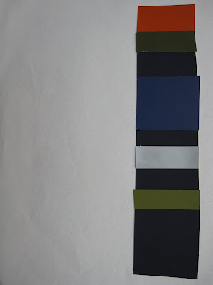
The colour combinations I'm showing were compiled by Janice Lindsay, she agreed that fresh and clear colours were a trend but so was muddy and muted--this is where gray comes in. Colours are grayed, like the combinations shown with a hit of clear and fresh. Some descriptives from the conference were:


Colour Interrupted

Pretty Ugly

Classic with a Twist

A musical chord with a 'wrong' note inserted in it which is then what creates the magic!


Cynthia Cornell said"the Style Story is: Fresh Air, Fresh Food, Screen Fresh, and Earth Bound. We must find the bridge between cartoonesque colour and earthbound colour".


"The balance is Earth, what’s happening is Patina, we are going gold in accessories next but really it’s the patina, the overlay, sculpted, bronzed, the marking. The other side of fresh is dirty. Other side of being hopeful is distressed."

What is the bridge in between, and how do we coordinate all of it?


We are not telling you what you should wear or buy, manufacturing is responding to what the market demands.


So that's my colour news from the conference! It's a dichotomy of opposites. In order to incorporate fresh colour we need grayed colours to ground them.


If you would like your home to fill you with happiness every time you walk in, contact me for on-line or in-person decorating and colour.

Related posts:


New to this Blog? Click here ; Subscribe to my Monthly Newsletter; Become a True Colour Expert

It Is Better To Look Good, Than To Feel Good...


House Beautiful


via pink wallpaper


Unknown


Unknown

You might not be the most comfy seats out there but I just adore you! All of you!


Monday, April 26, 2010

Before & After: Blue Chickadee

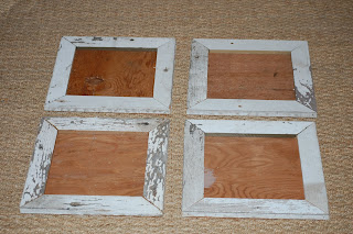
Remember the post I did on my friend Way Way of Blue Chickadee a while back...she makes all the amazing totes, wall canvases, onseies, aprons, notecards, diaper covers, etc.? Well she bought these frames made of salvaged wood from me on my site Objects...

And look at what she did with them!!!


So cute!!!

Sunday, April 25, 2010

The Inside Scoop on what's Next in Colour


When I arrived in New York yesterday it was sunny and beautiful and then today we woke up to rain so it's a good thing I've been in colour forecasting meetings all day long. . .


The Colour Marketing Group Conference kicked off with a reception where I saw our President James Martin (above) with the Color People. I interviewed him on my blog a few months ago, here.


Then met some new colour colleagues, from second on the left, Jacqueline Rosadiuk, Roza, Janice Lindsay, James Martin and I'm on the right. For colour professionals we are all looking very neutral I did notice!

This photo (above) is what we work on all day today (I was a co-facilitator so I was sticking them on the board--above). We determine which colours are 'NOW' and then everyone has prepared (in advance) which colours are going to be 'NEXT'. Once we all have the colours we brought on the board we start to narrow it down and everyone presents their 'argument' for the colours they have brought!

Margit Zsedely with Margit Publications represents a company that packages colour combinations and sells them to Fashion, Interior/Home, Residential/Contracts and Industrial Markets. Her presentation had some beautiful colour boards to go with the samples of yarn but they were top secret (for buyers only) so this was all I was allowed to photograph!

Green continues to be a big story, (but it's fresh not too yellow and I talked about the difference between the two here) it’s almost a neutral. Orange, fresh new, rejuvenating the space using natural elements. Fresh, happy colours are mostly what ended up on the board. Grays were there of course as a neutral and Brown was still there but that's because it's not going away yet, we named our brown 'Stayin Alive' which I thought was great!

Sherran Arthur, Marketing Manager for Canada from Larson-Juhl talked about frames and warm metals tones--that golds are coming back but not as bright as they were. Hammered and burnished gold. I had a fascinating group of colour professionals at my table, it was a really fun day!


Lori Lewandowski from Masco Retail Cabinet Group, had a beautiful presentation on her take on upcoming colour trends and navy is a big story. Blue stands for water and sky which represents hope, very important still in todays times! Someone else said that for a few years no one was interested in seeing the wood grain of cabinetry because it was espresso brown and now people are wanting it back in the bleached out woods we are seeing everywhere.


Ceiling in the Marriott Brooklyn lobby

I was also introduced to Mix Publication which is a Global Color Research organization. They also have a blog which I can't wait to check out!

Hope you had a great weekend! I'll fill you in on my week when I can!

If you want your home to have atmosphere including colours that flow to fill you with happiness every time you walk in. Contact me by emailinfo@mariakillam.com for on-line rates or call me at 604.318.9725 if you are local.

Related posts:


If you are new to this blog click here to see the best of Colour me Happy.

Saturday, April 24, 2010

Perfect Pairings In Design

High Point Market ~ #Details in Design ~ “Shorts” #1

Upon returning from the High Point Spring Market, I’ve had a lot of inquiries about I what I thought might be trending.  There is so much to cover, one post can’t do it all justice, so I’m going to pop in what I’ll call, “High Point Market Shorts”.  I promise to “keep my long stories short”, as I know visuals are always much more fun!

Back to this pairings post . . . I noticed, as I went from showroom to showroom, there were lots of happy couplings – and no, I’m not talking about reps who had been working way too many hours together!  Lamps, vases, pictures, tables, chairs, loveseats and sofas, shelves – just about anything imaginable had been neatly placed, side-by-side.  While designers might think we should be challenged to find a different way to display or plan a space, I think we are simply looking towards make rooms feel less cluttered, more balanced, and well . . . even more intimate.

Droid Downloads 234  (This perfect “couple” greets you in the entryway!  - Councill Showroom)

So, without further adieu, I’ve created a little video for some of my market photos.  I hope you’ll keep checking back, as I’ll be posting more of my observations.  (You can turn off your sound, if you prefer to view in silence.)

Cheerful Pairings to You!  Wanda

LinkWithin