Wednesday, March 31, 2010

Style at Home and Penelope Trunk

What do the two have in common? The May Style at Home issue (which I’m in) arrived in the mail yesterday and I was mentioned in Penelope’s latest blog post both on the same day!

image

It was all very exciting. I spun around and did a happy dance for a little too long on Tuesday morning so I actually had to reschedule an appointment I had with a new marketing person (who might be the one to help me take my blog to the next level, we’ll see) as I ran out of time to prep for it!


image

Brett Walther (below) an Associate Editor at Style at Home Magazine, also writes a great blog called Style Sleuth. He found my blog when it was just a baby and linked to The Best Trim Colours NOT Cloud White post and wrote a post about it here. He was the one who emailed me saying he wanted to include me in their colour issue for May! A huge thank you to Brett and Style at Home!


image

Grace at Sense and Simplicity was the first to announce that I had been mentioned in this sweet post she wrote on me (because my issue came through pony express and her's arrived one week ago)! Thanks Grace!


image 'Pale colours and whites can really only be enjoyed with a lot of natural light. Painting a dark room pale colours simply accentuates the shadows in a space' Maria Killam

And then the next thrilling thing happened. Someone sent me a tweet saying they found my blog on Penelope Trunk’s blog and I thought, “I haven’t seen a post by her today”, and then, literally 2 minutes later it came through to my in box. Click here to read it.

Anyone that has been reading my blog knows I love Penelope’s blog. Her authenticity inspires mine! Click here to read all the posts (5 actually) where I’ve linked to her.


image

It’s already easy for me to share personal stuff about my life because I’ve always been like that but reading her blog makes me realize I’m just a beginner when it comes to sharing myself in public. As she said on her webinar tonight (How to be a millionaire from your blog. Really) in response to someone’s question ’what are some blog ideas that are unique’—answer, “There is nothing new, Information is a commodity so if you don’t differentiate your blog from everyone else’s with your personality, no one will read it” (I was taking notes so it’s not word for word but that’s basically what she said).

image I love this backyard of a farm house(credit)

By now you may have read on Penelope’s blog that I am doing an on-line colour and design consultation with her (Monday actually). She’s got her fan-deck ready and sent me the photos of the farmhouse and Monday we’ll choose the colours (including a white for her kitchen cabinets) and talk about the furniture she’ll be buying, space planning, etc. I’m very excited. (email me for more info on what on-line consulting looks like).

imageWe are going to paint her kitchen some shade of white (or maybe colour) she wants happy!

I also wanted to tell you why she made this comment in her post (in case you were wondering the same thing):

“She’s so weird about the photos because they are beautiful but generally unrelated to the post, and somehow she makes that work.” Penelope Trunk

imagePenelope wants a pink and yellow master bedroom, I love the idea! (credit)

Okay so usually you learn something and there's a related image to go with it but sometimes for example, here and here when I am just rambling on about something that I think is interesting (it’s important to be interesting Penelope said)--and since this is a blog about colour and design--I can’t just post a bunch of words without photos, so I’ll find some images that I think are beautiful and include them in the post. And my readers have reported it’s like getting a mini magazine in their inbox everyday, so it works for me!

image We could add some yellow to this room! (credit)

That is my exciting news of the week! Thank you to Style at Home and Penelope Trunk!!

If you want your home to have atmosphere including colours that flow to fill you with happiness every time you walk in. Contact me by email for on-line rates or call me at 604.318.9725 if you are local.

Related posts:

A light Colour will never Come to Life in a Dark Room

Warning; You are the Colours in your Home

Kitchen Paint Colours; 5 Questions to Consider First

When is White just Right?

New to this Blog? Click here ; Subscribe to my Monthly Newsletter; Become a True Colour Expert

Decorganizing Wednesday: Martha...You Again


Damn you Martha, damn you!
So tired of her making the rest of us look bad. This office is crazy organized. I could get some serious business/crafting done here (she says from behind stacks of unfinished work).

Tuesday, March 30, 2010

Simplify

Unknown

Sometimes we over think ourselves.
Art can be this simple. Try using images from a book or calendar.

Monday, March 29, 2010

Should you Surrender to the Temptation of a Trend?

Lately I’ve had a few clients say to me, “I’m not a trend follower” or “Is that trendy, I want timeless”! So it started to make me wonder if trend is a dirty word.

image

Trends usually last about 10 years. The brown trend in the design world started in 2002 (in my industry anyway, you might say something different) before that, everyone wanted a gray/moss green sofa. Then it went from moss green to chocolate brown. Now (2010) everyone wants a gray or white sofa (okay not everyone, just many of the clients I’m seeing these days).

image

‘Wait’, you say, ‘we technically have 2 more years before the brown trend is over’, and you’re right. It takes time for mom’s in the suburbs or smaller towns who are so busy raising their small children (like my two sisters in Abbotsford) to notice if they even have their make-up on!! Really. I don’t have children but when I’m around my 2 sisters and my 3 nephews starting in age from 5 months to 4 1/2 years old, I have great respect for mom’s, it’s the hardest job there is!

image

My point is, the further I go out from the core of the city for consultations, the more questions I get that have been accumulated by moms (and dad’s too) who care about how their house looks but really haven’t had the time to analyze exactly what they should do (let alone which colours are in, unless they notice while shopping at Costco), they are so thrilled when I arrive (and don’t judge--of course—remember my colour and condoms post) and give them a plan for decorating and painting their home :)

image

So here’s the thing about trends. It doesn’t matter what style your house is or what era it’s in. After you’ve been looking at anything for 10 years you want something new! It’s just the way human beings are wired. People with large amounts of disposable income re-decorate every 5 years, so of course by year 10, we are ready for something new.

image

The best advice I can give on choosing colours is this; if you loved brown before it arrived in a parsons chair in every restaurant in town, then go for it! If you only decided you liked it because you’ve seen it everywhere, that’s when you might think twice about installing an espresso brown kitchen, for example.

image

Personally I think the most timeless rooms are the ones that you decorate in your favourite colours. Tobi Fairley, a designer (who has one of her projects on House Beautiful’s cover this month) in an interview with the lovely bloggers at The Skirted Roundtable noted that the clients who decorated with beige got tired of their space quicker than the ones who trust her advice and installed a red sofa instead (for example, like I did for one of my clients in this interior).

image

Perhaps surrounding ourselves with colours we love creates atmosphere faster than beige (maybe). Regardless, if you love beige than you should have it in your house. But since the colour trend is going towards happy, you may want some of that somewhere in the months to come!

image All images from Tobi Fairley Interior Design

When you re-decorate this year or in the future? What colour sofa will you buy?

If you would like your home to fill you with happiness every time you walk in, contact me for on-line or in-person decorating and colour.

Related posts:

Atmosphere; The one Thing you Cannot Buy

5 Steps to a Kitchen you will Love! (painted or wood stained cabinet?)

Colour Trends for 2010

New to this Blog? Click here ; Subscribe to my Monthly Newsletter; Become a True Colour Expert

Sanford & Son


(click here for the theme song!)

So I was going to work on my curb appeal this weekend but saw that my neighbors moved out and put all their crap onto our shared yard so it now looks like Sanford & Son Salvage. Nice. Then it rained a monsoon last night so now there is wet and molding crap in my yard. Even better. But here are some things I plan to do...

Still need to paint the front door Peacock Blue


I desperatly want this doormat. I have been doormat-less for almost a year because I cannot find one I like then I saw this gem...

I saw it here and have to have it!

Will someone near an IKEA please buy this and mail it to me?
Or if I know you and you live in Charleston please bring it to me!

TRAMPA Door mat
Many thanks!!!

I have two of these (but in black) on either side of my door. They finally got small palms in them. I give 'em about a month. I kill everything. My poor father (he is a landscape architect). I guess that gene skips a generation.


I still need some "flair" but not tacky flair and not 1,000 pieces of flair (like my embarrassing neighbor). But just a normal amount of classy, cool flair. Any ideas for me?

Sunday, March 28, 2010

How to Test Exterior Colour – 3 Steps to get it Right

This weekend I consulted with one of my lovely readers in Seattle when I was there! She emailed me a few weeks ago and asked if I ever come to Seattle, and this weekend was it!

Picture 010First 4 Photos by Maria Killam

This is the wonderful vignette that greeted me when I arrived so I had to take a photo to show you! My clients are completely renovating their house, moving the kitchen from the back of the house to the front where the view is (below). It’s very exciting!

The hardest piece about any renovation or brand new house is decided which direction to take on. . . well, everything (especially when you are starting from scratch). What colour are the countertops? The Cabinets? The flooring? What colour should my furniture be and then how do I pull it all together with the right colours so I have flow throughout my entire house?

Picture 012

The entire exterior of this house is going to change to a more craftsman feel. Even the power lines (above) are going underground so they don’t interfere with the view. My clients had decided if they were going to stay instead of move, they wanted everything done right! The siding was going to shingles and she was considering a semi-transparent stain until I confirmed that the maintenance would be too much work (re-staining every 4-5 years if you’re lucky).

Picture 013

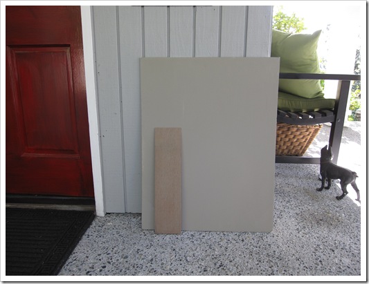
She had actually matched a colour she liked on a house she had seen to a paint chip and painted up a large sample. Then when she held it up against her existing colour she worried that it was wrong.

Why? Because it (HC-105 Rockport Gray) just looked muddy and ugly next to her existing colour (HC-165 Boothbay Gray). Everytime you compare a muddy or muted colour next to a cleaner colour, the muddy colour looks ugly. This does not mean it’s a bad colour, it’s simply that you don’t have a context for the new colour because you are still comparing it to the old one.

I confirmed that it was a great colour for her new house and that her first instincts were correct (which they often are unless it’s not our area of expertise, that’s when we usually second guess ourselves!).Picture 007

I recently consulted with another client on her exterior. We chose 2 colours, a much lighter gray (second image below) than her existing colour which was muddy and dark (she hated it) and a yellow beige (directly below). Later she emailed me and reported that the first one looked blah and boring (which it would compared to a much darker colour) and the second one looked like a bumblebee (which would happen comparing to the existing dark, muddy colour). However she confirmed that she had also painted up large samples and walked around the house holding them up to the existing colour.

imageYellow Beige house

She lost all confidence in my advice as anyone else would have as well. I had failed to advise her (in advance) how to test the colour so that she could see it for what it was.

imageLight greeny gray

Just because I have helped you choose a colour for the interior or the exterior of your house doesn’t mean you are going to like it when you see it up on a bigger sample or that I can predict every time, how the light is going to change it. Therefore, as arduous and painful as testing colour is, hiring me is not going to save you from that angst (sorry). Hiring a professional will however, give you the confidence to move forward with your colours, renovations, decorating plan for your house, etc. Testing is just a necessary piece of getting the colour right!

When this happened, I realized I have not been consistent in advising my clients on exactly the steps that are required to test colour properly (especially on top of an existing colour)! So, here are the steps to seeing your colour accurately and knowing if it’s right for you and your house:

image

1. Buy a quart of the colour you are testing.

2. Paint up your new colour on a minimum 5 ft x 5 ft area, preferably beside the window trim so that you see it in context with your trim colour.

3. If you can’t confine the area to in between the edge of the house and a window (for example) and you can’t force yourself to stop comparing then it’s better to actually paint a 1-2 ft strip of white around the test colour so that you stop visually comparing it to the existing colour.

imageHow NOT to test colour (credit)

The only way to avoid this process is to walk up to a house you like with the same trim and the same siding and match the colour to a paint chip. Even then the lighting should be the same (eg. North vs. South), the roof. . . it’s harder than it looks!

image Credit

Apparently there’s a new i-phone application that also matches up the colour? Has anyone tried it yet?

If you would like your home to fill you with happiness every time you walk in, contact me for on-line or in-person consultations.

Related posts:

Exterior Undertones

Effect of Natural Light Exposure on Colour

5 Steps to Choosing the right Exterior Colours

Should your Interior Colours flow with the Exterior of your House?

Insider Secrets to Testing and Selecting Paint Colours

New to this Blog? Click here ; Subscribe to my Monthly Newsletter; Become a True Colour Expert

“A Spiritual Spring Cleaning”*

On occasion, I’ll step back from the world of interior design, to look through a different pair of lens.  As the holidays of Easter and Passover are almost upon us, it would be easy to share tips on how to prepare your homes for entertainment and speak of chocolate bunnies or special dishes, but that would be glossing over the surface.

Kiawah MorningWhile going back through some images, I found a photo I took at Kiawah Island, SC, at dawn.  Ever the night owl that I am, I still do find the solitude of an early morning to be a wonderful time for reflection and to take heart in the dawn of a new day.

Depending on your personal religious or spiritual beliefs, this time of year bears great significance for many.  The message for Christians is of the Resurrection occurring so that one may walk a new way or path of life.  Forgiveness for transgressions, or sin, is provided through the ultimate art of sacrifice.  For those of the Jewish faith, Passover signifies a liberation or a freeing of burdens.  (A great article on “Passover 2010 – Why Pesach Matters” – can be found here.)  In both cases, while there may be a difference in doctrines, the ability to “let go” parallels closer than some might think.  It’s kind of like a “spiritual spring cleaning”, as referenced by author Bob Deffinbaugh*.

I think it’s comforting to be reminded how each new day brings possibilities.  We’re given a choice of how to address our destiny, no matter what circumstance may have preceded it, or what lies before us.

Kiawah Marsh View. . . . for Joy cometh in the morning.(excerpt from Psalm 30.5 – ) – Another view of Kiawah.

Thank you for letting me take a little bit of time away from my interior design world.  I’ll be in the process of a little spring cleaning of my own.

Blessings to you all!  Wanda

It's Time for Colour!

I have never had such a great time shopping in my life (I'm still in the States doing my Spring shop) and you know why? I'm buying colour because I've finally figured out how to wear it so it looks just as classic as wearing neutrals (blog post on that soon). And it's the same with your home. We love colour, but how do we inject it into our homes without looking like we tried and failed?

I grew up in Florida - that's where I got my love of colour. I'm not shy about a shocking pink here or there, an acid green, you can't scare me.

That's what this blog is all about! I'm back from Seattle tonight and I'll be giving you a glimpse of an exterior consultation I did in Mercer Island this weekend so stay tuned. In the meantime I wanted to share this quote from Ashley Whittaker with you. It's in House Beautiful's March issue. I just flipped through and snapped this photo with my camera (sorry for the wonky image).

Happy Sunday!

Related posts:


A Pink Tablescape with Sarah Richardson


If you are new to this blog, click here to see the Best of Colour me Happy

Friday, March 26, 2010

Sofa City Sweetheart

Unknown


Designer Suzanne Kasler

Southern Accents


Elle Decor


Coastal Living


I haven't seen my living room all week. I miss it. I am hoping to get some quality time in with my long lost friend over the weekend. If fact, if you can't find me, I will probably be in "sofa city sweetheart." Hope you have a nice relaxing weekend yourself!

Thursday, March 25, 2010

Shopping on Approval

When I’m sourcing furniture or accessories for clients and I arrive at a store without a return policy the only way I can remotely consider buying it is to take it ‘on approval’.

imageJonathan Adler x Benches Credit

When a merchant gives you something to take home ‘on approval’ they usually take a credit card number or imprint but don’t process it until they get a phone call from you to confirm that it’s going to work. Many times they’ll only let you take the item for 24 to 48 hours.

imageJan Showers

If the store has a firm ‘no return’ policy and won’t let me take an item on approval I leave it there. I can’t possibly shop on behalf of a client without knowing the item can be returned if it doesn’t work. Many of my client aren’t aware that they can take furniture or accessories and try them this way so here’s the official inside scoop :)

image Donghia

The world changes once you are a celebrity designer travelling the globe for objects and furniture for your clients so until I’m at that point (very soon :) I still need to know it can be returned.

image source

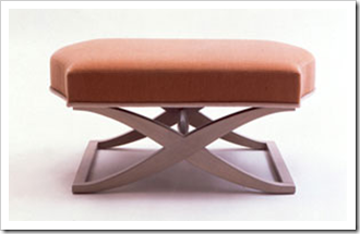
I’m currently looking for 2 X benches for a client’s living room! These are some options that I’ve found! They are going to be in a beige and brown zebra print! I’m liking this one (above).

image Jonathan Adler x Benches Credit

Speaking of shopping, I’m going to Seattle this weekend (early) tomorrow morning to spruce up my spring wardrobe! The dollar is at par so that means everything there will be 50% cheaper :)

imageImage source

I am also seeing two of my readers to help them with their colour and decorating decisions! I’m excited, work and play all wrapped up together!

Have a great weekend my lovelies!

If you want your home to have atmosphere including colours that flow to fill you with happiness every time you walk in. Contact me by email for on-line rates or call me directly if you are local.

Related posts:

Love your House and your Closet!

How to choose an Area Rug

What is Enlightenment and other Deep Questions

New to this Blog? Click here ; Subscribe to my Monthly Newsletter; Become a True Colour Expert

LinkWithin