You know how referral business is always the best because if you have a great client, then it’s likely that their friends will be great too? Well I have decided my readers/clients (that’s you) are all fabulous! It’s like I get the best referrals on the planet from those of you that read this blog and I am so grateful!
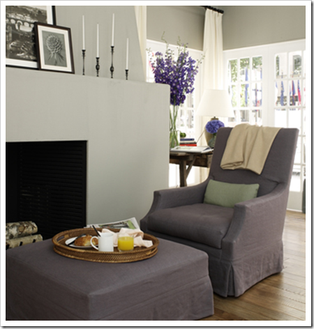
I was on the phone doing an on-line consultation this evening and my client said she was copying House Beautiful’s 2009 Kitchen of the year (above). So I thought I’d post it to show you!
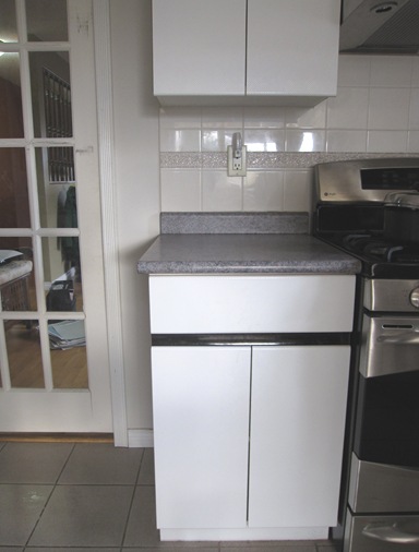
Yesterday I was at an in-home consultation with a lovely couple in Steveston. She led me into her kitchen and said “What do I do with these 80’s cabinets?” Their renovation budget was being spent updating the entry and basement first so the kitchen would have to wait!

She asked if she should paint the counters. That can be done but I would only recommend it as a last resort. I told her she might be surprised how cute her kitchen could be with just the right colours and suggested purple for the bottom cabinets.
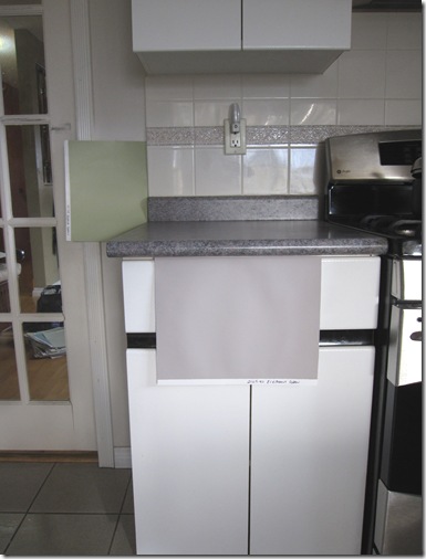
Annie (my client) looked skeptical until I pulled out (BM) 2109-50 Elephant Gray and held it underneath the countertops! I recommended that we paint the lower cabinets and keep the uppers white. And which green would look the best with white? Why a fresh one of course! We chose HC-115 Georgian Green (BM).
And I love green and purple together! Since most greens go together (just like in nature) even though the green in the countertops was more of an 80’s teal, I could still specify a fresher green and have it relate to the counter (going back to yesterday’s post), that always looks the best and would be my first suggestion.
Here is a better picture so you can get the idea! See my piles of large samples through the glass in the pocket door? Can’t specify colour properly without them!

Annie was thrilled because until I showed her this purple/gray colour, she saw her counters as pink and green! Remember how I wrote in this post how I have saved many a “OMG I hate this kitchen/bathroom” from an immediate renovation? Well here’s another example of the power of colour!
What do you have in your house that is 80’s and has got to go?
If you want your home to have atmosphere including colours that flow to fill you with happiness every time you walk in. Contact me by email for on-line rates or call me directly if you are local.
Related posts:
10 Ways to Save money Now by Creating a Focal Point
How to pick the Right colours for your Kitchen
If you are new to this blog, click here to see the Best of Colour me Happy


