This weekend I consulted with one of my lovely readers in Seattle when I was there! She emailed me a few weeks ago and asked if I ever come to Seattle, and this weekend was it!

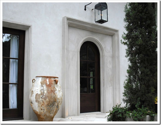
This is the wonderful vignette that greeted me when I arrived so I had to take a photo to show you! My clients are completely renovating their house, moving the kitchen from the back of the house to the front where the view is (below). It’s very exciting!
The hardest piece about any renovation or brand new house is decided which direction to take on. . . well, everything (especially when you are starting from scratch). What colour are the countertops? The Cabinets? The flooring? What colour should my furniture be and then how do I pull it all together with the right colours so I have flow throughout my entire house?
The entire exterior of this house is going to change to a more craftsman feel. Even the power lines (above) are going underground so they don’t interfere with the view. My clients had decided if they were going to stay instead of move, they wanted everything done right! The siding was going to shingles and she was considering a semi-transparent stain until I confirmed that the maintenance would be too much work (re-staining every 4-5 years if you’re lucky).
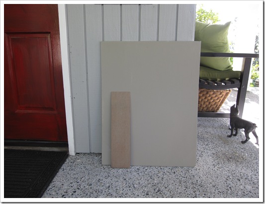
She had actually matched a colour she liked on a house she had seen to a paint chip and painted up a large sample. Then when she held it up against her existing colour she worried that it was wrong.
Why? Because it (HC-105 Rockport Gray) just looked muddy and ugly next to her existing colour (HC-165 Boothbay Gray). Everytime you compare a muddy or muted colour next to a cleaner colour, the muddy colour looks ugly. This does not mean it’s a bad colour, it’s simply that you don’t have a context for the new colour because you are still comparing it to the old one.
I confirmed that it was a great colour for her new house and that her first instincts were correct (which they often are unless it’s not our area of expertise, that’s when we usually second guess ourselves!).
I recently consulted with another client on her exterior. We chose 2 colours, a much lighter gray (second image below) than her existing colour which was muddy and dark (she hated it) and a yellow beige (directly below). Later she emailed me and reported that the first one looked blah and boring (which it would compared to a much darker colour) and the second one looked like a bumblebee (which would happen comparing to the existing dark, muddy colour). However she confirmed that she had also painted up large samples and walked around the house holding them up to the existing colour.
She lost all confidence in my advice as anyone else would have as well. I had failed to advise her (in advance) how to test the colour so that she could see it for what it was.
Just because I have helped you choose a colour for the interior or the exterior of your house doesn’t mean you are going to like it when you see it up on a bigger sample or that I can predict every time, how the light is going to change it. Therefore, as arduous and painful as testing colour is, hiring me is not going to save you from that angst (sorry). Hiring a professional will however, give you the confidence to move forward with your colours, renovations, decorating plan for your house, etc. Testing is just a necessary piece of getting the colour right!
When this happened, I realized I have not been consistent in advising my clients on exactly the steps that are required to test colour properly (especially on top of an existing colour)! So, here are the steps to seeing your colour accurately and knowing if it’s right for you and your house:
1. Buy a quart of the colour you are testing.
2. Paint up your new colour on a minimum 5 ft x 5 ft area, preferably beside the window trim so that you see it in context with your trim colour.
3. If you can’t confine the area to in between the edge of the house and a window (for example) and you can’t force yourself to stop comparing then it’s better to actually paint a 1-2 ft strip of white around the test colour so that you stop visually comparing it to the existing colour.

The only way to avoid this process is to walk up to a house you like with the same trim and the same siding and match the colour to a paint chip. Even then the lighting should be the same (eg. North vs. South), the roof. . . it’s harder than it looks!
Apparently there’s a new i-phone application that also matches up the colour? Has anyone tried it yet?
If you would like your home to fill you with happiness every time you walk in, contact me for on-line or in-person consultations.
Related posts:
Effect of Natural Light Exposure on Colour
5 Steps to Choosing the right Exterior Colours
Should your Interior Colours flow with the Exterior of your House?
Insider Secrets to Testing and Selecting Paint Colours
New to this Blog? Click here ; Subscribe to my Monthly Newsletter; Become a True Colour Expert


