Wednesday, September 30, 2009

Signature Look or your Clients Look; Which one works the Best?

I have just discovered something. It’s new. In the last month, I have finally discovered for myself what ‘my signature look’ is, and the best part about it is that people are suddenly calling me because of it.

image

Eileen Kathryn Boyd

Given which designers inspire me, it seems silly that it’s taken me this long to define it for myself. Especially because I have been describing my style on this blog and my website for almost a year now; ‘With a fresh take on contemporary and a passion for colour, Maria is known for creating warm, comfortable and inspired spaces for her clients'.

image

Tobi Fairley Interior Design

Every time I start a new project (and I have several right now, it’s really great) I look through my dozens of design magazines or design books to get inspiration and ideas, for example I saw an ottoman in one last week and decided it was perfect for one of my clients. And as I was looking though them, it suddenly hit me exactly what it [my signature look] is!

image Tobi Fairley Interior Design

So the question is; is it better to have people come to you for your look, or is it better to work with each client to bring out their style? New designers that have yet to discover what their ‘look’ is will definitely say the latter. And perhaps even established designers will say the same thing. But you know what the issue with that is [I’ll just speak for myself]? When sourcing fabrics for a clients living room [for example] without ‘a look’ I would just show up with the fabrics I’d selected, hoping I’d got it right and bring along a dozen fabrics books to back me up and hope that something stuck.

image Eileen Kathryn Boyd

Since I appeared on the cover issue of BC Home this month [below] clients are calling me because of that ‘look’. It’s fresh, colourful and contemporary (Like I’ve been saying all along – duh). In Kimberley Seldon’s ‘What you don’t learn in design school’ course a few years ago, I remember her saying that the first time she was published, the style of the home was French Country. She said because of that first issue, she still gets the occasional client that says “I know you only do french country, but do you think you could. . . ?

image Maria Killam Colour & Design

The lesson here is when you do get published [as a designer] hopefully it represents a look that is ‘you’ and one that you really love to re-create, because it’s a big piece of what you will be known for.

Having a ‘signature look’ doesn’t mean you don’t work with a clients existing furnishings, or their colours, etc. Obviously you’ll still create a custom look for each individual client, however the fact that that client has come to you for your look [because it is defined by your website, blog, etc] means that is the look they are searching for in their home. (have I said ‘look’ enough yet?)

I would have to say blogging [October 31 will be one year for me] has been the biggest access for me to really define what ‘my look’ is. All you have to do is scroll through my blog, and it becomes obvious by the photos that I choose, what it is.

image Sarah Richardson

The best education has also been the literally hundreds of homes I have consulted in over the past 10 years. It’s also why I like a clean look in kitchens and bathrooms and why I’m not a big fan of ‘accent tiles’. I have seen too many ugly, dated tiles in my travels and it’s always a conversation when selecting colour “Can we ignore them, paint them, work with them?” Accent tiles seem to be soooo important when gathering tiles for your bathroom or kitchen, but once they are all installed, mostly look busy and out of place if not tastefully done [below]. See how the mosaic is repeated in the floor? If you’re going to do it, it should be repeated in some way in the bathroom. A four inch row of mosaic tile 3/4 of the way up your shower wall does not cut it!

image

Sarah Richardson

I was helping a real estate agent choose colours for a home he was ‘flipping’ a couple years ago and he was all about ‘accent tiles’. He said when taking clients through homes, those were the little things they noticed and commented on. So I think it depends on the business you are in. Flipping homes to be sold ‘right now’ during a hot trend, or choosing finishes for your own home, that should be much more timeless than the current trend.

image Sarah Richardson

Two years ago when I first moved into the house I’m in now, I held a housewarming party. Two of my designer friends came. One lived in an exclusive neighborhood in Vancouver and the other lived in the suburbs. A couple that attended my party were in the preliminary stages of discussing their kitchen renovation and each asked my friends [individually] what they would recommend for a new countertop.

My designer friend from the suburbs immediately said ‘Granite is the big thing, that’s what we’re doing now” while the other said “Caesarstone, it’s less blotchy than granite and that’s the latest. What works for your home--based on this story—is to install what people are looking for in your neighborhood. Unless you are going to live in your house for the next 10 years or more, then do whatever you want as it’ll be time for a renovation by the time you sell anyway.

Website photos 001Maria Killam Colour & Design

Bottom line, there is an argument to be made for both sides, but you can hardly be approached to design a fabric, furniture or wallpaper line [like Barbara Barry or Candice Olsen] if you do not have a ‘signature look’.

PS. Having a signature 'decorating' look does not mean that I cannot choose colours for your house no matter what the 'style' of it is. That is what I do the best, take any look and any style and pull it all together using the right colours.

If you would like your home to fill you with happiness every time you walk in, contact me for on-line or in-person consultations.

Related posts:

My Interior Design Style

Colour vibe by Eileen Kathryn Boyd

10 Ways to Save Money Now by Creating a Focal Point

New to this Blog? Click here ; Subscribe to my Monthly Newsletter; Become a True Colour Expert

Vintage Wine Jugs


I have always collected old glass bottles which I usually select based on the age, color or even area in which it was produced. Over the last few years, I have started to collect old wine jugs mainly because I love their larger size and shape but also because of their history. Wine was originally stored in stoneware but the taste of the wine was often altered by the container. The invention of glass by the Roman Empire opened up new options for wine storage, allowing it to age and be stored for decades which enabled wine drinkers to enjoy a larger selection of wine. Most of the bottles available today are French originating around the 1930's and sell for $95 and up.

They can even be turned into lamps!


~Images: wine history via http://www.wineintro.com/history/glassware/ 1) via shelter blog 2) Southern Accents July/Aug 2007 3) Unknown 4 and 5) Coastal Living Nov 2007 6) Unknown 7) Unknown 8) sixx design 9) House Beautiful Jan 2009 10 and 11) Tom Scheerer

Tuesday, September 29, 2009

Sweetgrass Baskets


If you have ever traveled along Highway 17 in Mt. Pleasant or visited the market in downtown Charleston, you have undoubtedly noticed the plenitude of sweetgrass baskets. An art form brought over from slaves in West Africa over 300 hundred years ago, this tradition of basket making has since been passed down from generation to generation. Originally these graceful baskets were used as working baskets on the plantations but now they are mainly coveted souvenirs for tourists.


Once a plentiful grass of the coastal dunes, sweetgrass is now difficult to cultivate due in part to the urbanization of Mt. Pleasant as well as the development of the barrier islands into resort destinations. Sadly, artisans now have to travel to Georgia or Florida to find an ample supply. Technically, sweetgrass baskets are made of several materials including pine needles to provide a contrasting color, black rush to add strength and strips of palm leaves to sew all these materials together.


Buyers Tip: The tightness in the design of the basket equates to the quality. (i.e. the tighter the pattern reflects a higher amount of workmanship involved and thus equals a higher quality basket.)

I try to support this local industry by using sweetgrass baskets when designing for my clients or as house warming gifts for friends and family. I especially like the idea of hanging them on the wall in a graphic pattern as I did here in my own home. Now I will say this is not for everyone as I tried it for a client once and she told me they looked like either dryers from a hair salon or inverted breasts hanging on her wall. Ha! Proof that clients can't always see your vision!

Maximising The Potential Of Small Spaces


If your living space is small and restrictive you will need to adopt the tricks of the interior design world to give the illusion of more space!

White is a classical example of maximising space by tricking the eye into thinking the space is larger than reality. Brushed steel and reflective surfaces are another trick used as the light is bounced around the room which again provides the illusion of more space.

Many people place a mirror on a chimney breast as older houses typically have the window directly opposite the fireplace! Maximising the light by placing a mirror to catch as much natural light as possible has been adopted for many years!

White is also an ideal choice for kitchens and bathrooms as bright white has a clean, crisp look, especially when new! Be careful though otherwise your home could become an uninviting steely icy place which makes you feel cold! The easiest route and key is to add subtle touches of a vibrant warm colour such as red or orange.

Just select a few carefully placed objects of interest and add the finishing touches such as either a white or coloured roller blind to the window which will allow the maximum amount of light to enter the room when pulled or rolled up to the top of the window. Roller blinds are also ideal for lowering to a height which prevent glare from sunlight when working in the sink area, because just like older styled houses have windows opposite the fireplaces, they also have kitchen windows above the sink!

Image: AtticMag

Monday, September 28, 2009

Worn Out!


I'm baaaack! And I feel like this old chair...way too tired and worn out for a real post. My apologies, I will get back in the groove soon. However, there is a new post over on Objects so check it out!

BTW if you want a laugh google "photos of worn out" and see which celebrities come up...

~Image: Courtesy of flickr.com

Sunday, September 27, 2009

5 Steps to a Kitchen you will Love!

Wood stained cabinets or painted? Which one is right for you? Read on to find out.

imageImage source

I’ll start with the espresso brown kitchen cabinet trend as it's still going strong:

The following is an anonymous comment that I have heard many times since the brown trend started. By the way--a little insider advice—designers are always seeing and looking for what’s new and what’s next, we quickly get tired of a trend when it becomes common and seen everywhere, from restaurants to your best friends kitchen! Naturally, since we are in the design industry this is normal. It is what we do (It’s the same for you inside your own industry). But this comment [below] I had to write about immediately in case anyone else is about to make the same mistakes:

image Image source

“Our house is almost built but I am not excited. I have listened to the advice of a colour consultant that was provided by our builder so now I have cortina brown kitchen floor tiles with natural finish knotty alder cabinet (mission style) and countertop in beige (santa cecilia granite). The color combination is just blah. In the bathrooms, I have the natural finish knotty alder cabinet with tropical brown granite countertop time. They are called ridgeview warm green by daltile and the color looks too muddy for me (looks like camo green to me).

To be frank, I am quite depressed and not looking forward to living in this house. The floors look too dark and muddy for my taste. I am getting a new dining room and living room furniture (I just dont know what colors to choose). I have medium beige wall color throughout the house. What can I do to make all this color combination much more pleasing to the eye?”

image Image source

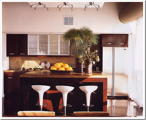
Colours to bring this much [above photo] brown to life are orange, yellow, pale blues/ turquoise, fresh greens [including the kelly green above] and certainly red but the combination of brown and red can be too masculine depending on how much of it you are using—context is everything when it comes to colour. I have seen way to many dark cave-like kitchens created by using too much brown which is why my advice is about balancing them with creams, etc.

Personally, at this stage of the brown trend (it’s been about 7 years) and trends tend to last about 10 years, I would not specify an espresso brown kitchen. Two weeks ago, I was surprised when I walked into the condo of one of my new clients to see that he had forest green countertops and backsplash in a unit that was only 9 years old. This happens when builders work on spec, without designers, unaware that a trend [hello 80’s?] is long over!

image Image source

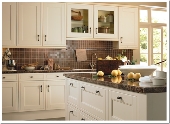
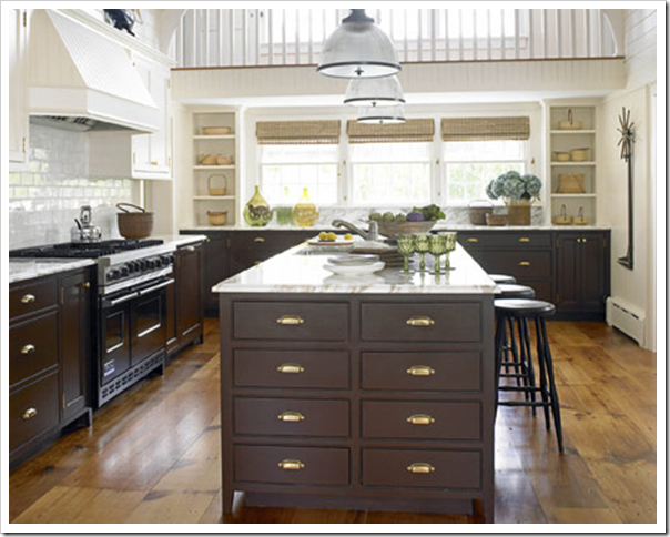
Here’s another kitchen with creamy cabinets and chocolate brown stone counters with the brown continuing on the backsplash. Please, what ever you do, do not paint your cabinets screaming white if you are going for a brown counter and backsplash, it will [almost] look like a white 90’s kitchen with new brown granite. Your cabinets must be cream or beige with this much brown. White on white is way too stark!

image Image source

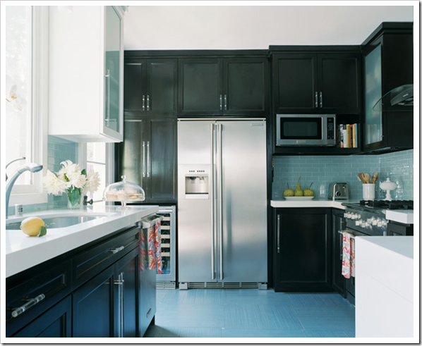
White goes with black [above] but cream goes with brown in my opinion.

image flickr

If you choose brown cabinets [above] I recommend a light backsplash and counter, otherwise your kitchen will simply get too dark!

Here are 5 steps to make sure you love your kitchen when it’s installed:

image Image source

1. ) Do your homework to determine which look you want for your kitchen. Basically your choices are a wood stained cabinet or a painted cabinet. Make sure you see enough kitchens when doing your research [reading design magazines and blogs] that you start to see a pattern in the kitchen that truly speaks to you. [If you have been reading this blog you already know which kitchen I prefer and a small side note—95% of every high end home I have seen has painted cabinets over wood stained cabinets] Once you define it [the one you love], do not let yourself be talked out of it by your kitchen designer or builder. Which leads me to my next point:

image Image source

2) I often tell my clients, ‘Good design advice from an experienced professional makes sense even if you are far from being an expert yourself’. If the advice you are getting does not ring true for you, do your research and pay for another consultation. The design of any project is the most important piece so if you do not like the advice you’ve just paid for, find another designer and pay for new advice—again. It’s still going to be worth it in the long run.

image Image from Things that Inspire

Working with creative people can be a crapshoot, it’s not like buying a gallon of paint, you see it, you know what it is, what it will do and it’s not a surprise. Obviously referrals then become the best way to hire a designer and these days a blog written by a professional is like getting a referral because you can get a real sense of the personality and expertise of the person writing the blog. The following is for Laurie who asked:

I'd appreciate a post on how to find a color specialist in my area. What accreditation should I look for? What are questions I should ask when talking to a color specialist about working together? I once hired a designer for assistance in selecting colors and just as you described in your post, "The Three Most Important Words in A Color Consultation", all I ended up with is a bunch of colors. I'm moving into a new home soon and I'm beginning the search for someone to help me pull everything together. Can you provide some tips for finding the right person to work with?”

The best advice I can give here is this; look for years of experience and be willing to pay for experience.

It takes years of various courses and exposure to a lot of different spaces and design styles, to be able to walk into [any] home and select colours for a home owner working with existing and often dated finishes and/or be able to define--what about the space-- from a decorating perspective, needs to change as well. In the 4 years that I worked at store level, I conducted over 1,000 consultations, that is an average of 5 calls a week. It’s the best crash course in colour and design ever because it’s experiential [which is the best training for any industry].

An experienced colour designer will be asking themselves (and/or you) questions like:

a) What should we ignore here?

b) What do we need to work with?

c) Does the colour in this room need to be light or dark?

image Image source

d) Can we inject some colour into this house or does it have to be more neutral (based on existing finishes)?

e) Is my client looking for ‘neutrals’ or ‘colour’?

image

Image from House of Turquoise

e) What kind of design advice does my client need that will take them in the right direction inside their renovations or in decorating their home?

f) Which room is it important to move forward inside of current trends vs. choosing something that goes with something dated but not being replaced anytime soon.

image Image source

g) Bottom line, an experienced designer will explain why their recommendation works or validate the choices you have already made with an explanation as well. You are buying the ‘because’ make sure you get it!

image Image source

3) For the spouse that does not think a designer is required. Do not say to your partner “What’s the problem honey, why can’t you just pick a colour?” or “Where is that tile, we need it? or “We don’t need a designer, we can do it ourselves!” Women are quite often way more affected by colour and aesthetics than men are [generally speaking] so unless you are willing to listen to years of complaints about how the backsplash ended up too busy, or pinky beige and your counters are yellow beige, go for it. Otherwise, a designer is a bargain, especially because this is their business—it’s not yours! If you are on a strict budget you have no budget to waste on mistakes!

image Image source

4) Selecting tile is much harder than it might seem. I have seen tile in a store that I would swear has a green undertone go pinky beige when it’s installed—eeek! Choosing the wrong grout colour can also give you that effect because now you are visually comparing the minute differences in beige’s which when paired incorrectly change the colour of the tile right before your eyes. Never buy tile without taking it home and looking at it in the lighting of your bathroom or kitchen. And if you don’t have that luxury because you are building and the lighting will not be installed until after the tile? You might still be surprised when everything is complete.

image Image source

A note about undertones: Don’t get upset if it’s difficult for you to distinguish them. I make it sound obvious and easy but it’s taken me years of working with large colour samples, to be able to see the undertone of a countertop or sofa from a mile away. And even then I’ll tell you which finishes can me tricky when defining an undertone. Carpet; sometimes I have to hold up a few paint samples to see whether it’s pinky beige or greeny beige as both can get grayish and hard to distinguish.

image Image from Things that Inspire

5) The days of defining spaces with flooring are over [above]. We are now installing hardwood throughout the kitchen as well. If you are in an older house and have existing hardwood but do not have it in your kitchen, consider cork flooring in a tone that coordinates with your existing floors (if it’s too painful to try and find matching wood to install in your kitchen). If you still want tile for ultimate durability consider a larger size than 12 x 12 which (depending on the tile) can take you right back to the 90’s.

Here's the 5 step recap:

1) Do your homework to distinguish the look you think you'll be the most happy with.

2) If you are not an expert, hire one.

3) Unless you are a designer, it's best to hire one even if it's just for a 2 hour consultation to make sure the finishes that are about to be installed are going to work in your home. Have a selection for the designer to eliminate.

4) Tile/stone is not easy to choose, go back to step number 2.

5) Choose flooring that works with your existing finishes and keep it current.

If you would like your home to fill you with happiness every time you walk in, contact me for on-line or in-person consultations.

Related posts:

White Kitchen Cabinets

Hiring a Designer; Luxury or Necessity

Colour is Context

Selecting your kitchen or bath backsplash; Accent tile or NOT?

What everyone should know about Beige

New to this Blog? Click here ; Subscribe to my Monthly Newsletter; Become a True Colour Expert

Saturday, September 26, 2009

Orange Hue Happy?

People either love orange - or they severely dislike it – or, at least they think they do.  Sometimes, if you just say the name, you can see a scrunched up nose, in response.  Before you pass over this post, let’s open your mind to the possibilities!

I do have to say, orange, in my opinion, has received a bad reputation.  So many people associate it with its use in: industrial safety, a color used in a prominent home improvement store, the color code for the 2nd highest level of alert for terrorism by Homeland Security, or a not so healthy alert for the ozone levels.  Even in some studies on packaging and labeling, orange has been considered a color to be used by discount variety stores and it changes the perception of the consumer as to the level of product quality. 

ban_roomset_550

There is just the right balance of white to offset the jolt of a citrus splash, in this room.  Can you say “Dreamsicle”?

bandonese  Photo and wallpaper, courtesy of Thibaut – Pattern:  Bandanase

As a designer, I have never really had a true dislike for any color – maybe just the tones and tints or combinations.  I think if I remember orange, in a less favorable way, it’s because I’ve associated it with the era of burnt orange, olive green and harvest gold and the advent of some pretty scratchy synthetic fibers, which went along with the whole theme.  (Grandmother B. thought this would be a bullet-proof solution to her family room sofa.  I get hives recollecting the texture!)  I have developed a love of the introduction of a newer, cleaner and clearer palette of orange.  I’ll bet, after seeing some beautiful examples, if you are an orange naysayer, we will see that scrunched nose transform to a rounded, mouthed “ooooh”!

color_purple_236The right combination, of a color compliment, can take this hue to a whole new level!

thibautCourtesy of Thibaut – Papaya Pattern – Sure to stimulate the appetite.

Colefax & Fowler Courtesy of Colefax & Fowler – There would be no gray days in this room!

img_dogdays_ss4 Just look at what this touch of coppertone paint adds to the ceiling.  When considering painting the “fifth” wall, keep eco-friendly paints in mind, like Benjamin Moore’s Aura. Not only will you have a a happy palette, your house will be happy, too!

dahlia_orangeHaving a low energy day?  A bunch of orange Dahlias might help.  Orange increases oxygen to the brain and stimulates mental activity. 

pKSLCI1-5726014_kspr01_dt Even gold is considered a member of the orange family.  Gold often symbolizes high quality.  That must be why I “heart” this Kate Spade bag, so much!

Okay, let’s say you are “warming” up to the palette but can’t get past the name, o-r-a-n-g-e.  Peche, coral, tangerine – you call it as you see it and just maybe it will be your new BFF!

Cheers to you!  - Wanda

LinkWithin