Turquoise office photos by Maria Killam
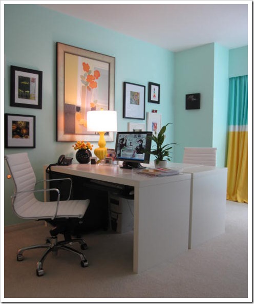
Sometimes I get direct inspiration for a project from reading design magazines, blogs or even movie sets. Everyone knows the Something’s Gotta Give set that is the most copied white kitchen! For my home office, inspiration came from Meryl Streep’s office in the Devil Wears Prada. I love all the haphazardly hung frames and that they don't match. What unifies this look are the white mats.
My Lido office chairs finally arrived, I ordered them directly from Costco for $250 thanks to a tip from a reader. I’ve linked to them but suddenly I can’t find them on their site – maybe they are sold out?
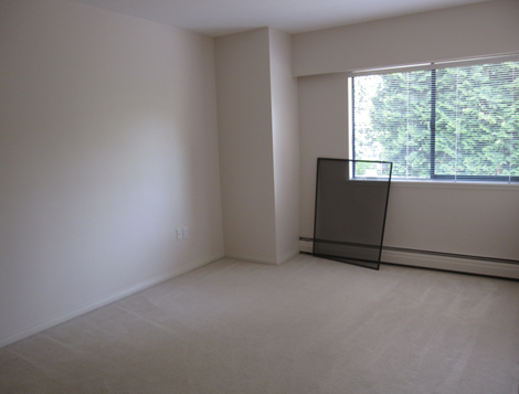
Here it is being painted, you can really see the pinky beige.
 The colour is 626 Caribbean Breeze by Benjamin Moore. I had the yellow, turquoise and white linen from a display at the Spring Home Show so I sent them to my workroom to get sewn into these panels. I love the colour in this room, I get happy just walking into my office in the morning. The empty desk is a good space for sourcing fabrics for clients from my wall of books (below) and an assistant which I will need very soon.
Here is the room with only the drapes and furniture installed (below):
The desks are Jonas from IKEA. I wanted the one with the built in drawers but the white was discontinued so I had to get this style so I didn’t install the pull-out which obviously would get in the way of drawers. I had the black drawers already so I just re-used them. I chose this desk to hide the cords. Most of the desks at IKEA are so open you see everything. The shelving is Lack. I only had panels made for one side (as you can see) because there is very little wall left on the right and the drapery covers up the wall on the left. Since the bookshelves come almost to the window I decided it was okay to leave it asymmetrical.
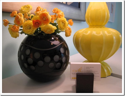
And my faux flowers, I just love them.

Love this watercolor, a giveaway I won at Bright Bold & Beautiful by Laura Trevey, she is so talented!
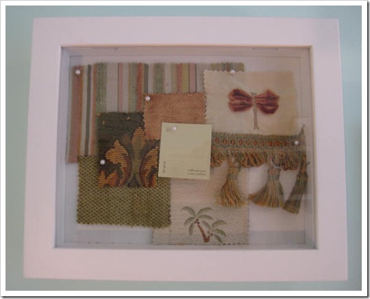
This was one of the first living rooms I decorated for a client many years ago. When I first started designing I thought the coolest thing about designer fabrics was the pattern mixing part of it. I have changed my opinion since then to include less pattern and more colour blocking and drama.
 A client sent me this card a few years ago. It’s a bit hard to see but she crossed off th in Martha and inserted i instead for my name. I loved it so much I framed it.
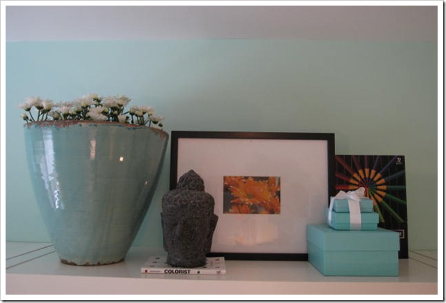 This photo of orange daises I received from Victoria and Kelly over at Design Ties! It looks terrific sitting on top of the bookshelves!
This little oil painting I bought in Paris when I was there a few years ago. My sister found me this tape dispenser.
 My fan decks (in the closet behind me) from paint companies all over the Country for my on-line consultations and I finally have a Dulux deck for international if you are in Australia or London (for example) and need a consultation. I’m doing an average of about 5 per week and they work really well, email me for more information. Remember I can also decorate your house from top to bottom if you are local, in addition to colour :).
My invisible assistant :)

I just found a blog party at Centsational Girl that my office coincidentally fits right in. Check it out here, so many fun offices to see.
If you would like your home to fill you with happiness every time you walk in, contact me for on-line or in-person decorating and colour.Related posts:
How to Create an Ethereal Colour Scheme
Sneak Peek of my Entry
Painting is so Emotional
New to this Blog? Click here ; Subscribe to my free Monthly Newsletter; Become a True Colour Expert


