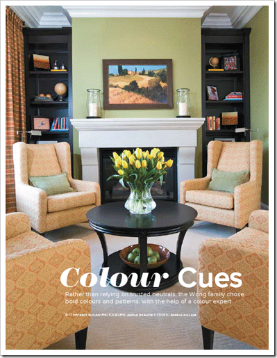
As promised, here is the actually story on my project featured this month in BC Home by Tiffany Sloan. If you missed the ‘before’ pictures from my last post, click here to see them.

“We’ve always said we wanted our house to look impressive when people walk in,” says Laura Wong. “We wanted the ‘wow’ factor.”
Laura, her husband Edmund and their two kids moved into a brand-new house in White Rock last fall, and although they knew they wanted it to make a statement, they weren’t exactly sure how. A survey of local interior designers brought them to Maria Killam, a colour designer whose brightly hued online portfolio jived with their own design sensibilities.
“Right away Maria knew what she wanted to do,” says Laura. “We’d just moved into our house and it was pretty much empty, but she walked in and had this vision of what she could get our house to look like.”
Yet when Killam began introducing swatches and paint samples, Laura admits she was apprehensive. Edmund, too, raised a skeptical eyebrow – particularly the day he was greeted by bold green walls in the library. “I was intimidated, uncomfortable about these – what for me were – strong colours. I think most homeowners go for the comfort of beiges and other ‘easy stuff,’” says Laura. “You do it a little on faith – you trust that she’s the expert and knows what to do.”
In the end, Laura says she wouldn’t change it for the world. Although the colours are bolder than what she would have felt comfortable picking out on her own, they aren’t at all overbearing in context, she says. “When you walk in, there’s flow. Everything goes together. It doesn’t mean everything is matchy-matchy, but it’s just natural as you walk from room to room.”
“When you’re creating flow – and certainly in the main areas of the home – it’s really important to repeat the colour,” explains Killam. “One way is to have it on the floor in one room, on the furniture in another room, and then have it as the wall colour in another. It’s a unifying element that way.”
For the Wongs’ home, Killam began with the fresh green of the dining room rug – a bargain find at HomeSense that inspired the entire colour scheme – and repeated it in the living room furniture, on the library walls, and in accessory pieces throughout the main floor. The four pullout ottomans of the living room coffee table – a piece Killam had custom designed for the family of four – are a bold complementary orange that draw the eye and make the coffee table the focal point of the room. Similarly bold shades of orange in the drapery and throw cushions round out the effect.
“Just like I used to think sophisticated dressing was about wearing beige, black, white and brown, what I learned about wearing colour – and I think it works the same for interiors – is if I have a fabulous orange sweater, having the matching orange shoes is what really pulls the outfit together,” says Killam. “And it works for the same for your house.”
Orange also makes a more muted appearance on the library chairs and on the walls of the vaulted-ceiling entry and living room: “Laura didn’t want green everywhere, nor a really strong orange in such a large space, so we chose a butterscotch colour that would be a nice warm, neutral backdrop,” says Killam.
Clearly, Killam doesn’t shy away from using bright, bold colours – and surprisingly, less isn’t necessarily more. Using a bold colour once will make it stand out, but repeating that colour can make it look like it belongs. She references the commonly touted “rule of three,” pointing out that although the dining room seems bursting with colour, the colour palette is limited to green, orange and sunshine yellow (not including neutrals), all repeated at least twice.
“You have to repeat the colour, and you want to use colour in gradations of scale,” she explains. “When you’ve got an accent colour like orange, you want to have a small orange, a big orange, and an even bigger orange if possible.” Taking the living room as an example, the throw pillows and decorative papered books on the bookshelf are the “small orange,” the ottoman coffee table serves as the “medium orange,” and the butterscotch-orange undertone of the wall colour works as the “bigger orange.”
The same technique is applied in the library – orange echoes from the framed artwork on the walls to the bold fabric of the curtains to the elegant upholstery of the chairs. And although this room’s green walls once sparked misgivings in Edmund, he quickly fell in love with the finished product, says Laura. In fact, the once-awkward unclosed space off the entry went from being “the one room we didn’t know what to do with” to the one that receives some of the most compliments from family and friends.
SOURCES:
Bookcases in living room and library – custom made by Quality Cabinet Manufacturing, Vancouver, Green sofas, dark green chair and wing chairs – Van Gogh Designs. Round coffee table – Bowring, Square coffee table – custom made at Omega Furniture in North Vancouver, Two end tables in living room – Paramount, Dining table and chairs – Pier 1, Bird figurines on coffee table – client, Heron – Chintz & Co., Decorative moss balls – Chintz & Co., Orange shade lamps and yellow vases –˙HomeSense, Glass food display dishes – little: Pottery Barn, big: HomeSense, Dish and table holding pears – table: Paramount, dish: HomeSense, Paint colours from Benjamin Moore: Library: 2145-30 Brookside Moss; Living room: CC-304 Sisal; Dining room: HC-74 Valley Forge Brown
If you would like your home to fill you with happiness every time you walk in, contact me for on-line or in-person decorating and colour.
Related posts:
BC Home Article; Before & After
BC Home Interview with Colour Expert Maria Killam
New to this Blog? Click here ; Subscribe to my free Monthly Newsletter; Become a True Colour Expert


