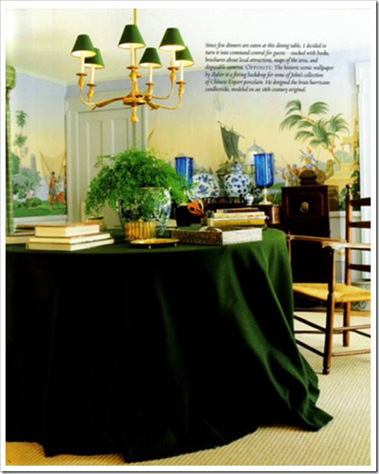
I have wanted green velvet drapes somewhere in my house ever since I saw The Holiday movie with Cameron Diaz. And by the way I’m calling it Kelly Green because I think it’s so much more current than saying Forest Green. Then I was at Cote de Texas the other day reading about the big debate on Bunny Williams Kips Bay Living room and saw this room designed by Bunny which I instantly loved so I had to post it here!
I also adore the wispy ferns on the table. My friend Lauren at Pure Style Home wrote a post last week about accessorizing with ferns.
Here is her office in The Holiday—love those drapes, they are way more amazing in the movie (this picture is blurry)! I even have a sample of the fabric in my office. However, I need to buy this house and renovate first, in order to install them!
For about 2 years now, I have been predicting that Kelly Green is coming back, (newer and more vibrant than Forest Green from the 80’s) I see it around, and shelter magazines mention it, but not with any great resurgence [yet]. I’m willing to be wrong though, especially because it seems that ‘yellow and gray’ seems to be the big new colours coming in. Here is another room done entirely in greens by one of my favourite Canadian Designers, Sarah Richardson:


Here we have olive green walls and a matching ottoman, mixed with a fresh ‘clean’ green in the painted armoire and end table. You could even throw in a clean yellow (like they’ve done with the addition of the tulips) and it would look great!

Here the ‘clean green’ is on the walls and in the printed ottoman and drapery. The throw, lamp and pictures frames are in a ‘muddy’ olive green. Notice here, there is lots of white in both images! White is the perfect neutral with light, fresh colours, including blues, turquoise, pinks, etc.

Here we have mostly an all ‘clean green’ room with a hit of turquoise. Notice there’s still plenty of white to keep the look fresh. Which brings me to the point of this post. I thought I’d include my opinion on this living room by Bunny Williams to add to everyone else.
I’m not as fussed about the red egg-chair, other than to say it doesn’t make sense from a design perspective, simply because the colour (or the style) is not repeated anywhere else in the room. It does visually appear as if ‘the client’ (I know it’s a show house) wanted it to stay and the designer ignored it.
My lowly (I am not a famous designer so who am I to say) opinion is that the turquoise is clean while the rest of the colours in the room (except the lipstick red chair) are muddy. That to me is the biggest reason why it’s not the most spectacular room in the world. And, like I said in my comment to Joni, Bunny Williams is brilliant to decorate a room that created this much publicity!
Well my lovelies, what do you think?
Related posts:
The Best way to Update Forest Green


