Thursday, April 30, 2009

Bobbie Burgers; In Full Bloom inside House & Home Magazine

Since I’ve had artists on my brain lately, I was struck by this article in the May 2009 issue of House & Home on Bobbie Burgers. Here is her Okanagan Weekend home in the interior of British Columbia:

image

The seamless transition from the inside to the outside makes this room so appealing, not to mention the view! And of course the Eames Lounger, so great how the green throw matches the grass outside, styling is everything!

image And of course, I just love flowers and the healthy dose of golden yellow in her paintings!image

The rustic table in place of a sleek island (above) certainly add to the cottage feeling of this wonderful home along with the fireplace (below).
image

I love the way this bedroom (below) has been styled with the toss cushions and colourful boxes to coordinate with the painting!
image

And here are some more pieces from her website love all the colour and they look so happy!

image

image

image

Related post:

Sexy Red Velvet Drapery (featuring artist Anh Duong)

Flashback!

I had a whirlwind trip to the High Point Market. With shopping lists in tow, I had my focus on certain things; however, I did get a chance to pop by some showrooms in order to check out some trends and color palettes.  This go round, I’ll let the pictures do the talking and I’ll pop back in with more in-depth articles, later.  What’s new, again?  I’ll give you a hint . . . if you watched “American Idol”, this past week, the music was all about the “Rat Pack” and the genre of the late 50’s and early 60’s.

Council 1 Council Showroom – Brownstone Collection

Council 2 Loved this chair – Ostrich Leather and just like “buttah!”

GG-0104 Soicher-Marin Showroom Piece – Reminds me of a lily pad.

IMG_3467

I promise you, my parents had this chair in their living room!


IMG_3457 

Love the honeycomb grillwork in the cabinet.

Monday, April 27, 2009

Color Vibe by Eileen Kathryn Boyd

This room was designed by Eileen Kathryn Boyd for the 2009 Kips Bay Show House and I found it on House Beautiful. If you have never seen her website, it’s one you shouldn’t miss!

image I am on the hunt for reasonably priced art for a client and it’s hard to find, I think I need to find an artist and do a commission! There are so many talented artists out there, I just need to find some! Love the simply, contemporary piece in this room.

imageAlso, I adore the pillows she designed. I NEVER design a room without the right toss cushions, I really feel they make or break a space and I’m always looking for new ideas for piping combinations and unique shapes!

image

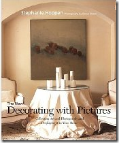
See how the artwork has been arranged here? First the lamps were placed on the console, then the art was installed around them. Even the two bottom pieces on each side where placed based on the fact that the chair was displayed on the left. That’s why the basic rule of ‘hanging art at eye level’ is too hard for most people to follow and best left to professionals! Just hiring a designer FOR THIS TASK ALONE, will make a world of difference in your home!! If you need some new ideas, a couple great books I recommend are Decorating with Pictures:

image And At Home with Pictures they are both a good resource, but if you are going to pick one out of the two, I thought this book by Paige Gilchrist was the best one:

image

Related posts:

Colour me Kelly Green! (A Jamie Drake Manhatten Residence)

My Interior Design Style (Another Jamie Drake Residence)

The New Hollywood Regency (A Kelly Wearstler Residence)

Kimberley Seldon on Decorating with Beige

Colour Love (Stephen Shubel Design)

John Saladino on Creating Scale

Sunday, April 26, 2009

Vancouver Colour Expert on The Best Paint Colours for Kids Bedrooms

It has always been my opinion that kids should have the colour they want in their room, but within a reasonable intensity! Not the screaming yellow or lime green they are currently waving at you, but a toned down version of that.  I always tell my clients, ‘your home is your decorated, personal space but your child’s bedroom is their personal space, so it should be an expression of their personality’. 

image

I’m showing this first room (above) simply because I love it, but most people want colourfull walls for their children’s rooms.

image

image My favourite periwinkle blue is 2067-50, Summer blue (above).

image

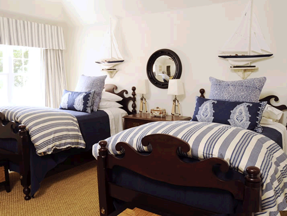
Sometimes a client is attached to having their child’s room  flow with all the colours in the house.  Since most people don’t paint their house varying shades of primary colours then your child’s room needs to look like a sophisticated room to grow up in.   Then it could be like this one (above) by David Kleinberg.

 image

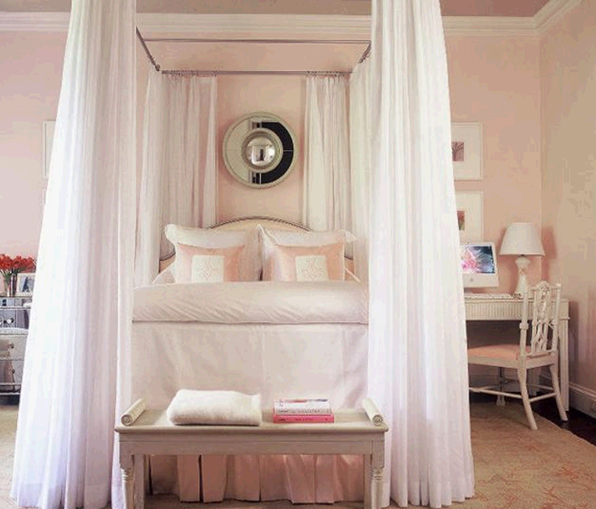
image 2005-60 Pink Pearl (above)  is my favourite pink for girly girls, it’s soft and far from being a ‘bubble-gum pink’ which you get if you don’t gray it down enough to begin with (room by Phoebe Howard)!   And here’s another room without wall colour (below) it’s just a nicely decorated space!

image

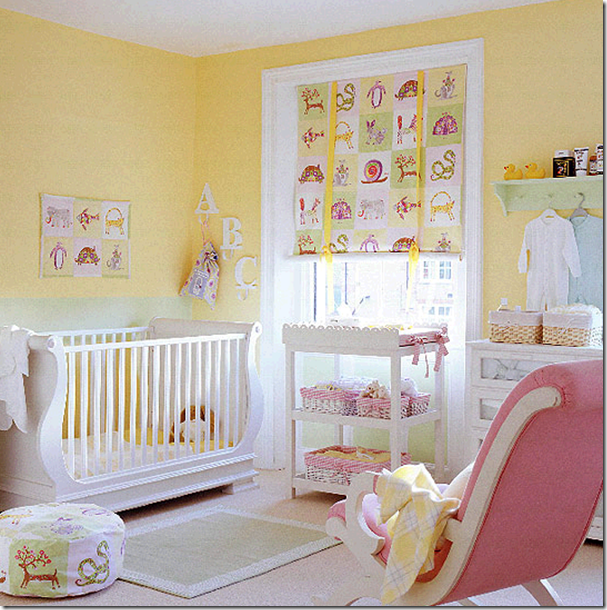
There is a big urban legend in the colour world that yellow makes babies cry.  This is completely false.   Lee Eisman said that a colour expert once announced this in a talk and the press picked it up and went with it.  She said he completely made it up and said it simply for drama. 

My opinion on why this myth is out there, is that people have so much trouble with yellow (see my previous post about that) and/or if you painted any bedroom a bright screaming, primary yellow, well we would all cry in a room THAT yellow.  If you want just a nice soft, butter yellow like this one, try Straw from Benjamin Moore, 2154-50.  It will give you this effect (below): 

image  image

image

image

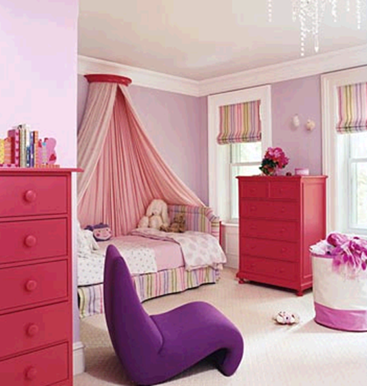
2071-60 Lily Lavender is  the perfect lavender for a little girl that loves purple!  The addition of the fuscia drawers in this room really adds drama and colour!

My favourite kids room green?  Dill Pickle, 2147-40.  It’s a great yellow/green which I’ve specified so much the paint store’s know it’s my colour chart before they look at the name.

image 

I’m sorry the image sources are missing, I saved these pictures ages ago and forget where I got them from, if anyone has a source, let me know.

Related Posts:

Why is Choosing Yellow Paint Colour so Hard?

Effect of Natural Light Exposures on Colour

Friday, April 24, 2009

The Richest Man in Town

RMITs believe that we do our kids a disservice when we tell them “you can be anything you want to be—anything you dream of being.” They believe you can’t be anything you want to be, but you can be so much more of what you are innately, genetically gifted at. Warren Buffet says, “I was wired to allocate capital.” He would have been a lousy fashion designer. Randall Jones – Author of The Richest Man in Town.


I was lucky to have Kate Smith from Sensational Colour as my mentor at the conference. I learned so much from spending time with her, she was extremely generous with me!  One of her many talents is products and packaging;  it’s what she spent many years doing prior to setting up her own consulting and speaking business. (by the way, she already knew me through my blog so she volunteered to be my mentor which is another reason to start your own blog!)
image
Kate has a very informative website in addition to three blogs about colour!   Colour talent runs in the family as I learned it’s actually her sister Julie Hoylen, a stylist and consultant, who writes the third blog,  live in full color.
image
The other inspiring colorist I met was CJ from Citron Paint.  This is a woman who couldn’t find the right colours for her clients so she started up her own paint company!  I actually met her a few years ago at one of the courses put on by the International Association of Colour Consultants in San Diego (of which we are members together)!
 image
image

She believes that colour should be full spectrum colour!  Made from lots of pigments and NO black, which is in most other companies paint formulas!  This is what gives your walls luminosity and light, and has them actually come alive in all different lights!  And she does colour consultations!  If you live in Tucson, she is the one!

Speaking of being rich, the other book I recently purchased is “I will teach you to be rich” by Ramit Sethi.  I didn’t realize until I bought it (online on the recommendation of another blogger) that it really is for an under 30 demographic, however,  he said he always asks young people two questions: Why do you want to be rich?  What does being rich mean to you?  He considers himself rich for several reasons, one of which is:

Make career decisions because I want to,  not because of money.
So yesterday, when a friend  called and asked if I was available for lunch, we ended up spending the afternoon sitting in my lovely garden, because it was a beautiful day. . .  that to me is rich.
Kensingon Gardens 002 Have a beautiful weekend!
Related posts:
3 steps to Finding a Mentor in the Design Industry
Why Blogging is good for your Career

Thursday, April 23, 2009

Off to Market! Stay Tuned!

I am wrapping up some of the paper piles in anticipation of heading up the road to the High Point Furniture Market. Lots of preview emails, postcards and catalogs have made their way for a sneak preview of what lies in store. It's always fun to see the new trends, color palettes and to catch up with vendors I may only see twice a year. Some companies come and go, and this year will probably be no exception. It's heartening to be receiving brochures from new manufacturers. They have the positive, hopeful spirit of the enterpreneur.

One such company, Justin Camlin, caught my attention. I loved the way the classic pieces were punched up with so many color options. I felt like a kid with a big box of Crayolas! Can't wait to get to that showroom to experience even more joy! This company knows just what we need - more possibilities without limitations. Isn't that a nice thing, for a change?

I've popped in some examples of their product line. Let me know what you think. I'll let you know more about market and other finds.


Wednesday, April 22, 2009

Pssst. . . it’s a Secret [for colour lovers only]

I’m back from the Colour Marketing Group convention in Seattle this past weekend, and here are the highlights:

image The fundamental message from the weekend? Colour sells and the right colour sells better.  Your customer will investigate the product further if they like the colour—you lose them if the colour isn’t right.  If you have 2 identical products/houses side by side the only thing that differentiates them is the look and the feel and that is created using colour!

image This presentation of 10 boards was made my Ken Charbonneau who worked for Benjamin Moore for many years and was responsible for putting together their Historical Collection which came out in 1976 and is now a fixture in their colour line.  He is currently with Wilsonart International (which is one of the reasons why he’s included laminates on his boards).

image

Ken said that laminates are the ‘great pretenders’.  And the biggest customers of laminates?  The gaming industry.  The hotel lobby and counter will be marble and then you walk around the corner and it’s laminate everywhere else.  It’s a great example of first impressions being everything.  It’s why if you can’t afford to install crown molding everywhere in your house, install them in the main rooms downstairs and you create the impression that the whole house has been done.image These boards are an example of colour direction that includes browns and grays.

image

image

Colour me Happy Blog 099

image

image

Colour me Happy Blog 097

Colour me Happy Blog 100

The second day was the most interesting to me as it was colour forecasting day.  If I told you the final colours we came up with I’d have to kill you (only CMG members get the final  colours, everyone else has to wait 4 months) but I can show you the board we put together on new member training day (which was Saturday).

Colour me Happy Blog 102Because I’m a residential designer I was in ‘Consumer Colours Current’  and here’s what happens.  Everyone comes with 8 colours.  One for each colour in the colour wheel including brown and gray or white.  We choose a colour that we think is currently ‘established’ and one that is ‘new’.  The most fascinating part of this exercise is how much similarity there was with the colour that people chose.  That’s when you know you are on the right track. 

You have all these people in the ‘colour industry’ choosing colours (with thousands to choose from), they go up on the board and so many of them are the same.  The above board is what we narrowed it down to and then named them on the spot which is a very important step in colour forecasting because it starts creating the story which is what sells.

image

6 years ago when the brown and blue trend started coming in, I tried to find that combination in fabric everywhere because I was starting to specify them in residential design and it was impossible.  The fabric houses simply hadn’t made those combinations yet, it was that new. 

One of my current clients wanted a gray/green sofa when we were selecting colours for the furniture in her new apartment.  I steered her away from a gray/green colour to more of a fresh green knowing that it would be much easier to find something fabulous in the newer green rather than the older one. 

image     Gray Green

image

Fresh green

That’s the power of understanding and knowing colour trends.

Anytime I have been hired to work on a project with colours that are dated, it’s much harder to find ‘fabulous’ fabrics that the client madly loves because the selection is so limited.  Obviously we can't all re-do our living room every 5 years so this happens a lot, however if you are starting with an empty room, it's much easier to find art and accessories to complete your space if you work with more 'current' colour schemes. 

This room (below) was decorated by a designer approximately 10 years ago.  A year ago, I was hired to select new drapery fabric and rods, toss cushions and carpeting (the current fabric belonged in a kitchen) you can see that the toss cushions were made to repeat the ‘fresh lemon yellow’ in the current drapery (so wrong with the ‘dirty, mature red’ which was the burgandy) in the room.

In addition to that, she had never found an area rug because it was difficult to find a square one so she had lived without one all these years until I came along.

backsbeforeliving

Before

Instead of trying to find a square area rug I simply chose some textured carpeting and had it bound in a herringbone, navy fabric from Ralph Lauren which certainly helped to define the space and tie in all the furniture.  I also recommended that we switch out the ‘bun’ feet on her furniture (which were too country looking) to match her more traditional coffee tables--much better don’t you think?   The other issue was the existing accessories on her mantle that were too small in addition to lacking balance and scale in this larger space.  An accessory shopping trip for new lighting and accessories did the trick.

backsafterliving

After

The challenge with the drapery fabric was finding something that was light enough to work with her current wall colour (re-painting because it was an open space would have dictated that the entry, halls and dining room would have to be done as well and that wasn’t in the budget) in addition to the existing ‘dated’ combination of navy and burgandy.  I ended up with a textured, raw silk which read two-toned in the end, gold  enough to work with the furniture but also light enough to complement the wall colour.

Backs Residence 008 An experienced designer knows which elements to work with and what to ignore in order to make a space work.  In the beginning of my design career I was asked to find two chairs to go with an existing, cold blue gray, leather sofa from the 70’s.  At the time I didn’t take the job because I had no idea which chairs I could find that would work with that sofa!

Now I know that the answer to that design dilemma would have been to advise my client that anything ‘new’ would scream TODAY and their sofa (even though it still looked new because it was sitting in their living room and rarely used) would scream YESTERDAY!   Sometimes you have to bite the bullet and buy new because you can’t save something THAT dated and make it work especially if you are adding new pieces.

I also met some fascinating colour professionals I’ll be talking about so stay tuned!

Related posts:

Hiring a Designer: Luxury or Necessity

Staging: Two Day Transformation

Bachelor Pad (Media Room Before & After)

LinkWithin