Thank you to the Washington Post for including this post in your blog watch, March 19, 2009!
When a client calls me to inquire about a colour consultation, here’s the question they need answered more than anything else: How do you create flow, and how do you transition the colour from one room to another? In addition to this, people want to know why the colour works or why it doesn’t? The process of narrowing down all the possibilities (from over 2,000 colours) to the one that is perfect for you is worth every penny. A professional will give you colour ideas that you never imagined, after all this is what they do every day. The following images illustrate the best way to create flow in your home.
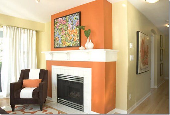
This is a living room I designed for one of my lovely clients Suzanne, two years ago. She recently hired me to complete her den and I met with her last week to finalize the selections. First though, a lesson on creating flow:
Suzanne had this colourful artwork by Vancouver artist Debi MacKinnon (shown above) and which we used for inspiration. She loved all the colours and especially the orange and fuscia, so that’s what we used for the accent colours in her condo. The colour we used as the ‘main wall colour’ in her space was HC-18 Adam’s Gold: Adam’s Gold is actually a yellow on the green side. And as I tell my students, these greeny yellows mostly just work with bright, jewel tone colours like we used in this space. With bright or rich dramatic colours (such as red or eggplant) using a greeny/yellow keeps the space more sophisticated than if we used a regular warmer, orange based yellow like HC-12 Concord Ivory. We then used a cotton velvet in a slightly darker shade for the sofa.
She loved the bright orange in the art, so we picked an orange from the deck, which was a little too bright so we took it to the paint store with the fabric I had found for the toss cushions and toned it down slightly, so the colour you see above is a custom orange. The closest one we ended up with is 2169-10 Racing Orange.
We selected 2076-10 Crushed Velvet as another accent in her living room (shown in the toss cushions below):
Then we used that same accent in the powder room and hung some artwork that also repeated the colours she already had in her space.
In her bedroom we introduced a lighter shade of purple (than the above flower in the bathroom) while still keeping the colours in the same, fresh colourful palette as her living room.
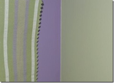
HC-115 Georgian Green and 2070-40 Spring Purple. This (below) is the drapery fabric we selected for her bedroom.
In the den (before and after to be show upon completion) we chose 2 chairs which we will upholster in the velvet (shown below) in the ‘Crushed velvet’ shade from the bathroom and the accent colour in her living room. The drapery was our favourite fabric. And it repeats the fuscia colour as well (it’s slightly lighter as you can see). Then we chose an ostrich faux leather for a round ottoman. We will also repeat the white in the entertainment center for her TV and bookshelves. What makes this perfect for her space, when she needs extra seating in the living room, she can pull out the chair from the den and it will look just like it belongs there.

The colour we chose to tie in with the drapery is CC-338 Bluffs which was darker then the fabric. You can’t tell by looking at the photo though right? Don’t ever make the mistake of assuming the colour is right by just holding it next to the fabric like it is shown in the above photo. To make sure that it was the right colour, we held the fabric up by the window, then held the sample behind the fabric, we also held it up in the corner of the window (with the colour beside it to ensure accuracy). For even closer accuracy (of course) a bigger sample should be painted up just to be on the safe side.
Many people think that the only way to create flow is to take one colour and go from light to dark throughout the entire house. However, it’s really about keeping the ‘fresh’ colours together and ‘dirty colours together. If you mix them up, that’s what creates problems with flow including the feeling that gets created in your home.
If you don’t have a ‘perfect’ scenario where you can basically decorate your entire home at once to create the kind of palette I have shown here, then you need to decide which rooms you will ‘move forward’ using current colours and which ones need to coordinate with the existing colours in the home. For example, if I am in a house that is mostly renovated, except for the bathroom, I will ignore the flow in this case, and just pick a colour that coordinates with the existing tile in the bathroom. I would rather specify the best possible colour with existing (dated) finishes, to make it look as good as possible in a bathroom that is not going to see a renovation anytime soon, than worry that much about how it works with the rest of the house.
So my lovelies, what is the undertone of the above beige?
Related posts:
Insider Secrets to Testing & Selecting Paint Colours
What Everyone Should Know about Beige
Should your Interior Colours flow with the Exterior of your House?
New to this Blog? Click here ; Subscribe to my Monthly Newsletter; Become a True Colour Expert


