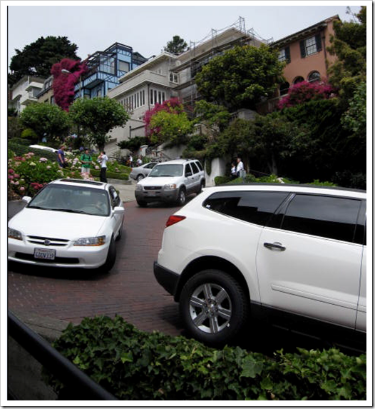
 First stop was Lombard Street, the world’s most crooked street. I walked down it and snapped this photo of what looked like a white car convention.
  This house was right on Lombard Street. Everyone was taking pictures of it. Made me wonder what it must be like to live on a street that is busy with tourists probably year round!
Then we continued our tour, I liked this one, because kelly green, white and black always look good together!


Normally when I see a battleship gray house, I have the urge to run up to the front door and give the homeowner some shade of yellow to paint the windows or the trim but I liked this one with the navy blue windows. I even got the photo with a blue car in it.

Here’s a close up so you can see what I mean.


My token palm tree shot!
 The paint is fading and peeling on this building but what I liked about it is that the colours were chosen to work with the blue and orange in the brick.
 Now that I think about it, I don’t think I’ve ever seen blue in orange brick before. Must be a San Francisco thing.
  Those might be blue drapes (to match the shutters) hanging in the window but what a great idea to have the exterior colours coordinate. Even if the drapes were a different colour inside, they could have been lined in the same blue as the shutters.


When we got to North Beach I went into this great little store called Pink Blossom and came out with two very cute tops! The shopkeeper was just great. Check it out if you go to San Francisco.


I got to meet Rachel Perls from Hue Consulting when I was here! She is an architectural colour consultant in San Francsico. I also interviewed her here on my blog. It was so fun to meet and talk colour!
Whats the undertone of the 2 beige colours on the first photo with the yellow and raspberry?
If you would like your home to fill you with happiness every time you walk in, contact me for on-line or in-person consultations.
Related posts:
5 Steps to Choosing the Right Exterior Colours
Exterior Before & After; Blue to Brown
Commercial Exterior; Before & After


