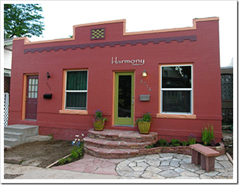
James Martin owns The Colour People who provide color design services to developers, builders, architects, property managers, and home owners. James was an originator of the movement of Architectural Color Consultants and the first color consultant to offer color design services nationwide through their now much copied mail order design system. James and his team work in all 50 states and numerous foreign countries.
I met James this past April at my first CMG Conference in Seattle. He is the new President of the Colour Marketing Group and has been a member for 15 years. I am thrilled to post this fascinating interview on my blog this week!
[MK] What’s your favourite colour? What colour would you like to see banished from all paint decks?
[JM] The kids always ask me this. I don’t have a favorite color. I cannot allow my self to have favorite colors because I cannot be attached to any colors when I work for my clients as my job is to give them what they love and want. I have to create a sort of zen “beginner’s mind” situation every time I design a color scheme for someone.
[MK] When did you first know that your talent was colour?
[JM] When I was studying Graphic Design in college, I was taking a photography class and my instructor looked at my color work and said, “You are a real colorist!” I hated it at the time because I was really trying to be into B&W photography which at the time was the only art photography. Black clothes, B&W moody photos, you know, art school. Only later did I find I really was.
[MK] What was your biggest colour/design mistake?
[JM] You know I have never really made a mistake. Doing exterior color is very tricky color changes at scale and you can never completely rely on color behave so it is essential to sample before you paint. My only real mistakes have been to be too understated, or safe with my colors.
[MK] What is the most important colour lesson you’ve learned?
[JM] The real joy of color for me is that it is the only thing I know of in the universe that is completely relative. It never behaves. You can never count on it to act reliably. That is why architects do such awful color work. They have to have things that perform the same way always- that they can be exact about. Color won’t help them. So they use colors that are boring or do nothing to explain the architecture and only become postage stamps of color on their buildings.
Color changes with the light. It changes with scale. It changes with finish. It changes with what is next to it. It changes with proportion. It rarely looks the same way twice. Isn’t that lovely! To be a colorist you have to be completely intuitive about color. You have to feel the relationships and act based on what you have seen. And that is really the truth about color, you cannot learn it in school, you cannot learn it from a book, you can only learn about it by paying attention. I look at every building I see, every room I go into, and ask myself did it work or not- and why? It is so simple, yet so difficult. The zen thing again.
[MK] When it comes to colour, what’s hot? Which one do you think it timeless and which colour trend would you love to see disappear?
[JM] I am currently serving as the President of the Color Marketing Group, the international group of color professionals that forecasts and tracks color trends.
We just completed our Fall Conference in New Orleans (we do it a different place each time to learn in depth local flavors in color and design) and put out our palette of the colors that are “Next.” You must know purple is hot, but also hot and due to get immediately more significant is yellow. The yellow we have identified we call “Yellie Mae” a bright almost electric green influenced yellow. We named it after one of the women whose houses we worked on in New Orleans during our CMG Gives Back part of our conference helping the still ongoing Katrina recovery efforts.
The trend I would love to see disappear is the New Modernism’s return to white. I love the new modernism but the whole “less is more” business has been proven for years to fly in the face of how people live and how they feel about housing. I cannot understand why it continues to be seen as “cool” except that they fawn over it in architecture schools where they still refuse to teach color or recognize the power of color in our lives. Buildings are for living after all, something they should acknowledge up front when teaching design.

The truth is color allows a painting to come to life and reach out well beyond its frame and touch you, envelope you, and fill up your room and your life as well. Test it if you think I am wrong put two paintings on two opposite walls one white, one a color (doesn’t really matter much which color) and then take turns looking at them. White is the color of death in the much more intuitive Asian cultures.
[MK] What do you think is one of the biggest mistakes homeowners make with colour?
[JM] The most horrible mistake is living with blah because someday you might sell the house and you don’t want to affect buyers. (Realtors are notorious for promoting the blah life and as a class are dangerous as tastemakers.) I have known people who have lived with beige and white for 25 years, bored to tears, just because they thought it was a smart real estate decision. How sad.
[MK] What is The Color People Pledge?

[JM] Repeat after me: I WILL NEVER USE WHITE AGAIN!!!
[MK] What are the 5 things in life you cannot live without?
First, my life is spiritual, so I cannot live without being connected to the Universe
Then it follows Truth is an essential
As is love, particularly empathy
Then music is an elemental part of my life. I play, I sing, I have music playing almost all the time at work and at home.
Lastly, Nature, my mountains, and the out doors.
Sounds like I was a hippie, doesn’t it?
[MK] Thanks James, this was such a great interview!! My favourite part of Colour Expert interviews is I always get to look at colour from a new place, I love that!
Related posts:
5 New ways of looking at Colour; from the Experts
New to this Blog? Click here ; Subscribe to my Monthly Newsletter; Become a True Colour Expert


