10 years ago when I started my design business I placed an ad in the Yellow Pages that included the words “Expert Colour Consultation”. Then as I looked at those words I thought, ‘I better become an expert’, and that is when I found Joanne Day at The Daystudio in San Francisco.
Joanne Day has trained many colour consultants, designers and faux finishers all over the world and it was her colour course that inspired the years of colour training that followed, in addition to discovering that it was going to be my niche in Interior Design. I am honoured and delighted that she agreed to be interviewed on my blog!
Sidenote: I took the liberty of adding photos to make this post more colourful!
[MK] What’s your favourite colour? What colour would you like to see banished from all paint decks?
[JD] Before I was so involved in color I used to think color choice was infinite – it was too many choices. Which blue was the right blue? Now I visualize color as only 6 choices, ROY G BP. Each parent color with all its derivative color children being enclosed inside a back yard fence and on the other side of the fence is another parent color backyard and all their children. It makes choosing combinations of colors much easier. I always like to add blue as an accent. It is interesting to follow trends and favorite colors and the psychology behind them. Trends are often unconscious reflections of what is coming into everyone’s consciousness. 10 years ago when green came in like gangbusters we were starting to individually perceive Nature, ecology and the food chain, how trees take in our CO2 and we take in their oxygen. Now we perceive that behind green (which is considered a neutral now) is blue, water, and how important it is. These show up as color trends and changing favorites.
Banish the white strips between colors on a chip deck, they keep you from seeing the difference between adjacent colors. Place your finger over it and the brain thinks they are connected and can see the subtle differences between them. And banish the distracting black lettering too (put it on the back as they do in Europe). Letters and lines put us in the analytical left brain and overpowers the intuitive/visual/feeling right brain where color is decided.
[MK] What was your biggest colour/design mistake?
[JD] A warm/cool mistake. Today we often use multiple fabrics, carpet, old and new furnishings in one room, and several paint colors. When we choose a room color we need to bridge those many existing colors. The more objects and colors in a room the more difficult it can be to make sure everyone is sharing something in common and when a color doesn’t, it shifts cooler or warmer than the rest and sticks out like a sore thumb. A good colorist chooses colors that won’t make the client have to change everything in the room.
[MK] What is the most important colour lesson you’ve learned?
[JD] The quickest way to change your life is a coat of paint. We all go through transitions and color helps us get there faster.
And there is no wrong color, only wrong color combinations.
[MK] When it comes to colour, what’s hot? Which one do you think is timeless and which colour trend would you love to see disappear?
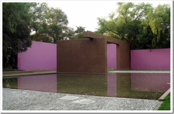
[JD] Chameleon colors are hot. Chosen because they take advantage of natural and artificial light-shift and morph a color into different hues at different times. Without light there is no color, they go hand in hand. Colors that take advantage of changing light are timeless, they enchant us. It’s kind of like getting three colors for the price of one, a bargain. Google Luis Barragán, an architect who decades ago started adding color pigments on a large scale to exterior stucco taking advantage of and playing with light in locations all over the world.
I still see that awful dusty blue and pink on kitchenware and wall art, someone must still be buying it, but I would love to see it disappear for at least the rest of my lifetime.
[MK] What do you think is one of the biggest mistakes homeowners make with colour?
[JD] Following a trend that doesn’t agree with a clients genetically hardwired color bias. When a perfect color outfit makes you feel beautiful, it empowers you. It follows that the colors in your home should be chosen in a similar way.
[MK]How do you get clients to take a confident leap into color?
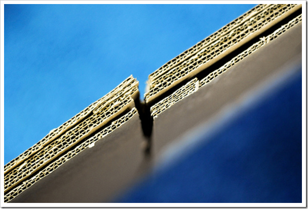
[JD] I’ve learned that patches on a wall don’t help the client. They are still just as confused and unsure. So I paint a cardboard file box the color I recommend and put it somewhere in the room. Let them move it around for a few days. A 3D object will test the color in all light situations unlike a 2D patch on a wall. It will get a definitive yes or no. I also hold the box top under the clients chin, if she or he can’t wear it with their coloring, the environment will not empower them. It’s a no.
[MK] What are the 5 things in life you cannot live without?
1. [JD] Beauty, because it inspires us and sometimes brings us to our knees.
2. Nature, because it is our mother, it rejuvenates us, it soothes us, it supports us.
3. Friends, because they make the uncertainties of this world less scary. Friends are members of a tribe that share common interests. Like color combinations that share a common pigment ingredient are harmonious and embrace each other. Colors that don’t, push away from each other.
4. Doing Art, because it calms and balances my life, and of course, art is about color.
It’s kind of like yoga, you do art and art does you. Some people garden, some play music or dance to get into the “zone”. It’s a right brain (visual-emotional) activity that balances out a very left brain (analytical) world. So is color. That is why recessions bring out brighter colors, to balance our uncertainty.
5. Teaching/Consulting, because it’s a way of sharing what I love most, it gives people a tool and a skill that changes lives.
Related posts:
Interview with Colour Expert; Kate Smith
Interview with Colour Expert; Janice Lindsay (Washington Post Blog Watch, July 9)


