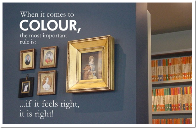
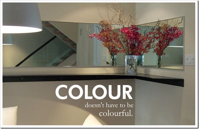
Some of you know that I recently purchased Janice Lindsay’s new book called “All About Colour” [below] and then wrote a post about the first thing I read when I opened the book here.
Janice Lindsay is one of Canada's leading colour designers. With a column in The Globe and Mail newspaper and her newly published book, Janice is a sought-after colour consultant for residential, commercial, and institutional projects.
When I received her book and started reading it, I decided I had to interview her for my blog! And given that she is a Canadian, I thought it was even more appropriate that she should be my first interview; so I am pleased to introduce Janice Lindsay:
[MK] What is your favourite colour?
[JL] I am red by nature and mauves are not me but I don’t have a favourite colour. That would be like asking a mom which of her kids she liked best.
[MK] What colour would you like to see banished from all paint decks?
[JL] Pinkish, grey beige.
[MK] What was your biggest colour/design mistake?
[JL] In an insipid office hallway I introduced too much colour. It wasn’t that the colour was wrong but I did not take into account how much people hate change! (70% of all change is perceived as negative!) Now the people who weren’t happy would probably squawk if it were painted back to its original blandness.
[MK] What is the most important colour lesson you’ve learned?
[JL] I am still learning so it’s hard to say. One would be trust your instincts? Or colour rules are meant to be broken, or at the very least, bent. That colour is not tiring but to many, too much colour contrast can be. . .
[MK] When it comes to colour, what’s hot? Which one do you think is timeless and which colour trend would you love to see disappear?
[JL] All colours are timeless. It is combinations that go in and out of style. When others ask me what colour is hot you can’t just say ‘yellow’ or ‘chartruese’. A colour trend is not about a colour so much as how and where a colour is used.
A few years ago at a Color Marketing Group conference I said greens would be very big. The leader in my group took me aside and said greens were always big in interiors so it was not a trend story. She missed the point. I was saying green would divorce red and show up alone in the most unexpected places—grass green on an expensive Italian sofa, for example—and in unexpected combinations—primary green with olive with yellow-green. And that citrus green would replace red as the attention getting colour in everything from advertising to purses and home accessories. Green as in celadon and sage, is a constant in home decor always, but this greenness was totally new.
[MK] What is the most under utilized colour?
[JL] Black. Because when it is doing its work you often don’t see it and that is its magic. Because we associate it with negative things and forget that it is strong and elegant and quiet – the yin to white’s noisier yang.
[MK] What do you think is one of the biggest mistakes homeowners make with colour?
All images above - Pink Colour & Design
[JL] Actually there are a lot of mistakes that people make – like under estimating the power of colour to not just decorate but renovate on a physical and an emotional level. Like not using enough or using it crudely. Like being obsessed with white ceilings and trim!!! Or thinking that colour is always about look-at-me decorative colour when it is the less attractive work horse hues that are just as important to balance up the final result. They are the ones that you feel but don’t notice. I could write a book about this----oh, I did?!?!
[MK] What are the 5 things in life you cannot live without?
[JL] Hmmmmm. If you mean material things rather than family, friends, travel, music and a good game of tennis – then:
1. Really comfortable shoes – Arche or John Fluevog,
2. Clothing by Annie Thompson because they feel like Me
3. Fresh Flowers
5. And unfortunately perhaps, my blackberry.
Janice has recently partnered with Pittsburgh Paints and developed her own Colour Card which can be ordered by calling 1-877-238-6441 and soon available on-line here.

Janice Lindsay’s company is called:
And if you are lucky enough to live in Toronto, you can call her directly for a consultation!
Related posts:


