Sunday, October 31, 2010

Dishing About Eddie Ross ~ Dining Delight!

First, I have to shout out . . . Wow!  Wonderful!  - and - Whoopee!

These simple words come to mind as I think of how I’ll be stalking following Eddie Ross and his partner, Jaithan, around our local, (Charlotte, NC), Metrolina Antique’s Show, on Friday afternoon, November 5th, (sold out).  Eddie is the king of making the process of styling look simple, yet planned.  Whether it’s a room or a table setting, he can scour any shop or flea market for overlooked treasures, add his magic touch, and . . . voila! . . . a masterpiece of design has been created!  I found out about his show schedule, relatively late, but was so excited to get squeezed in for what I’m sure will be a delightful afternoon.  (Thank you, Jaithan!) 

6a00e55391c48e883301348885dbae970c-450wi

Eddie Ross during a recent treasure hunt.

overview-l

A lovely setting, by Eddie, featured in “Southern Living” Magazine.  Love his use of vintage milk glass!

E Ross Table

A recent feature about Eddie, in “Lonny” Magazine. 

I have a feeling I might find a kindred spirit,in Eddie, as I tend to have a weakness for beautiful tableware!  With only two of us at home; however, I tend to forget to bring out some of my seasonal pieces, unless it’s time for holiday entertaining.  Reading Eddie’s blogposts has inspired me to make as many of our meals a bit more special.  After all, what good does it do for it to be tucked away in cabinets?

Today, I decided to put a few flowers together, light some votives, pop in a few pumpkins, and bring out my Johnson Brothers’ pattern.

IMG_20101031_140747

Mixing it up with old and new.

IMG_20101031_141012

A layer of my transferware, creamware, and a charger.

Eddie Ross table 001

A little bit of gilt goes a long way!

IMG_20101031_142929

Pulling in some of the colors from my transferware, via flowers and pumpkins.

IMG_20101031_140906

I love how the texture of the blue pumpkin compliments the mercury glass style vase!

IMG_20101031_140846

The Johnson Brothers’ pattern is called “Frozen Up” and it’s resting in Lenox’s “Butler’s Pantry”.

Eddie Ross table 008 I kind of have a thing for oak leaves and acorns.  Notice the border pattern and the votive!

IMG_20101031_142955

As an interior designer, I do love to try placing things on angles, as in the napkins.  It adds a little extra zip! 

Eddie Ross table 019 (2)

Because I have a “few” table patterns, the French vasselier stays dressed in a simple stoneware backdrop.

While it may seem a bit early for Thanksgiving-inspired table settings, I know there is a small window of time when I can use these dishes, so a few practice runs won’t hurt! 

I’ll be sure to do a follow-up post about my adventures with Eddie and Jaithan, as well as to record any found treasures.  I have a feeling another collection could be in the works!

All my best! ~ Wanda

PS - Contest Alert!  I’ll be giving away an autographed copy of Vicente Wolf’s “Lifting the Curtain On Design”!  All you have to do to enter is to leave a comment on any two of my posts, beginning with this one and by November 30, 2010.

51-NT0XN9hL__SS500_ 

I’ll announce the winner the first week of December 2010.  I hope you’ll enjoy a festive month!

Restaurant Colour Themes; Heaven vs. Hell or Clean and Dirty

At High Point Market I had two very different experiences dining out. The restaurant below is in The Proximity hotel where a few of us had dinner the second night I arrived. We walked into this serene, beautiful space with fabric panels dividing the restaurant into sections, oval backed slipped chairs in green and white with the early evening light filtering into the room. Simple, elegant, divine. If I had heard angels singing I would not have been surprised.

image

Then I had the opposite experience in another restaurant when Traci Zeller, Laura Casey and I arrived for the Editor at Large presentation at lunch.

image

I’m guessing whoever designed this space probably did it this way (below) intentionally. You might love it! I'm just not a big fan of Halloween or decor that reminds me of this day.

imageThis empty full room shot was taken by Eddie Ross right before his presentation the next day

In Vancouver we have a restaurant called Hell’s Kitchen (below). The exterior is bright screaming yellow and black, and this one could very well have had the same name.

imageImage via Hell’s Kitchen

This is such a perfect space to show you clean and dirty colours that I couldn’t resist snapping photos as soon as I sat down. My biggest issue with the colours in this space was that there is zero relationship between the decor of the restaurant and the wall colour. And the chosen red and orange screamed way too primary and bright.

imageSince it actually was set underground with a huge skylight above us, it could have been called Hell’s Kitchen and been totally perfect!

image

Personally, I felt disturbed sitting in this space, the right red (way more toned down and muted than this one) would have at least not clashed so badly with the chairs, stone wall and urns in the dining room. But then walking down the halls to the restroom was a whole other experience!

image

Now with the black concrete floors and the red walls there was no relief from the Halloween themed feeling!

imageEven the washroom was more red mixed with the orange from the dining area in stripes! I really couldn’t wait to leave.

image

Photos by Maria Killam

The biggest mistake designers and homeowners make with colour is in the clean and dirty category (given that all colour is defined either, cool or warm, clean or dirty, light or dark). When a reader emails me a photo because they have a room bothers them and they need to know why, simply understanding how to mix clean and dirty colours accurately is the fix in many cases. This doesn’t mean you should not mix clean and dirty colours but it should never happen by accident because that’s usually when it looks bad.

A good place to learn how to combine colours accurately is in my course (I know it’s the perfect plug for my True Colour Expert Workshops). But these kinds of colour mistakes are expensive!

imageImage via Simplified Bee

Happy Halloween Everyone!

If you would like your home to fill you with happiness every time you walk in, contact me for on-line or in-person decorating and colour.

Related posts:

A Dirty Answer to a Clean Question

Clean ALWAYS Trumps Dirty

The Difference between an Experienced Colourist and a Novice

New to this Blog? Click here ; Subscribe to my free Monthly Newsletter; Become a True Colour Expert (new dates)

Interior Design Ideas - Snow White


I know it's a little premature to be thinking of snow – but couldn't resist sharing this beautiful white lounge with you. You have to admit that it look stunning with the touches of gold adding an elegant touch.

Furthermore this lounge isn't swamped by swathes of curtains and drapes and proves a point that a vertical blind can make a superb window dressing. The vertical blind slats give hight to the room along with an extremely versatile approach to privacy and fabulous light control.

All white rooms are still being favoured by interior designers this season; especially if rooms aren't that large as white enables a room to appear much larger, however the stark and clinical approach is subtly being made into a warm and friendly home look with the addition of soft grey rugs and statement table lamps.

Of course there is no room for clutter (my obsession which I haven't mentioned for a long time!) - having a beautiful lounge is easy to achieve on a budget as white paint is probably the cheapest wall and ceiling paint; paint flooring white will also help to highlight your rugs in an understated natural way.

Friday, October 29, 2010

Top Two Trends from High Point

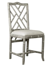
image Clayton Gray Home

Well I was going to skip this post but then I received an email from one of my readers letting me know that the little I had posted from my High Point trip was NOT ENOUGH :) I had also come to the conclusion that a few of my blogger friends had already done such great recaps, like Traci Zeller with her comprehensive posts, here, here and here.

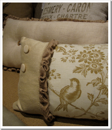
image

Really. I mean I just can’t add anything else new that Traci hasn’t already said. The above pillow collection was definitely the theme (I photographed it because I loved the little ruffle on this one). Burlap and linen and one showroom after another filled with gray, limed furniture.

imageSharon Foster Art

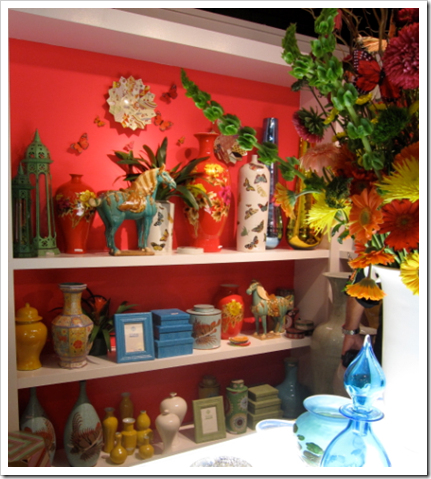
Seriously, they all needed a hit of colour (like this piece of art) or an accessory from this shop (can’t remember what it was) look at that fabulous colour on the back of the shelves!

imageAbove photos by Maria Killam

The colour pendulum has to swing back and forth every 10 years because we get tired of looking at the same colours (trend or no trends). We’ve had dark cabinets, now it's the opposite-- white ones (although these days everyone is adding a hint of blue or green to their white cabinets). We’ve been looking at earth tones for 15 years, time to go to fresh and bright (above photo). And gray, black and white is the best combination with bright and clean accents! So there’s my take in one little paragraph! Plus I'm in Portland next weekend for the Colour Marketing Group fall Conference so this won't be my last post on trends that's for sure!

image Source

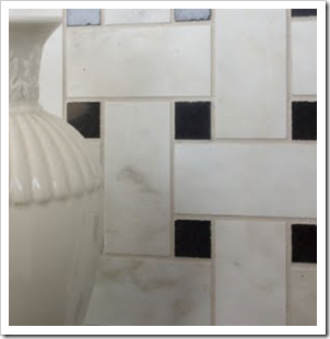
If you are building or renovating your kitchen or bathroom right now, it probably looks something like these two photos (below).

image flickr

Carrerra Marble. It’s flying out of the stores these days!

image

Still want more? Check out Traci’s blog for all the latest on High Point.

image

I’m still writing one more little review from my trip but it’s a critique of Clean and Dirty colours from two restaurants I saw when I was there and more suited to Halloween night so stay tuned! I’m thinking of headlining it Heaven vs. Hell or something like that, hahaha, not that bad but close!

If you would like your home to fill you with happiness every time you walk in, contact me for on-line or in-person decorating and colour.

Related posts:

High Point and Comfortable Shoes

Art from High Point

When is Gray the right Background for your Space?

New to this Blog? Click here ; Subscribe to my free Monthly Newsletter; Become a True Colour Expert (new dates)

Adios Amigos!


Ok, so this time I really am taking a blogging break. I am headed to Mexico (you have to say it like Alex Trebec would) for a good friend's wedding.

Here is my date...

Kenny Powers


How many of you had one of these?


When I return, I am going to single handedly bring back the Pancho.


While I am there, I also promise to listen to you Dave.


by Dave Matthews

So I don't Pokipsy myself...


Adios Amigos!
(Too bad I took French in high school.)

Faux Fur Rugs are Right On-Trend This Season


If you want to be right up to date with the latest interior design ideas then you need rugs – in every room! Not just any old rug will do, the look is all about keeping things in balance along with remembering that although big is beautiful it can overwhelm a room and make it look smaller than it is in reality – sometimes less really is more, so it's worth bearing this in mind with your choice of rugs.

A popular choice for using faux fur fabric is with area rugs - usually the larger the better in this context. Yet there is something so welcoming about a faux fur rug to keep your feet nice and toasty during colder months! White fur is very on trend and is probably one of the easiest and flexible of all colours - in simple white it is far less about adding colour or pattern; it is all about the added texture and warmth which can be used successfully in almost any decorating style. Contemporary monochrome schemes can be given more warmth with a zebra print rug or try a patchwork brown for rustic décor.

Image: Belle Maison

Thursday, October 28, 2010

The Red Party


Tonight is The Red Party a masquerade at the Old Charleston Jail in downtown Charleston benefiting the American College of the Building Arts, a school dedicated to educating the next generation of building artisans. I had such a blast last year! And if you go, be sure to bid on a design consultation from yours truly in the silent auction. Click here for more information!

Red Party Invite1

Wednesday, October 27, 2010

Art post for Week #3; Baskets & Poodles

Okay, I may be the only one in love with this blog party idea of posting inexpensive (or better yet cheap and cheerful) ways to create art for your home. But I really don’t feel like I’m the most creative person in the world when it comes to inexpensive art. Really. I would just love to buy beautiful and outrageously expensive art for my home and be done with it. So since I know that whatever you focus on expands – I’m continuing on with this party and hoping you’ll link up!

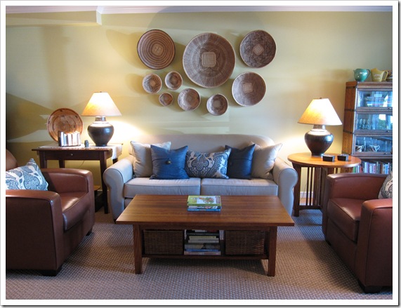
Colour me Happy Blog 910First, when I arrived at Barb’s lovely townhouse in North Vancouver this afternoon, this is the lovely setting that greeted me upon walking in the door. The baskets are from Zimbabwe and are called Tonga Binga. They are traditionally used to winnow grains. I love the way she arranged them on the wall as a fabulous focal point above the sofa. I neglected to ask her if they were expensive but it would be easy enough to find baskets this pretty (I hope).

Colour me Happy Blog 912 I was there to discuss finishes for her kitchen (stone counter and backsplash/colour to paint the cabinets) as well the colour in her living room was not right (existing from the previous owner). The walls were painted BM Dijon (the lighting was not good to show colour so you’ll have to trust me) and both Bleeker Beige and Manchester Tan looked good with her sofa (which in this photograph looks pinky beige). The reason why the existing colour did not work was that it wasn’t repeated anywhere in the decorating of this living room.

Colour me Happy Blog 913This artist is local who although his art is famous around the world, still works as a fireman!

Colour me Happy Blog 915

I loved the creative way she dressed up the ledge above the entry, an empty space that would otherwise be filled with vases (Too 80’s) with basket trunks and vintage luggage (below):

Colour me Happy Blog 914

Above photos by Maria Killam

My favourite link from last weeks party is for a pet lover:

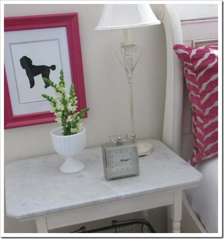
image flickr

Red Door Home created Dog Silhouettes for her daughters bedroom and I loved the simple and graphic result! Click here to see how she made them!

imageImage via Red Door Home

Please post a link below if you have an inspired (and inexpensive) art project on your blog and next week I might post your idea! If you are an artist, please include a post from your blog which lists the price and link back to this post so everyone’s inspired ideas get read!

If you would like your home to fill you with happiness every time you walk in, contact me for on-line or in-person decorating and colour.

Related posts:

Cheap yet Happy Wall Art

Does your Colour Consultant understand Beige?

How to update an 80’s Kitchen with Colour

New to this Blog? Click here ; Subscribe to my Monthly Newsletter; Become a True Colour Expert (new dates posted)

LinkWithin