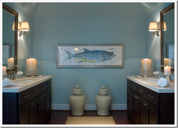
I can’t tell you the number of times I have had people say things like this: “Well I picked that flooring because it was the lightest one, I didn’t want my place to look dark”, or I chose that tile because I didn’t want my bathroom to look dark.

Well that is, until the chocolate brown trend came in really big—then for a few years it seemed like brown seemed to be the automatic choice for tiles, flooring, paint, countertops and cabinets—too much! Now all those brown kitchens are being painted white. The pendulum always has to swing in the opposite direction at some point.

When choosing colours for clients, they usually react the fastest to light vs. dark colour choices.This is natural. If design is not what you do and you don’t have a context for what you are seeing, how do you judge it otherwise? The problem with choosing finishes this way is that the whole picture is not necessarily being considered. Choosing anything one piece at a time and using light vs. dark as a guide is probably not going to give you the bathroom or kitchen of your dreams.
A big part of a consultation with a professional (especially exterior) is comparing one colour to another, in addition to creating a colour scheme that has the correct balance of light vs. dark. That’s how you know you have the right colour, because now you have seen them in context. On your own it’s pretty much eeny, meeny, miny, moe, and that’s when it becomes hard to sleep at night!
If you would like your home to fill you with happiness every time you walk in, contact me for on-line or in-person decorating and colour.
Related posts:
Is Quartz sexier than Granite?
Slate or Porcelain Tile in the Bathroom
How to know if the Tile you have Selected has the Right Undertones
New to this Blog? Click here ; Subscribe to my free Monthly Newsletter; Become a True Colour Expert
