Sunday, January 31, 2010

Carnival Colour Schemes

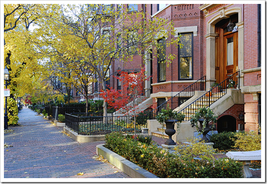
The difference between the architecture in America vs. Europe is that you can always tell which era the buildings are from [here] and it was no different at the Harrison Hot Springs Hotel this weekend!

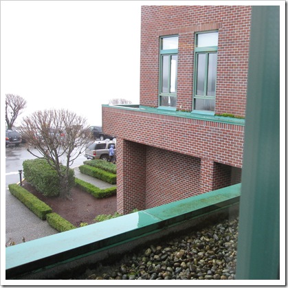
Colour me Happy Blog 460 This is the lake view outside our hotel room. What made it extra pretty was all the moss which remained a fresh spring green even though it’s January! Being in the colour business, and especially because I write this blog, I find I am even more affected by colour everywhere I go!

Colour me Happy Blog 467 You can tell this addition was put on in the 80’s because of the green windows and flashing. How much more timeless this would look if it was black instead (below).

image flickr

In my colour courses I like to have students define decorating styles (like modern, traditional, countrified) using only colour.

image Styling by Maria Killam

This way, (for example) as a colour consultant/designer, if you are asked for a palette of ‘French Country’ colours (above) you would know what they are.

Colour me Happy Blog 464Walking into our room, with the burgandy drapes, fuscia bedskirt (not shown) and striped duvet and valance, I felt like I was inside a circus tent! Yet another perfect example of how colour instantly creates a feeling. What made this hotel great though,was the spa and the Hot Springs outdoor pools and we had a great meal in the Copper Room Restaurant on Saturday night!

Colour me Happy Blog 473 The carnival theme continued when we stopped into Milestones for lunch on the way home! There was 2 different shades of orange, yellow, green, and a striped accent wall along with striped carpeting! This time I’m sure the theme was intentional!

Colour me Happy Blog 470 There is a reason why decorating guidelines say to limit your colours to 3 or 4 shades maximum! Unless a busy, playful space is what you are going for! I’m guessing they are going for a younger demographic with this colour scheme!

Colour me Happy Blog 474On Friday night my sister Anita organized a fundraiser for Haiti. She is currently participating in the Self Expression & Leadership Course through Landmark Education which is a 3 month program where you create a project that makes a difference in your community!

Colour me Happy Blog 453

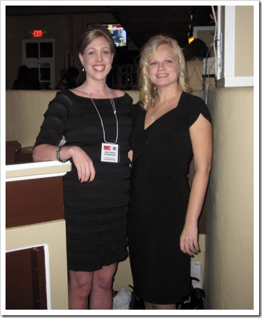
Jennifer Searcy & Anita Junttila

Anita, along with her good friend Jennifer (above) held a pub night in Abbotsford at the Rain Bar & Grill, sold tickets and accepted donations for a silent auction! They raised almost $3,500 and the event was sold out!!

image Here I am with my tickets!

So that’s my recap of this weekend! I’m off to watch the Grammy’s now!

Related posts:

The Secret to having the Life that you Want

Inspiration for Monday

If you are new to this blog, click here to see the Best of Colour me Happy

When I Grow Up...


Today I participated in an event through our local home show where I met an 8 year old girl who wants to be an interior designer when she grows up. She had a stack of note cards in which she had prepared a series of questions to ask all of the designers that were participating in the event. She told me her name and shook my hand. I gotta tell you it was one of the cutest things I have ever seen!!! She reminded me so much of myself at that age (as I talked about in an earlier post). In case you are wondering, her questions were as follows:

"When did you know you wanted to be an interior designer?"
"Do you watch HGTV?"
"What was the most exciting project you have ever worked on and why?"
"What is the best piece of advice you give your clients?"

I must say....pretty thought provoking for an 8 year old!!! I suspect that someday I will read about this young girl and be inspired by her work.

Friday, January 29, 2010

Beautiful Books

As the air has a distinct chill, indicating the weather folks may be right about an incoming winter storm, I am finding myself in full nesting mode . . . hot cocoa, wrapped in a fuzzy throw and thinking about catching up on some good reading by the fire.  (Or rather the hope of one if I can convince dear hubby it won’t be a waste of heat as it floats up the chimney.)  In the interim, some great old movies are being replayed and I am always a fan of the Meg Ryan and Tom Hanks pairings – including this one:

200px-You've_Got_Mail For those who haven’t seen this movie, Tom Hanks plays the role of Joe Fox, the villain and owner of a major bookstore chain, who becomes a direct competitor of Meg Ryan’s character, Kathleen Kelly, as she struggles to keep her mother’s bookstore, The Shop Around the Corner, afloat.  The irony struck me, in thinking about this film, released in 1998, the Joe Fox’s of the world are now sharing that same struggle.  The advent of audio books, Amazon.com, Kindle, and now the much talked about Apple ipad tablet, has the whole industry of bookselling rethinking their strategies.

ipad_hero2_20100127

Personally, while I do enjoy my technology, I so enjoy the tactile experience of holding onto a beautifully bound book, flipping the page in anticipation of what is yet to come for the characters, or to see how the plot thickens.  As a designer, I view books as a wonderful way to add texture, history and warmth to a room.  After all, what’s a bookcase if it’s only filled with tchotchkes ?

398px-Chethams_library_interior Chetham's Library, Manchester, England

designer-mix parchlifestyleLeather bound antique books or parchment wrapped volumes are almost sculptural.

library-3 Doesn’t this make the world feel as if it’s in perfect order?  (A period bookcase in County Cork, Ireland.)

excellence-bild-1-b_ger 

I could live in this fabulous combination of library and dining spaces created by Paschen Bibliotheken

c141L%20Refillable%20Leather%20Sketchbook

Can you believe someone still does hand binding?  The embossed turtle design is a testament to taking ones time for beautiful craftsmanship.  From Hardbound Leather Books by Marcia Engletjes 

OPB-bild-1-b_ger I could work here . . . . .

BibNo5-bild-2-b_ger

. . . . oh, and definitely here!

(Photo credits, above:  Paschen Bibliotheken)

It seems a bit odd, to think of hearing, “I’m going to curl up with my Kindle or tablet.”  It loses something in translation, for me.  There’s no turning the corner on a page, using a beautiful bookmark, or having a soft landing on my forehead, if I happen to fall asleep while reading.

Cheerful Reading to You! – Wanda

Oh . . .  and if bookcases befuddle you, give me a call!

Love your House and your Closet!

I am fashion challenged. I know, you’re shocked right? When I announced this to my sister Elizabeth (whom I shop with every Spring & Fall so that she looks good) she said “If you’re fashion challenged, what about me?” My other sister Anita, (who writes this blog) agreed.

image Image source

I’m 42 years old and trying to be current and fashionable without spending a fortune. The problem is I’m not sure how far I should go with the skinny jean trend (for example) before it’s too ‘young’ of a look for me. I have bought 2 pairs of skinny jeans (the dark ones—below--I bought right before Christmas when I had slimmed down even more and I was so smug. . . sigh) and a second pair I bought this January that I wore for almost 2 weeks and then thought “Maybe they should be washed” oops.

image Image source

So this week I decided to take the advice I’m always dishing out on this blog and hire a professional for everything I can’t do professionally myself. I hired a stylist, Amber Foreman (click here to email her). It took 4 1/2 hours to go through my entire closet. I have 2 huge bags of clothes that are going out to the local thrift store! Anyone in Vancouver a size 6-8, you would love me right now!
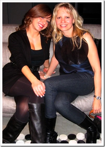
image Here are my dark skinny jeans!

I consider myself to be a practical shopper who buys ‘classics’ so I was a bit sheepish about the 2 bags of clothes. Most of them I have barely worn. I try to shop outside of the box but then I don’t end up with clothes that are ‘me’. And I still stick a turtleneck on in the end because I hate to be cold. I have 11 turtlenecks.

blog photo I have four black ones :)

The other reason I don’t need to spend a lot of money on clothes is I don’t go to an office everyday (like I used to) where I didn’t like to wear the same thing for 3 weeks. I see different clients and different suppliers every day so I just want to look designerish (is that a word?). Plus when I do on-line consults, I could be in my bathrobe, which honestly does happen sometimes. When I’m working from home I get annoyed when I look up at 11:00 am and I’m still in my robe!
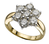
image I love this ring!

So back to the moral of my story; I had bought 2 sweaters last week which my stylist pointed out were all wrong for me so I returned them (Value $130.00). My consultation with her cost $250.00 - $130.00 which she immediately saved me, actually reducing the total cost to $120.00.

I would not be happy if I started adding up the cost of all the clothes in those 2 bags that I have barely worn. So I have decided to only buy clothes with my stylist. Is this only for the rich and famous. Hardly. But isn’t that how we think about hiring these professionals?
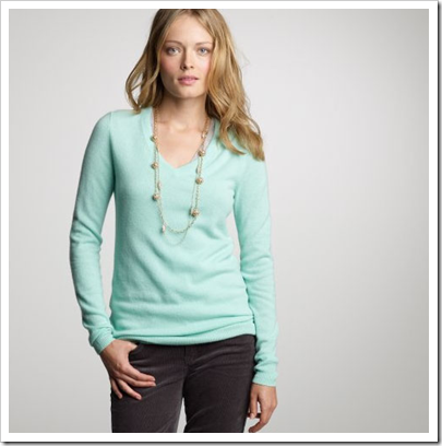
image Turquoise is my colour I need a sweater like this she said

When I arrive at a clients house, many times they’ll say to me “Just ignore that rug it was only $200, that was only $50 bucks I can toss it, and the list goes on. Wouldn’t you rather just pay for a designer to buy the right pieces in the first place so that your house looks finished and most of all has ‘atmosphere?’.

How about the gallons of paint you buy in the wrong colour? I have never left a consultation without the client saying (or thinking—I can tell :) I never would have thought of that! Just this week a client (in a kitchen renovation) was going to replace all the laminate flooring in the house because it had faded from the sun in the kitchen dining area (and they couldn’t find a match to the existing flooring). I suggested they take the tile that was going into the kitchen into the dining area as well, saving them thousands in labour and new flooring!

image Image via House of Turquoise

Well that’s where I’m at with my wardrobe. I would rather pay my stylist and buy a few quality pieces that I’ll add to my favorites pile than waste a bunch of money on clothes I don’t wear.

She pointed out simple things like the length of my tops (many were too short) necklaces (should be longer for me) and my favourite Bebe jeans were wearing out so she told me to hem them so they could be my weekend jeans (and then I could wear them with flats)! Things that did NOT even remotely occur to me!

image Image source

Just like when I’m in your house. There’s a fine line between your colour and furniture having a relationship with each other and being too ‘matchy matchy’ or the opposite extreme. You know the “Just-moved-in-need-to-paint-moving-out-soon-look”. The latter a client said to me once and I wrote it down I thought it was so funny—and true!

So just before you decide design advice is only for the rich? Think about what I’m saying. Professional help is not free but we don’t value the help we get for free the same anyway!

image Image via House of Turquoise

When I’m being paid, my clients are listening and paying attention, vs. my family or friends (quick email questions excluded) who take my advice for granted and sometimes waste my time because they are not paying for it! Okay, that’s another post so I’ll stop there, but I think you see what I mean.

You know that post I wrote, 20% of the colours we use 80% of the time? Isn’t it true that we tend to wear 20% of our wardrobe 80% of the time?

I’m thinking a Designer or Stylist equals Stylish homes and Sylish wardrobes, period!

If you want your home to have atmosphere including colours that flow to fill you with happiness every time you walk in. Contact me by email for on-line rates or call me directly if you are local.

Related posts:

Why you can’t afford NOT to hire a Colour Expert

When it comes to your Decor, your friends are Polite

Signature look or your clients look; Which one works the Best?

Design Pet Peeve: No.Two

Ick.

See, I told you there would be more! Ok, so I am not a fan of towel bars. Pourquoi? a.) They aren't all that attractive 2.) They are annoying to use and c) Why take up so much wall space by displaying a wet towel? I much prefer a hook (preferably hung on or behind a door so it is out of sight). Keep dry towels folded on an attractive vanity/shelf or rolled up in a nice basket. They have that pretty etagere above, why not fold all those towels and keep them on there? Again, I'm just sayin'.....

Real Simple

Designer Suzanne Kasler


Country Home

Thursday, January 28, 2010

Fresh & Fruity Colour Trends for 2010

One of my blogging pals Kelly at Arte Styling is in the annual Colour issue for Better Homes & Gardens for February!  It’s such a great interview I had to share it with you!

image

I especially love how she answered this question as it relates to a post I wrote last year:

BHG} What sort of message do some of these brighter pinks and oranges send, especially when used in an interior?

KB} They send the message of energy and warmth. They are youthful, playful, fresh, sassy, friendly, approachable, social, lively and open. When you use these colors in your home you are expressing these qualities in yourself. Citrus-infused colors tell everyone who comes into your home that you are full of warmth and energy. If that’s the message you want to send, then these hues are right for you!

image Images from Arte & Styling Blog

Click here to read the interview, it’s so great! Congratulations Kelly!

Related posts:

Warning; You are the Colours in your Home

Rules are for Breaking by Janice Lindsay

Bobbie Burgers in Full Bloom; Inside House & Home Magazine

A Pink Tablescape with Sarah Richardson

If you are new to this blog, click here to see the Best of Colour me Happy

Design Crush: Lindsey Coral Harper


Interior designer and University of Georgia alum (holla!), Lindsey Coral Harper, left South Georgia for The Big Apple and has been kicking the design world's ass ever since. Her resume includes an internship with Ralph Lauren in London, eight years working under famed designer Richard Langham and freelance work for Dorothy Draper, Inc. just to name a few! Images of her New York apartment have been blowing up the design websites/blogs and she was set to be featured in Domino just as the magazine folded...wa wa wa. But don't feel too sorry for her, when you are as talented as she is, you are bound to recover.

Lindsey Harper's NY Apartment


Lindsey's sister and my sister-in-law are bff's so we have been hearing about each other for years but have yet to meet. I finally emailed her introducing myself and she was nice enough to take the time to answer some questions. So here goes...

After years of residing in NY (and abroad), do you think your southern roots have any influence in your designs? If so, in what ways?
ABSOLUTELY! I am Southern to the core, ask anyone who knows me...or ask me a question and you can hear it as I still have the accent. Or as my grandfather used to say, "we don't have an accent, the rest of the world does". One of the things I love about this city is that there is a huge southern contingency and we stick together. I actually have a large group of southern decorating friends and we refer to ourselves (and so do others) as the Southern Mafia. I do think being southern has had a huge influence on my life, the way I live and the way I design and decorate. I am big on comfort and I like most southerner's I love to entertain! I really try to get to know the client and figure out who they are and how they live so that I can make their house or apartment a welcoming and comfortable environment they really love to be in all the time. In the end it's really about lifestyle!

You have such talent for accessorizing and creating eye catching tablescapes. Any advice or rules of thumb you live by?
Why thank you! I do love my accessories. If anything I'm a maximalist not a minimalist. I love shopping, antiquing, flea markets, and junk stores. If an object catches my eye whether it's a great color or a wonderful shape, a bit odd or makes me laugh, I will usually buy it. A great accessory doesn't have to be expensive or "important". It just has to mean something to you. I also love to travel so I bring things home with me typically in my carry-on (I do not check my luggage) and then I have a little reminder of that place and that trip. Most of my accessories are really wonderful memories.

You clearly are not afraid of color! Where does your color inspiration come from? And are there any colors that you refuse to work with?
I certainly love color. Not sure why, but it just makes me happy. And if you think my apartment is colorful, you should see my closet!! Maybe because I'm a redhead, I had to deal with pairing colors and getting colors right from an early age. I also think my color confidence comes from working with RKL. He too admired color and wasn't afraid to use it. He trusted me to pick paint colors for him on several jobs in the beginning of my career there. A few years later I was specifying all the colors for all of my clients and big jobs, no questions asked. He was a huge risk taker and pushed me to think outside of the box. I also like to try new things and new colors!! There are so many great colors, textiles and color combinations out there...why do the same thing over and over?! The only color I'm really adverse to is white! I rarely do white walls. Unless you have a KILLER art collection, you are going to have to really beg me to give you white walls. If I do white walls look closely, they are probably a textured paper and will definitely be paired with an amazing hi-gloss colored ceiling! Don't you just love when a really well done hi-gloss ceiling looks like glass!

Some of Lindsey Harper's Design Projects

Palm Beach


New York


This busy designer is currently working on several projects from Vermont to New York to Palm Beach. Click here to see LCH Interiors full portfolio.

Lindsey also has an online shop, called Lamshop, with her bestie and business partner, Maggie Currey, which offers custom furniture, art and one-of-a-kind treasures. Lindsey said they are working on some new pieces incorporating fun elements like Shagreen, Tortoise, Malachite, and Faux Bois as well as some new jewel-inspired tables that are "very glam." I cannot wait to see what she comes up with next!!!

Wednesday, January 27, 2010

Decorganizing Wednesday: Party Invitations

Here goes, Decorganizing Wednesday...

If you are really popular (like me) and having a hard time figuring out what to do with all of your party invitations, take some cues from these creative folks.


Designer Lindsey Harper


Designer Mary McDonald for Domino

Use an old door or shutter.
P.S. I tried this once and the tacks wouldn't penetrate [pause for giggles] the old wood so check first!
Designer Kay Douglas for House Beautiful

I have a random wall in my kitchen that is about 30" wide and I have filled the entire wall, floor to ceiling, with invites and photos. I tried using the chalkboard/magnetic paint but it wouldn't hold a magnet (despite three coats) so they are just tacked in. I am real excited about the day when I get to spackle this wall![she says sarcastically] Therefore, I highly suggest using cork instead.


When you are done displaying your invitations, you can cut them up and use the pretty printed parts as tags for gifts (or so says my inner Martha). Anyone have any other creative ideas for displaying party invitations? Leave a comment!

Tuesday, January 26, 2010

Managing Client Expectations

A big reason (besides atmosphere) why people hire designers is because they have a hard time visualizing the end result. What will that fabric look like on that sofa or is leather better? Read my opinion on leather here. Will I like that colour all over my living room? Managing expectations is a very important part of our job!

image Image from Cote de Texas

The length of drapery is something I’ve been focused on lately. After reading Joni’s post on Curtains, I decided (depending on the house) to start installing my drapery at floor length or even pooling if necessary (I confess I am a romantic!).

So right before Christmas I installed 60 yards of fully functioning striped, silk drapes, just touching the floor (like the above photo) in a living and dining room. Then I received an email (from my clients) in the new year saying they didn’t like the fact that the drapes seemed to have too many ‘kinks’ in them (above and below) and were puffing out too much from the forced air vents.

image Image from Cote de Texas

I thought they were talking about the fact that silk has a natural ‘wrinkly’ look to them, just like linen! As it turned out, they simply needed to be taken up by 3/4 of an inch with a chain added to the hem, otherwise it would take too much fussing and managing, which in the end--the lesson here is--if they are stationary, you can pool them or have them touching but if they need to be drawn nightly, they need to hang just off the floor (unless you are okay with the fussing that will be required)!

image Image from Cote de Texas

It’s also a good reminder that if you are installing silk or linen in a clients home to let them know they will never look perfectly straight because of the nature of the fabric!

Yesterday, I received a hasty email from a client telling me that the colour I had chosen for her powder room was way too purple!! It was 2112-30

imageWell since I had picked it to coordinate with the upholstery fabric in her great room I was very concerned!! So I drove out immediately to take a look:

Colour me Happy Blog 441 First of all, this is NOT I repeat NOT the way to test a colour. This particular shade of gray definitely has a purple undertone but it is being tested (with one swipe of a paint brush no less) on a yellow, goldy beige colour. And what happens when you stick complementary colours together? Each one makes the other pop!!

I tried to assure my client that it would in no way look that purple once it was all painted in her powder room and that currently there was zero context for the colour but I might as well have been Charlie Brown’s teacher. . . (after all there it is, PURPLE and she can see it with her own eyes!)

However, I was completely responsible for the fact that I had not shown her how purple a gray it was in the first place, (because I did not have an oversized sample of it in my kit) and it wasn’t obvious just looking at it without comparing it to anything else. I should have compared it to a greeny gray and a blue gray so that she could have made the decision seeing it in context!

imageimageimage

So to fix it, we whipped out to the nearest Benjamin Moore store to tone down the purple (in the gallon) so that she was happy. Which is what we want, isn’t it? Turns out the upholstery is not as purple as the colour and once it arrives and we decorate with some fun and fresh colours (including the existing yellow in her living room to bring in flow), it will be fabulous!

Colour me Happy Blog 443

The adjoining great room, painted in Inukshuk (A taupe with a little pink in it) looked fabulous in her north facing room. She was happy that it looked brighter than she thought (because all colours get twice as bright once they hit the walls) and as a north facing room adds gray to a colour a little pink was needed to have the colour look beautiful!

image

So there it is, a lesson in the latest colour trend (in action) and I need to learn to articulate it better to my clients because what is obvious to me is not obvious to everyone unless it’s compared to something else!

A great reminder that managing client expectations starts at the beginning of every job all the way to the end, and makes all the difference between a good designer and a great designer!

Related posts:

Colour is Context

When to buy Leather Furniture

What Everyone should know About Gray

White-on-Gray-on-White by Kelly Deck

If you are new to this blog, click here to see the Best of Colour me Happy

LinkWithin