Tuesday, June 30, 2009

Can't You Just Taste The Sweet Tea?


Summer is in full-force here in Charleston and it is H-O-T! But that doesn't stop us from being outside! Whether beachside, poolside or dockside, we will spend countless hours outdoors amongst the mosquitoes and humidity relishing every minute of our Utopian town.

In a city that is famous for its southern porches (or verandas or piazzas), we clearly do a lot of outdoor entertaining. As the big holiday weekend approaches, I am looking forward to spending time amongst close friends enjoying good food, great conversation and lots of cold beer! I know it is only Tuesday but I am already dreaming of the long weekend hence these inspirational photos to help get you in the mood as well. Happy daydreaming!
~Images: 1) Unknown 2) Window and Wall Ideas Summer 2006 3) House Beautiful March 2002 4) Elle Decor 5) Country Home March 2008

Fabulous Ways Of Using Curtains


Removing doors and replacing them with full length curtains is not only an inspirational idea in rooms where doors are impractical, they are also make a very elegance and frame through which to look through and an easy way for the eye to be naturally drawn through into the next room and the natural light coming through the window.

The aspect I really find an easy, yet brilliant idea is to have the tie backs up high to enable the space to be fully utilised. Of course, this type of door way is a perfect for any type of interior design, be it traditional, modern or contemporary, it would purely be just a matter of choosing the right style and colour of fabric and altering the pelmet to suit.

With the curtain pelmet touching the line between the wall and the ceilng also adds height to the room. Look closely and you will see that the windows in the other room have the same curtains, also with high tie backs, creating a real sense of cohesion and harmony.

Using tie backs up high would look wonderful on sheer fabrics such as silk and voiles, particularly if you were to use the latest trends of beaded tie backs in a contrasting colour. Opt for opaque beads to allow the sun to make fascinating patterns of subtle colour to give the room a wonderful and gentle focal point.

Much nicer than traditional style of net curtains used in many homes in the UK, predominately to stop prying eyes seeing into other people's houses rather than for their somewhat bland and in my opinion boring and outdated look which do little to enhance the beauty of anyone's windows!

Image: Absolutely Beautiful Things

Monday, June 29, 2009

Zebra Rugs

Another favorite of mine is the zebra rug. There is just something about the graphic design and the soft texture that makes a room seem instantly glamourous. Here are some images I have collected over the years. I especially love layering a zebra rug over a seagrass rug like I did in my own living room.
~Image: 1) Designed by Ken Fulk 2) Designed by Jonathan Adler 3) Liz Lange's Home Designed by Jonathan Adler Featured in Domino August 2007 4) Designed by Margaret Ann McEver in Domino April 2007 5) My Living Room

Want One? Zebra printed on cowhide rug approximate size is 5x8 for $595 + shipping. Email
sidney@eclectic-idg.com for more information!

Sunday, June 28, 2009

10 of my Favourite Posts

Things that Inspire does an annual “Favourite Posts” every December. She said every time she comes across a post she likes, she saves it in a folder. I thought this was such a great idea, I started doing the same thing but it’s June and I was already at 14, so I thought I would do a mid year review instead. So here are my top 10 favourites in no particular order:

image 1. Since this post is inspired by ‘Things that Inspire, I’m starting off with one of my favourites from her blog. It’s hard to choose one, she writes such extraordinary posts, this one is called Light on Two Sides. Who would have thought there was even such a distinction, but there is!

2. Next is COTE DE TEXAS. You need a fresh beverage when you sit down to read one of her posts because each one is like a magazine. This is a woman that get’s over 100 comments on every post she writes. And it’s easy to see why, the amount of work and research that she pours into every one she writes certainly deserves the amount of attention her blog gets from her readers.

image This post is called “Like Mother, Like Daughter”, where she compares. . . well you’ll have to read it to find out.

3. Next is ‘Design Esquire’. It’s called Kitchen Inspiration and I fell instantly in love with this kitchen (below) without upper cabinets. So beautiful and clean looking. Love the windows!

image

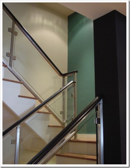
4. This post from Designing Your Dream Home is called ‘Staircase Railing Part One: Iron’. She has a total of 5 posts about railings, everything you need to know about this topic! Here is one of my favourites from her post:

image 5. And one of my ‘closer to home’ blogger friends Patricia Gray Interior Design wrote a post about ‘DIY Canopy Beds’. With drawings and instructions, she walks us through the process of doing it yourself!

image

6. Just Imagine, wrote a post about my favourite colour called ‘Yellow’, it is filled with images of this happy colour!

image

7. Another Vancouver blogger friend, Albarosa from Brillante Home Decor has a wonderful blog all about design and travel in Italy. Here we got to see ‘A House on Como Lake’.

image

8. A Schematic Life wrote a very cool post with images of the set from the Kevin Costner movie from the 90’s. It’s called Message in a Bottle Set, Even I would approve of this leather sofa!

image

9. One of my blogger friends Brooke Giannetti from Velvet & Linen has a fabulous blog which covers the everyday life of a luxury interior designer in LA. It was very hard to choose my favourite and I already posted a photo of her dining room here because I loved the way it was styled. This is Brooke’s second home in Channel Islands Harbour and this post is called C Magazine, because it was also featured in the magazine.

image

10. LaurenFaythe, posted a house that was entirely decorated in yellow, called ‘The Yellow House’.

image In my experience, an entire house all done in yellow is too much for most people. Clients that have all yellow homes have called me--not to get rid of it--but to help them choose other colours that coordinate with it. I did think the bathroom above was very luxurious, with full drapery, not something you see very often.

I hope you enjoyed my top 10 posts. Hopefully this will inspire you to start your own lists! There are so many talented bloggers out there, it was very hard to choose only 10.

Related posts:

Colour me Happy's Top 10 Posts (from July - Dec 2009)

When to Buy Leather Furniture

Why is it so hard to choose yellow?

The New Hollywood Regency (A Kelly Wearstler Residence)

A-ma-zing Closets


After a long day at the beach, I am now trying to be somewhat productive although my body is really fighting me on this. As I am putting away my laundry, I am wishing that I had a really grand closet. Wouldn't it be great to have a closet that mimics a store boutique? Take a look at some of these amazing closets! I am officially inspired. Hopefully I will post photos soon of my new and improved boutique closet!
~Images: 1) Eva Jeanbart-Lorenzotti's closet featured in Domino April 2007 2) Designed by Kay Douglas featured in Traditional Home May 2007 3) J.Crew Creative Director Jenna Lyons featured in Domino Nov 2008 4) Unknown 5) Designed by Barclay Fryery

Friday, June 26, 2009

10 ways to Save money Now by Creating a Focal Point!

You know when you first tour the home you are about to rent or buy? You see all the flaws, the cabinets you will paint (yesterday!), the fireplace stone (it’s gotta go), or how about comments like “Honey there are no crown moldings!” etc. Besides seeing the ‘potential’ of the space, what you also see is the ugly and the dated and before you move into a house, it all seems larger than life not to mention, very expensive!

image Then you move in, your furniture is placed, your artwork is installed and those flaws you originally saw as such ‘deal breakers’ don’t seem so big any more.

Clients have said to me “Well I just got used to it I guess”. But I have another theory and it’s closer to--you simply have something else to look at now that you've moved in.
image

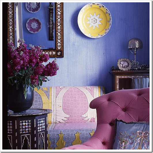
1. The mirror hides the imperfection in the wall [above].

2. The piece of art above the fireplace becomes the focal point, therefore the mantle or stone doesn’t seem as bad as it did at first.

3. Ever notice how much sexier your dining table or desk looks--even when it’s covered with paper--if it has a stunning vase with flowers in it [below]?

image

That’s how important it is to have a focal point in each room of the house!
image

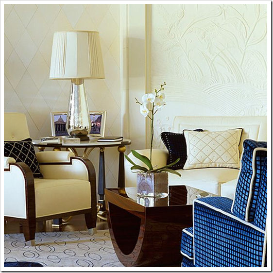
4. If the end table in your living room is the first thing you see when you walk in, (like in this image above) then your lamp needs to be one of the most important pieces in the room!

5. Toss Cushions. You would be surprised at how quickly your sofa can be transformed from dull and dated to interesting and eclectic, with the right toss cushions. It seems obvious but all you have to do is take a piece of fabric (or a matching cushion from your sofa) on your next shopping trip to bring some colour and drama home with you!

6. Bedrooms. The bed is the easiest piece of furniture to keep neat and tidy so if the first thing you see when you walk into your (or your kid’s) bedroom is a messy bookshelf or desk, re-arrange the room. It’s amazing how many clients look at me like I am a genius when I make this suggestion (which of course I am :) when it seems so obvious and straight forward to me. However, I don’t judge, I am just thrilled that you have hired me to help you make your home more beautiful!

image

Above images from flickr

7. Garage. Why does it need to be white when the walls in this room get the biggest beating? Bikes, lawnmowers, garden equipment, outdoor furniture, etc. Paint it a fabulous colour (which then becomes the focal point) that fills you with happiness every time you see it and read my post about light colours in dark rooms, if you are still not convinced!

8. Bathrooms. I have saved many an immediate (I can’t stand this bathroom!) renovation by selecting the right colour for the cabinets (that relates to the countertop) and the walls (that relates to the tile), but this solution only works if you have the right colour. This is when the design fee of a colour designer really looks like a bargain!

image House Beautiful

9. Kitchens. Cabinets if they are dated, should be painted white or cream period [above]. Read my post on white kitchen cabinets and then have your husband read this post so that he can get aligned with you on painting them! It’s possible also to paint the backsplash if you can’t afford to take it out immediately, sometimes my clients have just painted the dated accent tiles individually if required.

10. Crown Moldings. Okay do they really need to be the first thing you install in your living room before it’s even decorated? I know what this is (your husband is so busted!); men get the value of a house, they want a big, beautiful (our friends will be so envious) house, but then decorating it? The budget suddenly dries up. Is this a familiar song? That’s why I just don’t see the point (of making those kinds of--barely noticeable--changes) until at least your living room is decorated! When you are moving, a stylish living room will sell your house way faster than having crown moldings anyway, so take my advice and decorate instead!

Happy Weekend Everyone!

Related posts:

Colour & Condoms

A Light Colour will Never Come to Life in a Dark Room

Selecting your Kitchen or Bath Backsplash; Accent tile or NOT

The Secrets to Selling your House in 2009

New to this Blog? Click here ; Subscribe to my Monthly Newsletter; Become a True Colour Expert

Happy Birthday Finn!

So today is my nephew Finn's 7th birthday (oldest of my three nephews) and I am so bummed that I could not go to Atlanta to help him celebrate. However, I wanted to give a shout-out to the cutest, smartest (and oftentimes most manipulative) little boy around! I have enjoyed being your aunt more than you will ever know! Don't you just want to pinch his cheeks? And I couldn't resist sharing with you some of my favorite quotes of his because he is always cracking me up! Happy Birthday buddy!
Finn-isms:
-When he told me this week that the video game he wanted was really, really rare and they only sold it at Target and Walmart.
-When he asked me what my boyfriend did for a living (in the same tone that my father would ask me...he was three at the time).
-When he gave me the tour of his bedroom/bathroom (where I was sleeping for the night) and told me he left out some shaving cream in case I needed to shave my legs.
-When he told his classroom that his aunt lived in Charleston with all the boys (no idea where this came from!).
-When he told me he could see "my plumber's crack." (Thoes darn designer jeans!)
-When he puts things in air quotes (this is a new development and he never uses them correctly a la Joey on Friends).

Thursday, June 25, 2009

Barbie Furniture


As a young girl I was a huge and I do mean HUGE Barbie fanatic! I would spend hours upon hours "setting the scene" for the Barbie play I was going to act out. In fact, the setting up was my favorite part...I would lay out the Barbie village and decorate Barbie's Dream Home and plan out her wardrobe according the the imaginary play that I had created. I was in heaven! I was fortunate to inherit lots of Barbie furniture and clothes from older cousins and family friends so my entire basement was a Barbie Wonderland.

When my parents moved from Atlanta to Beaufort, they brought several boxes of my old Barbie stuff with them (God bless those pack rats!). Recently I spent a weekend at their house and I relished going through all the old 80's Barbie fashions and 70's furniture (remember the blow-up stuff?). It is unreal the amount of joy those little plastic dolls gave me the first decade of my life.

One of the fantastic discoveries I made in the old boxes were some bright yellow "S" chairs. I was not alive during the chairs' prime but have since discovered them in many of my favorite design magazines. The "S" chair was invented by Verner Panton in 1960 and is the very first single-form injection-moulded plastic chair ever made. Also known as the "stacking chair," these were his most mass-produced and well-known product.
~Images: 1) Traditional Home 2) Rashida Jones Home in Domino Feb 2008 3) Domino March 2008

Want One? Try www.moderndose.com where you can pick up a reproduction "S" chair for only $265!

Tips to decorating A Child's Bedroom


I'm staying with the theme of bedroom for children and teenagers as these rooms often pose dilemmas for parents.

Things I would recommend:

* Children grow very fast, silly statement I know but it's true! You send money and hours decorating it the latest fads of favourite TV characters and before the paint is dry they have changed their minds! Stick with more neutral themes and let them add their own identity by have their favourite toys (of the moment) and opt for cheap duvet covers which can be replaced without spending a fortune.

* Window dressings, always opt to have black out lining unless you want to be woken every morning by your children rather than the alarm clock! You can fit blackout linings to any style of curtain fabrics, and if you prefer to use blinds chose the ones which are made with light blackout fabrics.

* Flooring, this needs to be easily to keep clean. In the UK carpets are now being replaced with stripped floor boards or wood effect laminate flooring which is much easier to keep clean and far more 'accident' proof than carpets! Don't be fooled into thinking it's only toddlers who have 'accidents', as your child enters teenage years 'accident' of a different kind, usually alcohol related, will also take their toll on a carpet!

* Furnishing, trendy beds and furniture made from wood or metal are a good investment for children of all ages. Bunk beds or bunks which have a working space underneath are great space savers.

* Above all keep things simple! The more fancy you try and make the room the more cluttered and untidy it is likely to become. Always have lots of storage space and add shelves to store books, DVDs etc.

Image: Freshome

Wednesday, June 24, 2009

[Colour Theory] Rules are for Breaking by Janice Lindsay

I have secretly always thought that the emphasis placed on the basic ‘rules’ of colour theory were completely overrated. When I worked at Benjamin Moore at the retail level, [many years ago] and colour theory students would come in looking for help on a ‘complementary’ colour combination or an ‘analogous’ colour combination, it always occurred to me as a useless exercise. “I guess the way I pick colour is different from other people”, I thought.

image

When I taught colour theory at a local community college, I spent exactly 10 minutes in the first class distinguishing these combinations (and that was the end of the lesson). I have always told my students that it is definitely important to understand the theory behind the combinations; when you are specifying colour, you need to know that blue is the opposite of orange (complementary) and that yellow and green (analogous) are beside each other on the colour wheel, but I have never once specified colours saying to myself “I think this is going to be an analogous colour combination”.

image

Then a couple weeks ago, one of my designer friends in Calgary, Carol Ann told me about a book she wrote about here in her blog. So I ordered it on-line and it just arrived yesterday! This book, written by a fellow Canadian, Colour Designer Janice Lindsay, called All About Colour, is fabulous, (and here it is in writing, so now I can say it out loud :) and I quote:

image

No one, and I mean no one, uses theory to design their colours. If they do, they are amateurs. Colour theory explains how colour is organized. It is excellent for labeling what has been done. It gives us terminology for describing colour palettes.

I might tell you that here we have an analogous colour scheme, hues from neighbouring or similar colour groups, and this is a complementary one. Over here, we have gone for a monochromatic or a single-colour approach. And to really impress you, I might draw your attention to some split complementaries. Well lah-di-dah. You might think I design according to rules of colour theory. I can only categorize them—after the fact.

The funny thing about colour theory is how interesting it seems and how useless it is.”

People in the know about colour seem to think it is important, if they sang its praises, I hummed along. But the truth is that I never really understood how I was supposed to use it. I put colours together by feel." Janice Lindsay

image

All images from Pink Colour & Design

So my lovelies, put your mind at ease if you have done a colour theory course and barely remember what the rules are, or if you worry that you should be using them and don’t. That is exactly how I have always chosen colours as well--by feel. As long as you understand the colour wheel, you don't need to be that concerned with the 'theory' behind the combinations. After all, we don't use that language with clients either.

And of course taking into consideration that clean and dirty colours should only be included on the same palette if you intended it to happen. In other words, these are guidelines to follow and understand in general, unless you want to break the rules. However, as I always say to my students, at least you will know when you are breaking the rules instead of putting colours in a space that clearly do not work!

Related Posts:

What Everyone should know about Beige

Clean vs. Dirty Colours

Three Ways to Describe Colour

Organizing Your ReDecorating Project


If you have ever built a home, remodeled a home or even redecorated your home, you know how overwhelming it can to keep up with all of the information like paint colors and window measurements and fabric samples. My clients often ask me what is the best way to keep track of all this pertinent information and I think there are several good systems, it really depends on which one works best for you.

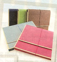
If I am taking on a large design job I like to use an accordion file. I label each tab with the name of the room like "living room" or "master bedroom" or by category for example "notes" or "photos." This system works well for me because I can keep all information in the pocket for each room (tear sheets of products, sketches, room dimensions, etc.) and I can carry the accordion folder with me to showrooms so I have everything I need at my fingertips.

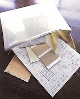
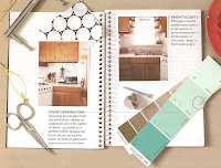
Another good system for organizing your redecorating project is a spiral notebook or sketch book. For example, you can attach photos of your living room sofa, notate the measurements and even paperclip the fabric swatch directly to the page. A notebook is also easy to carry around with you and you can make direct notes while on shopping excursions. If you want to have the information at hand but don't feel the need to be quite so organized, you can also keep all the information in a zippered pouch. Samples will fit nicely and all of your sizes and dimensions can simply be jotted on graph paper.

In order for any of these systems to work however, you must keep the information updated and easily accessible! I would recommend keeping it in your purse or your car. If you are out shopping and find an amazing handmade pillow and want to know if it will match your new bedding, you have the fabric swatch handy. Or if you finally find the perfect antique farm table but are not sure it will fit within the confines of your dining room, you can retrieve your file, notebook or pouch to look up your room's dimensions. Ta da! You have just avoided buying yet another piece of furniture that won't fit in your home!
~Images: 1) Unknown 2) Martha Stewart Good Things 3) Blueprint

Hipster Rug


Following on from my last post I had to share this fantastic rug with you! Created by Lil Mo this 'Hipster' rug it has to be one of the coolest rugs you could possibly choose for a teenager's bedroom.

You may not know what all the abbreviations mean but I can assure you with most teenagers using text chat and internet abbreviated speak all the time they will find this rug really trendy and will be the envy of all their friends!

The colours are just as cool and will blend with any décor scheme and style quite easily. It may just shock your kid's to know that you are just as hip as they are even though you prefer not to speak in abbreviations all the time! The rug is available in different sizes and is 100% acrylic giving you the durability you need in a teenager's bedroom!

If this rug is not quite to your liking Lil Mo has created other great designs with kids in mind. Visit Atticmag to see others in the the collection. These may not be cheap rugs but the certainly do cater for children of all ages and tastes and a ideal way to keep your kid's happy!

Your kids will be astounded at your impeccable taste in soft furnishing and they may even teach you how to text at ultra fast speeds...in abbreviated text of course!

Well, you have to LOL occasionally even if you really would prefer to stay straight-faced!!

Tuesday, June 23, 2009

The Best Way to Update Forest Green

If you still have forest green sofas from the 80’s, this avocado green will go a long way to updating your living room! Doesn’t it look amazing here?

image Miles Redd in House Beautiful image

One could argue that this is the new Kelly Green but it looks pretty forest green to me! Of course the nail head trim on the doors scream old money, but still – the yellowy green gives it the lift you need especially in a hallway.

See how it’s the fresh green that works in a room with no natural lighting? It’s a gray green that would dull it down as most people don’t have their lights on in a hallway during the day. However, if you have a dark corner in your living room, please, place a lamp there, as I mentioned in this post. Don’t just paint that dark room a pale colour, as you will not get the result you are looking for.

Related posts:

Colour me Kelly Green (A Jamie Drake Design)

Glamorous Hotels in London

Displaying Family Photos


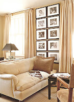
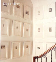
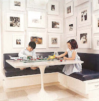
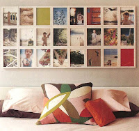
One of my biggest design pet peeves is a mess of mis-matched picture frames overcrowding a room. As I tell my clients, if there are too many frames then it just reads as clutter and you no longer see the amazing photos they are trying to showcase. With that being said, I love to display family photos and think it is an important element in making a house a home. So I am constantly trying to come up creative and stylish ways to display some of my client's favorite photos. I feel that displaying family photos tend to have more of an impact if they are framed in a similar manner and hung together in a grouping so the photos themselves takes centerstage. Here are some great examples that I have collected over the years for inspiration.
~Images: 1)Unknown 2) Southern Accents Designer Betsy Brown 3) BH&G July 1998 4) Elle Decor 5) BH&G July 1998 6) Domino Oct 2005

LinkWithin