Thursday, February 26, 2009

Vancouver's Colour Expert reveals the Insider Secrets to Testing & Selecting Paint Colours

image flickr

I arrived at a colour consultation yesterday and my lovely client Deborah agreed to let me photograph the consultation for my blog. She needed a colour for her living room. A new colour to freshen it up, she liked this one but knew it wasn’t right.

Colour me Happy Blog 063

You can see the existing yellow shade was looking a bit green next to her sofa and drapery which were more of a goldy beige.

Colour me Happy Blog 064

image

Colour me Happy Blog 073

The reason I took out my fan deck to match the existing colour was because she didn’t want to re-paint her entry (which was the same colour as the living room) because that colour continues back into the kitchen which she will be renovating. I had to make sure the new colour worked well with the one we were keeping.

Colour me Happy Blog 065

I have approximately 50 – 75 larger painted samples [above]. The best colour training I had in the beginning of my career—many years ago--was with the Daystudio in San Francisco. Joanne [Day] said, every time she picks colour for anyone’s house (and she’s been doing this for 35 years), she comes back with a 5 ft by 5 ft painted board [for each room], and tells the client to look at it in the morning, at noon and at night. Why? The light will dramatically alter the colour throughout the day. And if you are mostly in that room in the evening and you hate the colour then, you might need a different one.

This is why I have always used 11 x 17 samples when I conduct consultations because there are many times, when I have picked the colour I thought was right from my architectural kit, (and they are approx. 2” x 6”) and then when I have held up the bigger sample, it was SO WRONG. Not using big samples like this would be mostly hit and miss, because we as designers can guide the client to picking the right colour. . . but first, we need to be able to see the undertone with all the existing finishes in the house, and second, they need to see what a bigger sample looks like because I can’t predict whether my client will like the colour once it’s painted on a bigger sample.

So back to the colour consultion:

imageIf there is an existing colour on the walls you must look at the new colour with a white background. Otherwise, you will visually be comparing the new colour to the old one and that will influence your colour choices. We propped 3 samples up on the sofa (from left to right): HC-28 Shelbourne Buff, HC-34 Wilmington Tan, and HC-38 Decatur Buff. All of them were close but HC-34 looked like it was the best one.

Colour me Happy Blog 068

Then we found some lighter ones, and propped those up as well (along with the Wilmington Tan which was the winner out of the above 3). The above two (from left to right) were HC-35 Powell Buff and HC-26 Monroe Bisque. Here the Powell Buff was the right choice because (compared to the sofa) it had a little more orange in it (compared to the Monroe Bisque which looked green). And actually in the image above, you can see what I’m talking about.

Before you go running off to see the ‘orange’ or ‘green’ in either one, you need to understand something about beige. One beige colour will have more than one undertone depending on which beige you are comparing it to. I’ll explain this in another post—this one would get too long.

Colour me Happy Blog 070

With our choices narrowed down to HC-35 Powell Buff and HC-34 Wilmington Tan, we walked over to hold them up next to the drapes. We didn’t like the Wilmington Tan anymore because it looked too green next to the drapes (which you can see in the photo). Here you can also see that the Powell Buff is slightly darker than the Vichyssoise but it has more orange in it (with yellow, remember it’s always either more green or more orange depending on which way it’s moving on the colour wheel).

image

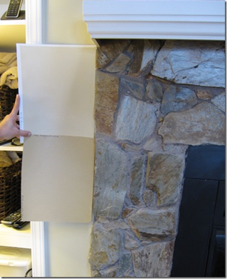
Then we held it up next to the fireplace stone and you can see here that the Wilmington Tan brings out the warmer gold tones in the stone. We briefly considered painting this wall the Tan (it was opposite the drapery) but decided against it because (I should have taken another photo here) there wasn’t enough wall space to have it work as an accent wall. The colour would get too choppy next to the built-in shelving on either side, etc.

Colour me Happy Blog 072

Then we held our chosen colour right beside the carpet. Here you can see that her carpeting is a pinky beige but she will eventually be installing hardwood flooring so we are ignoring the carpet. Even if she wasn’t changing the carpet, we would ignore it because there is nothing in her furniture that is even remotely pinky beige. A colour professional must know which elements of a room must be ignored and which you should work with to get the colour right!!

By the way, if you had art in the room, you would do the same thing. . . hold the samples up behind the frame to see how they look with the colours in the artwork.

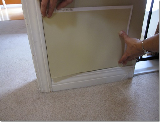
Next she asked me about trim colour because all of it needed to be re-painted.

image

image

As we stood there looking at her dining room (which is 2166-30 Bronze Tone) Deborah noted that the trim looked very stark next to the rich orange colour in the room. I agreed and we selected a warmer/creamier colour OC-38 Acadia White (which incidentally is the same colour as OC-130 Ivory White). In the image below, you can see that the creamier white would look much better with the rich wall colour. I could have chosen an even creamier trim colour had all the colours in the house been as rich and dark as this one but since we were pairing it with the lighter shade we had selected for the living room, we had to strike a balance. By the way, the existing white was CC-20 Decorators white which next to CC-10 Ultra White is the whitest white they have. When you are looking at white, make sure you compare it to the whitest white in the deck, otherwise there’s no way you can see the undertones in it.

By the way, notice the flow that has been created here? She has orange toss cushions in her living room and we have pulled the gold into her dining room with the drapery. That's how you start with flow. You don't just pull an orange from the sky if that's what you want your dining room painted in. You pick the 'accent colour' that is in your living room.

Colour me Happy Blog 076

A word about testing paint colours: This is what NOT to do. When you stick a bunch of painted samples up together on the middle of the wall (or worse paint them directly on the wall) you are now visually comparing them to each colour. I hear people say, “well I like that one because it’s warmer (like in the example below, the blues on the bottom look warmer than the top row because there’s more purple in them).” That doesn’ t necessarily mean it’s the right colour. Technically, you can’t even call a colour cool or warm unless you are comparing it to a ‘warmer colour’, or a ‘cooler colour’. When people say, “that’s a cold colour’, its usually because they are not seeing it in the context of the space.

Test swatches of paint by bbmowery.

In a colour consultation (when I was new) I had a client show me the tiniest little baby 1” x 1” stain samples on a brochure and ask me which one I would recommend for their hardwood floors? In that moment I thought ”Well I’m the designer, I should know shouldn’t I?” I left and called a designer friend of mine who said, “Tell them to get their hardwood floor people to paint up some bigger samples and that’s how they will know!”

I tell you this story because here I am, someone that understands that wall colours cannot be chosen from tiny baby samples on a fan deck, and I still got caught up in “I should know right?” in that moment. However, why would a stain colour be any different? Because it’s not!

See the colours on the pillars below? Now that is the size your samples should technically be. Especially when you are picking exterior colour for your house!

image

Bottom line: Testing is very important. Perhaps you can begin to understand also why a colour consultation (that was just one room) takes longer than 10 minutes. I have been doing this for so long I can pretty much narrow down the colour the minute I walk into a space. When I whip it out that fast, the client is thinking Why is it that one? Why not the other 2000 colours in your kit?”. So part of the process is showing them the pink undertones or the green undertones or other colour possibilities so they can begin to understand why the one I have chosen is the right one. By ‘the right one’ I mean when working with existing furniture and furnishings, obviously if the space is empty that’s a whole other conversation, for another post.

That’s part of what the client is paying for when they hire a professional. People want to know why the colour they have chosen is the right one or why it doesn’t work. The cost of hiring a professional gets very small when the right colours are chosen in the first place because it costs the same to paint the wrong colour as it does to paint the right one.

Related posts:

What Everyone Should Know about Beige

What’s an Undertone?

Clean vs. Dirty Colours

Colour is Context

The Right way to Create Flow using Colour

The first Mistake a New Colour Consultant will make Every Time

Tuesday, February 24, 2009

International Association of Color Consultants/Designers

I am a member of the IACC/NA (International Association of Color Consultants/Designers) which is the only accreditation in the world for color consultants.  I came across the website of  Charlotte Iseldyke, IACC, with The Color Company and she lives in Huntsville, Alabama.  I loved the intro so much (even the music which I’m always so quick to shut off on other sites) I had to share it with you.

image Color inspires the artist to paint

image

It engages you everyday

image

It wraps around you

image

And draws you in

Harness the power of color in your life

usTogether Bathroom Designs


If you love white and the very latest concepts in bathroom designs, usTogether bathroom suite will certainly tick all the right boxes!

The sleek and very chic basin and bath have very unusual clear sides which remind me somewhat of a fish tank! This bath is not for you if you share a bathroom as there is no modesty afforded here!

The suite maximises space in small bathrooms, a much needed asset in many modern homes where space is restricted, by incorporating the basin and bath into one slim-line unit which fits neatly along the length of one wall.

White provides a crisp, clean and very chic look in a bathroom. Combine this design with white décor and white blinds the room offers a sense of minimalist and almost sci-fi look.

The white contoured shelving is used to draw the eye along the line of the design. No clutter is definitely the order of the day in a bathroom such as this.

The use of white for the décor enables the natural light from the small window to be maximised fully. Using a slim-line white blind will enable the light to still enter the room and yet offer effective privacy to the outside world. By tilting the louvers of a Venetian blind upwards some interesting light effects can be achieved to add to the sci-fi feel of this bathroom.

usTogether are a team of British and Irish designers who focus primarily on bathroom designs. For further information visit usTogether

Image source: notempire

Monday, February 23, 2009

Sofa Love

Domino has a slideshow presenting the ‘Best of Domino' and the first image is of this antique sofa (which they recommend scouring Paris flea markets for—I will get right on that) Isn’t it beautiful? I would upholster it in a yellowy beige and cream damask.

image

image

Since my blog is all about colour, I thought I would post the blue shade behind the sofa (well what I think it is anyways). It’s cc-910 by Benjamin Moore.

Sunday, February 22, 2009

Six things about me

I’ve been tagged by Tiny White Bungelow and I’m to write 6 things about me and then tag 6 other people. So here goes:

1. I am in love with cute little faces, happy faces mostly. And the funny thing is I didn’t even realize this until I came home last year with yet another 'what not' with a smiley face.

image This candleholder with the dancing mice I fell in love with in a little gift shop in San Francisco when I was there two years ago. They just looked happy to me and I had to have them.

image Over the years my taste in art has changed and I have bought new pieces (and given away old ones) but this piece that I bought in the 80’s with the kids in the rain still makes me feel happy whenever I look at it. (and I live in rainy Vancouver so it fits)

image I bought this silly little thing (I don’t even know what it is) a few years ago cause I loved his face!

image

2. Even though I’ve been in the colour business for 10 years I didn’t really start wearing colour until last year when I learned that I was a summer and should be wearing turquoise, soft pinks, periwinkle blues and pastels. (In the winter it’s harder to find those colours though so this year I still wore a lot of black, brown and cream).

image Victoria’s Secret

3. I have hiked down and back up the Grand Canyon all in one day, and I’ll never do it again!

Grand Canyon 024

Grand Canyon 006

4. The single most powerful course I have ever completed in my life was The Landmark Forum 11 years ago. It changed my life (It’s the course behind the career I have now instead of the selling-my-soul career I had in corporate) and nothing thrills me more than when someone I know participates. The question behind all of their courses is this one:

image

5. I was raised a vegetarian. I did not eat fish or meat until four years ago my mother (who is practically a Naturepath) called me and announced that we were not getting enough protein in our diet and that we should start eating salmon. And because I do everything she says (with regard to health) shortly after that I was in Costco and I happened to be flipping through a book that said ‘People that add fish (especially salmon) to their diet notice such an improvement in their skin that they start eating it even more’. I walked straight over to the canned salmon, bought 12 tins and never looked back!

image

6. I got a Macbook for Christmas this year. . .I’m all excited. . . I now have a laptop. . . I can do powerpoint presentations in my classroom, I can blog anywhere – yaay! Right? Wrong.

image

Everything was great until I couldn’t figure out how any of the MAC desktop blogging programs worked and learned that (even the MAC users say) ‘Windows Live Writer’ is still the best desktop writer. So I still blog on my PC and do everything else on my MAC. So sad!

Bonus Tag: I know I’m already at 6 but I had to add, “I am also bossy but in a charming way”. Really. It’s true. Ask anyone that knows me :)

Alright, I am tagging the following:

Wise Space

Patricia Gray Interior Design

A Schematic Life

Meade Design Group

Design Ties (we get two for one here)

Things that Inspire

I look forward to reading your posts! Get writing!

Saturday, February 21, 2009

Happiness is. . . Having the Career that you Love

"People ask me all the time how can they get this life that I have where I do something I love, get to make my own hours, and support a family. Seems great, right? But that life also comes with this: having no idea how I'll get paid next. And it happens all the time." Penelope Trunk

image

I mentioned Penelope’s blog in a post I recently wrote about why blogging is good for your career. I love her blog because she gives the kind of career advice I would have loved to get ten years ago when I started my own design business and was filled with all the insecurities that come with working for yourself, trying to ‘make-it’ doing what you love, while looking for support in not selling out and going back to the corporate job that fit better into my comfort zone in the first place!!

image

Penelope’s bottom line advice on which career to choose? (You know, the corporate one or the freelance designer one?) "I just choose the lifestyle I want first, before I choose my work. I am a freelance writer because if I worked nine-to-five I wouldn't see my kids. That's my bottom line. There have been so many times when I've told myself that I can't stand the instability of a freelancer's life. But more than that, I can't stand the idea that I would only see my kids on the weekends.”

image

So that’s it. Choose the life you want and then choose the work that goes with it. Because the instability part she’s talking about? That is the part that goes hand-in-hand with being a freelancer! It’s about carving out your niche as a designer and that takes some trial and error to begin with!

image All images by Roland Bello

I decided 10 years ago that I have to be creative or die, and I would have loved this advice during the times when I truly questioned whether it was really in me to live the freelancers life. And then after a while, I started to trust myself and my abilities. I began surrounding myself with other designer friends that I could network with and exchange ideas and information with, and I discovered that I was not alone on the creative path. . .

image

Michelle Morelan (A Schematic Life), Nancy DeVries (Urban Aesthetics) Maria Killam (Colour me Happy) and Victoria Lambert (DesignTies)

Speaking of designer friends, I met Victoria Lambert from DesignTies for the first time last night at the Cantu Party along with a few of my friends (above). So great!

So now you have another way to approach the question of the creative job vs. the corporate one—if that happens to be the place where you are right now. Did I mention it’s totally worth it?

Have a great weekend!

xo

Thursday, February 19, 2009

Bathroom Paint Colours

Last night I took my students to a Benjamin Moore in Yaletown for a product knowledge session about paint. Michelle Campbell runs the store on Pacific Avenue and this woman knows paint and colour; She makes paint interesting! I walked out of the restroom at the end of the evening and said “I love the creative way the colours were picked in that bathroom” How cool is that!”. Three of my students had to look but they didn’t seem as impressed as me. One said ‘”But the floor is dingy”. And that to me was the point! How to take a dingy, commercial bathroom and bring it to life with just a little paint! Denise Bell, is the colour consultant that came up with this great idea and I loved it!

Colour me Happy Blog 141 image

The walls are painted in ‘Smoke’, but there are many other colours that would have looked great in here as well. Reds, oranges, yellows, fresh green, or even purple! In a bathroom like this, the choices are endless because it doesn’t need to ‘flow' with adjoining rooms!
Colour me Happy Blog 142 image

Here she matched the floor to come up with CC-490, Smoky Taupe and painted a wide stripe right next to it and beside the ceiling. This was the best part of the idea because now you are repeating the existing colour in the floor which creates a more coordinated look.
Colour me Happy Blog 143
image

Then she chose a darker browny/gray shade [Willow] for the door and another stripe in the center of the wall to ground the space and give it some depth! Commercial bathrooms can have the most unattractive floors (just like this one), so if you were dealing with one that had two colours that were just dead, you could repeat those colours in the stripes (on one wall so it’s not overwhelming, like she did here) and then pick a third unrelated colour with some punch and suddenly, the attention is off the previously dingy floor (but then you are not ignoring it either which can make it worse) and the whole space is transformed. That’s the power of colour!!

What do you think?

Related posts:

Another Powder room Colour

Creative Art for the Bathroom

Decades No. 2


I simply love the design and the idea of taking drawer fronts from different furniture pieces and mixing them together into one stunning chest of draws.

Decades No. 2 offers a practical storage space which is visually appealing and very ecco friendly! The discarded draw fronts were all sourced from flea markets and combine the draw fronts from offices and home furniture. This particular piece was designed for the Swedish Design Museum.

Recycling at its best in my opinion! A simple design concept which has produced a very practical piece of functional furniture. Incorporating different draw design styles across the decades brings a whole host of colour combinations together in a very stylish way. Each draw front has its own unique and original handle or knob, adding further interest and colour.

A great way to use a wooden blind to coordinate with the natural materials in the same room. Use in contrast or in conjunction with other wonderful salvage bargains the new in vogue ’Shabby chic’ interior design style will add a new concept to the meaning of shabby and very chic.

The Decades chest of drawers would look great in modern or traditional interiors as the mix of old and new provides a unique and very stylish piece of furniture. The white lacquered MDF shows each draw front off beautifully and enhances the natural and man-made material of each draw front in a very striking way.

If you would like further information and to view more images of Decades visit wisdesign

Tuesday, February 17, 2009

Ava Living

It was such a compliment to receive an email, from the CEO of Ava Living, a worldwide website for the interior design trade. It seems their design staff selected one of my inspiration rooms to be featured this week, through Sunday. I am rather new to this whole networking concept, online. There are never quite enough hours in the day to stay on top of posts to Twitter, Facebook, Ava Living, Merchant Circle and of course, my blogspot. I understand it can even be addicting! (That's another subject for another day.) One day, I'll learn how to "connect all of the dots!"

For now, thanks to the folks at Ava Living for placing me on the site.

Easy way to create Drama with Curtains

I subscribe to Style at Home Magazine because I do so much decorating and styling in my business, I always get at least one (usually more) idea that I can actually use with one of my clients. When I saw these little attic rooms Sarah Richardson designed, I had to show you the curtains. Here these small windows are totally transformed by hanging the drapery so much higher than the window.

image
By the way, the white drapery above, probably came from IKEA, these panels are a heavy cotton so as long as you don’t use a skinny rod from IKEA (that’s what makes them look cheap) you can create a really great custom look inexpensively. I used them in a media room to cover up some really ugly metal closet doors.
imageimage

I would have painted this room Pink Pearl (Benjamin Moore) it’s my favourite pink, it goes with all the pink furniture you buy off the shelf, it’s just the perfect girly colour, I spec it all the time. With pink you have to be careful because the colour you think looks good on the chip, can look like bubblegum on the walls. Not good unless that’s the look you’re going for!

Anyways, back to the drapery I was talking about, look how high they are installed! So great. Two little panels and the whole room appears taller.

image

See the drapes below? They are also from IKEA. Since drapery can get expensive custom made, the smart way to do it for a song (especially for children’s rooms) is to buy the drapes first and then decorate around them. Notice how the drapes have been hung from a rod with clips or rings instead of sliding them through the pocket (which is how they are designed) for a custom look once again. I used them last year in a condo I staged for a client.

image

Sarah generally chooses very pale colours for the walls but I truly believe interior designers that haven’t spent 10 years and close to 1,500 consultations specifying colour, [like me] looking at it, and analyzing it, should actually hire a colour professional when finalizing wall colour for their clients because it’s not easy – as you all know!

If you would like to schedule a Colour and Design consultation with Maria in person or via email, please call 604.318.9725 or email me at info@mariakillam.com.

LinkWithin