Sunday, May 30, 2010

Interior Design ‘Intention’ Deficit

Many individuals, couples, and families have found themselves battling the syndrome, ‘Interior Design Intention Deficit’, also known as ‘IDID’.  This syndrome is not uncommon and it can create great obstacles for the completion of a rewarding interior design project.  Without defining the intent, establishing priorities, or creating a plan, the project can quickly derail. Take a look at the following questions for a quick, self-test.

orange-focus-ron-brown Have you . . .

. . . ever begun thinking about projects, for one area of your home, then totally switched gears to another space?  

. . . fallen in love with every changing color and design style because you thought it was more important to be “trendy” rather than to honor your actual lifestyle and design preferences? 

. . . waffled on decisions because you listened to everyone else’s “expert” opinion of how your home should be designed and lacked the confidence to say “No, that’s not for me”? 

. . . suffered from “analysis paralysis”, by over-thinking every minutia of detail and ended up not moving forward?

. . . ignored important details which ended up costing you more, in the long run?

. . . stopped the process, before completion, because no project plan was in place, and a realistic expectation of your investment in time and finances had not been established? 

mba0028h(Analysis paralysis is one of the identifiable symptoms of IDID.)

If you answered “yes” to any one of the previous questions, you could be heading down the path for “IDID”. 

I’m sure, by now, you realize this post is somewhat in jest.  Clinical psychologists haven’t officially named this series of behaviors as a true syndrome, but as an interior designer, (who happens to have her minor in psychology), I believe there deserves to be a “cure”.  A bit of extra focus, (tunnel vision), and some professional help to administer some “tough love”, can go a long way in breaking the cycle of ‘IDID’.

Watch for the solution, coming in my June blog posts:  “One Room At A Time”.

Experience the best about design!  - Wanda

Learn my System for Colour Consulting

If you want the Rainbow you gotta put up with the Rain ~ Dolly Parton

image

flickr

My first True Colour Expert Workshop was this past weekend and I was a little stressed the first day knowing the expectations were high of all the designers and colour experts that flew from all over the US and Canada to participate! Traci Zeller (below, 2nd from left) from Traci Zeller Designs was the first to register for my course through her husband! He emailed me the same day I launched the course here.

Workshop 003

This was the first afternoon of colour mixing. Here we were mixing light/dark, cool/warm, clean/dirty primary colour wheels! The location is above the Designer’s Resource center about 10 minutes from the airport and I rented the classroom from Bea O’Driscoll who is the CEO of Choices Interior Decorating School! 10 years ago when I first began my business I took a one day “how to set it up” course from Bea. She is a wealth of information about decorating and her students are convinced there is nothing she doesn’t know. Click here to see her website.

Workshop 004 Photos by Maria Killam

The creative talent that we each have just shows up from when we are born but the skill that it takes to actually becoming a decorator, interior designer or True Colour Expert comes from training and practice. This is where the above quote comes in (Bea has a poster of it in the class). To get the rainbow you gotta put up with the rain—in other words, it’s a WORK shop! You are here to WORK :)

My participants were unanimously looking to gain more confidence in specifying colour so here are some of the comments from the feedback I received! Now I also know which areas should be shorter and which areas I need to spend more time on! Book now for June because it’s still at the introductory price as I’m tweaking it to make it perfect, but it will be higher for September which will be my next date.

Thanks for figuring out colour far beyond any colourist I have met! Your list of colours will be an invaluable tool!” Ann Flynn.

Loved it – I believe it jump started my confidence which is what I came for”. Ann Berens

Workshop 006Hannah Dee and Jesse Trapp

Maria you have such a great blog, you are a great teacher and communicator and your energy is great! And I love your confidence

I feel much more confident now in becoming a colour consultant. Great tools were given to us

We learned so much in choosing colour, how to deal with real life situations and how to actually conduct a colour consultation, thank you so much Maria!”

The case studies were valuable, and I learned the most from the real-life, hands-on stuff in terms of the discussion around what a client said, what you said, etc”.

Thank you very much for a fantastic 3 days ‘saturated’ with colour! I learned so much that words don’t do this experience justice. The tools you provided, the knowledge you shared, well let’s just say the world to Pandora’s colourful box has been opened and nothing will be the same again… Clean or dirty? Warm or cool? Light or dark? Sheila Zeller

Workshop 008Ellen Rush is a good friend who took my colour course when I taught at the Vancouver Community College. She was a great assistant and one of the comments were “I loved your presentation style and Ellen was delightful—Thanks Ellen!!

Workshop 005 I asked Susan Cohen if I could photograph her as the art in the back of the room matched her outfit! So colourful!

image From Left, the Class of Colour: Traci Zeller, Sheila Zeller, Shelley Armella, Pamela Evans, Nadine Carter, Maria Killam, Linda Holt, Ann Flynn (below) Ann Berens, Jesse Trapp and Hannah Dee.

The best part of the workshop was teaching to people who were truly passionate about colour! All three days flew by and I’m looking forward to the next one scheduled for Thursday, June 24, 25 & 26!

If you are considering attending my workshop and want to know more about whether it would be suitable for you, please email me your phone number and I will call you or you can also reach me at 604.318.9725.

Related posts:

Certified True Colour Expert Training is Here!

5 Ways to know if you should quit your Day Job to become a Designer

3 Steps to finding a Mentor in the Design Industry

New to this Blog? Click here ; Subscribe to my Monthly Newsletter; Become a True Colour Expert

Saturday, May 29, 2010

On A “Lighter” Note – Simple Summer Living

While I’m “officially” on hiatus for a few more days, I know many Americans are also “officially” kicking off the summer vacation season, or are planning for all of the fun times which coincide with it.  In order to have more summer fun, it’s best to keep it simple . . . cooking, entertaining, and even our daily routines.  It’s also the time of year when designers look at rooms, laden with heavy textures and colors, and clients are ready to open up their spaces, allow for more movement, and let the sun shine in!  Think of all of the phrases we’ve coined, containing a form of the word, “light”.  (Lighten our load., A lighter spirit., Lighten up., . . . to name a few.) 

So . . . . in the spirit of keeping this “light and simple”, I’m sharing some related posts from some other blog and design websites. 

grilledporkloin7 Grilled pork tenderloin and a simple salad – from my friend, Amy, of “She Wears Many Hats”.  Click here for her recipe.  (I love that she uses “Yum-Yum” as her food tab!)  Amy is an avid blogger from upstate South Carolina.  We tweet, from time-to-time, and have met in real life at a recent book signing for the Pioneer Woman.

martha deck martha fountain

Leave it to the team at Martha Stewart to find simple solutions for outdoor living spaces!  Some cedar decking, placed on squares of wood, then pushed together, create this portable deck area.  Cluster some potted plants and you are done!  I also love the stacked pot fountain.  It’s a quick day project with rewarding results.

img_whitestuffsslg_2

Sheers panels, as shown in this room setting from “Traditional Home”, provide an easy and airy solution for spur of the moment window treatments.  Later on, you can always layer side panels.  Some great blog reads, regarding window treatments and design, are:  terri’sfabrics.co.uk and Jackie Von Tobel Home

313-On%20Vacation_img_assist_custom

Need to plan a get-a-way?  Visit my friend, Julia Rosien’s blog, Go Girlfriend.  You’ll enjoy reading about her travel experiences, as she removes the complication from planning your travels.

501

Or . . . Is your home the arrival destination?  Quick ship bedding from Eastern Accents, (and a shameless plug, here), available through my design firm, can upgrade a plain Jane, (or John), room from economy class to a luxury suite, in a short order of time.

Hammock-748808 Of course, this is a great simple solution, too!

Have a safe and special Memorial Weekend.  Please take a moment to honor those who have served us well.

Memorial%20Day 

Experience the best about design!  Wanda

Friday, May 28, 2010

Long Weekend...Here I Come!

Unknown

I am going to pretend this is where I will be spending my Memorial Day Weekend! Not that I am complaining, Charleston ain't too shabby. And I am excited to be attending the SOS Memorial Day Party at the new Lookout Pavilion at Patriot's Point. Hope you are too! You can get tickets here (all proceeds go to benefit breast cancer patients on a local level). So after this event, some fun on the beach/boat and many, many cocktails, I want to spend Monday here....

via Apartment Therapy

Or let's be honest, curled up on the sofa watching trash TV. Bravo, I am counting on you!!!

Beautiful Summer Colour Combinations


Beautiful summer colours bring a room out of the doldrums and make you smile! With an eclectic mix of colours which radiate summer shades, living rooms become stylish interiors which ooze chic style.

Mixing and matching patterns is right on-trend and a great way to keep your living room bang up to date without having to spend a fortune; you can even cover the seats of your sofa and chairs in a completely different colour, pattern and type of fabric to create a fresh new look – a marvellous way to extend the life of your furniture along with embracing the trend of up-cycling effectively.

Add table lamps modern, bright and in a contrasting colour to add interest to a room and don't forget to add an abundance of fresh flowers to add the summer touch which can be picked from your garden! With the Chelsea Flower show in full swing this week it makes the quintessential flower inspiration easy to follow!

Mix stripes with floral fabrics, chevrons with blocks of contrasting plain colours within the same colour range and it's easy to achieve a beautiful room which is full of character and chic charm.

Image: VT Interiors blogspot

Thursday, May 27, 2010

The Yellow Period

The Skirted Roundtable interviewed Mary Douglas Drysdale on their podcast this week and Mary said that when her living room done in yellows (this is one of her projects not THE living room) was photographed years ago, everyone came to her for yellow after that, so much that she has a book which showcases her ‘yellow period’.

image

image

imageAbove images source

It got me to thinking about the ‘fresh green’ period I’m having. Ever since this loft that I designed was photographed and showcased in BC Home last September, a lot of my clients are loving this same green (below). Click here to go to my website to see the whole project. Kimberley Seldon a Canadian Designer said the first project she had published was a French Country living room and to this day people say to her “I know you like French Country, but can you. . . ?” How about you? Ever had the same experience from having a project photographed?

Website photos 121 Interior by Maria Killam Colour & Design

I’m not complaining, I love all these colours, I was just fascinated by the whole thing. So I’m doing a poll. Are you loving a ‘fresh green’ over a funkier ‘yellow green’ these days or is it just me?

If you would like your home to fill you with happiness every time you walk in, contact me for on-line or in-person decorating and colour.

Related posts:

The Difference between Fresh Green and Yellow Greens

Warning: You are the Colours in your Home

Three Different Shades of Yellow

New to this Blog? Click here ; Subscribe to my Monthly Newsletter; Become a True Colour Expert

Outdoor Showers

Coastal Living


via absolutelybeautifulthings blog

Coastal Living


Coastal Living


Of course I couldn't find the main image I was looking for which I have been saving for years. It was of an outdoor shower made of concrete with oyster shells embedded into the walls. Amazing! Anyhoo..I love an outdoor shower and think it can be great and super functional if you live at the beach. But they can be super creepy if you don't live at the beach. Like the time I was house sitting for some friends and they told me to beware of the neighbor that bathed every morning in their outside shower which was in clear view to the bedroom I was staying in. Bizarro! And this one time on spring break, I was staying in a house in Hilton Head in which the inside master shower had a glass wall that you could open up a wood door on the exterior of the house so that all the neighbors and/or people at the pool could watch you shower. I am assuming that Hugh Hefner owned the house.

Wednesday, May 26, 2010

Decorganizing Wednesday: Make-Up

How do you organize your make-up? In pretty little jars on a vanity? In a drawer? In a fancy make-up bag?

Real Simple


Real Simple


Trish McEvoy

I have mine organized in a drawer but I do like my Trish organizer for sleepovers. And I LOVE, LOVE, LOVE that there is a compartment for everything! Bravo Trish, bravo. As you already know, make-up can go bad. I did some research and found this article Real Simple did a while back. Some products have a PAO (Period After Opening) icon on the packaging that will help you keep tabs on the freshness but if not, you can refer to this chart.

Mascara/Liquid Eyeliner
Lasts: 3-4 mos
Toss it sooner if you get an infection, pink eye or the tube goes dry.

Powders (eye shadow, blush, face powder)
Lasts: Up to two years
Toss it sooner if it gets suspiciously crumbly or shiny.

Lipstick, lip gloss, balm
Lasts: A year with wand, two years with direct brush application
Toss it sooner if you get a cold sore or other lip infection. (duh!)

Pencils
Lasts: Up to 3 years, with sharpening
Toss it sooner if it becomes unusually dry or melty.

Liquid Foundation
Lasts: Up to 2 years
Toss it sooner if the color changes or separation occurs.

Moisturizer: Face or Body
Lasts: About 2 years in a pot; 2-3 years in a pump
Toss it sooner if you notice a change in the smell or consistency.


So my brother used the term "decorganizing" last weekend and I about died. LOVE IT! I am not sure what tickled me more that someone used the word in a sentence or that my brother reads my blog! Now if only I had coined the term instead of Tina Fey.

I need some help....anyone have anything they want me to talk about on Decorganizing Wednesday? Leave me a comment or send me an email sidney@eclectic-idg.com.

Who else Wants to be a True Colour Expert?

One more day and my first 3 day workshop will be here (Thursday). The course is almost full and the June dates are open for registration. June 24, 25 & 26, 2010. Click here for more information. I taught a modified version of this course for 3 years at Vancouver Community College and here are what two of my students said about the course:

image Source

“I took Maria's Colour Theory Course at Vancouver Community College in the Fall of 2008 as part of the Interior Design Diploma Program there. I found the course to be both informative and fun, a blend that reflects Maria's style of instruction and course material. We were taught the fundamentals of colour creation, using a hands-on approach that is unique to Maria's curriculum.

By mixing the various colours ourselves, we had clear understanding of the sometimes complicated world of undertones and "muddy vs fresh" colours. Additionally, Maria's homework assignments illustrated real-life scenarios and her instructions required us to draw knowledge from both the material in her lectures and our own growing intuition. I found Maria to be a pleasant, engaging instructor with many, many real-life anecdotes that helped make her points more engaging and relevant than any other college course I have attended.

I think the term "theory" is mis-used in the case of this course, as Maria delivers a practical, fun, hands-on environment that is anything but theoretical.” A. Beall, Colour & Design Consultant, Benjamin Moore

image Credit

“Mixing the colors at the beginning of the course gave me a whole new understanding of colors and their ‘makeup’. I bought a blue, HC 149, Buxton blue after I’d done the course and decided it was too bright/clear for my tastes. Instead of despairing, I tried mixing a little yellow into it to tone the color down. That freedom to play around with paint armed with some knowledge is really great.

Another exciting/interesting part of the course was learning where to start with a room and pull it all together. What are the fixed elements that you need to work with and is there one single very large color element, like curtains or a rug which will determine the tone and color of a room.” E. Rush, Creative Homeowner & Do-it-Yourselfer

I’ll be blogging about the course this weekend so stay tuned!

If you would like your home to fill you with happiness every time you walk in, contact me for on-line or in-person decorating and colour.

Related posts:

The Difference between an Experienced Colourist and a Novice

Why you Can’t Afford not to Hire a Colour Expert

Do you Need an Accent Wall? Take this Test

Does your Home have Colour Flow? Take the Toss Cushion Test

If you are new to this blog, click here to see the Best of Colour me Happy

Tuesday, May 25, 2010

Clever Uses For Wallpaper (Part 100)

I feel like I talk about clever uses for wallpaper way too much on this blog but for all you local folks...The Habitat for Humanity store in Mt. Pleasant inherited the inventory from Carriage Trading Co. (formarly Chuck Campbell's Wallpaper) and all rolls are on sale for $1. They are pretty picked over but they do have a lot left and you can use the wallpaper for many uses other than the obvious-covering books, wrapping paper, drawer liners, to cover a bulletin board, arts and crafts, etc. Get goin'!!! [Thanks for the tip Katie!]

Real Simple

Martha Stewart


Martha Stewart


Martha Stewart


Real Simple


thedesignfile.net


Martha Stewart


Country Living


Stay True To Your Own Individuality


Mix and not matching creates a chic style which suits modern family homes and lifestyles. Stripes are known to make rooms appear taller which gives the illusion of more space and light.

With discount fabric warehouse stores online its easy to collect materials of all colours, patterns and fabrics to make an abundance of cushions to pile onto sofas, chairs and beds to create a homely look.

I think it makes a real change to focus on reality rather than dreaming of the impossible! Interior designers undoubtedly create great interiors, however for the vast majority these designs come with a hefty price tag – the trick is to use the ideas, tweak them a little and create your own interior style which reflects your independence and personality not your budget.

With little skill you can transform your living space into a haven rich with colour, pattern and chic style. Just remember to stand true to the style of your home and leave the homes of the rich and famous as places to visit in person or via the internet and pinch ideas from!

Be open to trying new styles, experiment and broaden your horizons so that your home becomes envied!

Image: Decorology

Sunday, May 23, 2010

Is Quartz Sexier than Granite?

Two years ago I invited two designer friends--both were kitchen designers--to a holiday party in my home. One of my good clients (who was about to renovate her kitchen) also attended with her husband and during the course of the evening, they individually asked each designer which countertop material they preferred. The first one (who worked with clients in a high end residential neighborhood) said Quartz was the most current material to use. The second designer (who lived 1/2 an hour away in a suburb of Vancouver) said Granite was the countertop of choice. So which one is better (or sexier) for your home? Read on to find out:

image Credit

1. What are your neighbors doing? This is the one time where it’s okay to try to keep up with the ‘Jones’. If everyone is installing quartz countertops, then you should consider doing the same because it means potential buyers are looking for quartz as it is generally a higher end look because it’s cleaner looking – some people think clean is sexy.

2. Quartz will also give your kitchen or bath a more contemporary feel which is a look I prefer:

image Credit

3. Do you like pattern and texture? Some adore the look of granite because they love the multi-coloured, textured look. While others think it just looks blotchy. In general a more countrified kitchen works with granite. I prefer quartz because I like a cleaner more consistent look, however texture can be sexy too. After all, great design is in the eye of the beholder!

image

4. Granite is also a good choice for wood stained cabinetry because you can pick up the colour of the wood by choosing a granite with similar warm tones like these images below:

image House Beautiful

image

Source

For a great article on more countertop choices and an analysis of each one, click here.

Which one do you prefer and why, I would love to hear your opinion!

If you would like your home to fill you with happiness every time you walk in, contact me for on-line or in-person consultations.

Related posts:

Slate or Porcelain tile in the Bathroom

How to pick the Right Colour for your Kitchen

Is Travertine Pink or Yellow?

New to this Blog? Click here ; Subscribe to my Monthly Newsletter; Become a True Colour Expert

Friday, May 21, 2010

Tigressa Soft Style; 4 Steps to Removing Stains from your Carpet

The townhouse I have just moved into has very pale pinky beige carpet throughout. Since I’m renting, I can’t take it out and I was starting to get quite dismayed at how it was looking just from moving in our stuff! We were thinking about buying a little steam cleaner to keep it looking well, clean! I had no idea it would take travelling all the way to Atlanta to find out that I had been doing it all wrong until now.

Picture 116

A group of us were flown in to Shaw Headquarters for the launch of Tigressa Soft Style Carpet being released in stores this Sunday, May 23 at Carpet One Floor & Home and through FlooringAmerica retailers.

Picture 112 I arrived Wednesday evening at the Barnsley Gardens Resort 70 miles north of Atlanta in a stunning setting. Everyone was already at dinner as I came the farthest and was last to arrive (which is why it looks empty)!

Picture 115

Tigressá Soft Style is Shaw’s newest residential carpet line, named after the tiger, designed for softness and strength.

Picture 114This is the setting of the cocktail reception in the Historic Manor House Ruins.
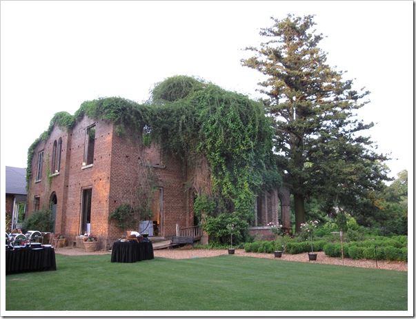
Picture 109The dinner was outside in the garden, it was absolutely beautiful!

Picture 110

I arrived just in time to hear celebrity guest speaker Amy Devers who is currently starring in Fix this Yard. She was fabulous, she talked about how much she loved. . . you guessed it—carpet. How it made stairs a safe place to play for her as a child, how it was way easier for her dog, as he got older to walk on carpet vs. tile and when she got older, the seductive quality of a well-placed shag :)

She went on to say that carpet softens and allows you to play up hard edges elsewhere. Because carpet is soft, it it makes you want to take your shoes off, and it’s a good thing when a building material makes you want to disrobe! The colour options are endless, and carpet also influences the mood and atmosphere of a space. And you have texture and pattern which can make a space feel bigger or smaller.

Picture 121 Amy Devers and Maria Killam

“And you can layer it, either carpet on carpet or over other flooring materials to define areas of space. As designers we have so much at our disposal to really craft and design a space. Because it’s soft you have options and it has an emotional sensitivity to it, if tile or concrete is like the cold shoulder, then wood floors could be like an honest, firm handshake, carpet is like a hug or a caress, when you touch carpet, it touches you back!” Amy Devers

Picture 120 This was the Tigressa Dessert which I had to take a picture because there was so much icing I had to dig a hole into it to get some cake—but it was yummy!
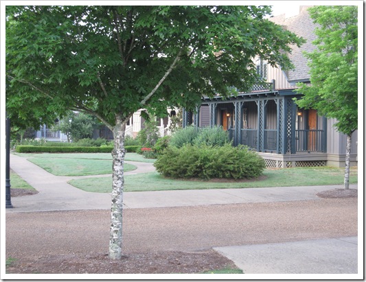
Picture 126This was the cabin I stayed in. The resort was like a little town, so cute.

Picture 105

This was my room.

Picture 122

And here is the living room off the bedroom. Notice the flow? Red walls which is picked up again in the bedroom!

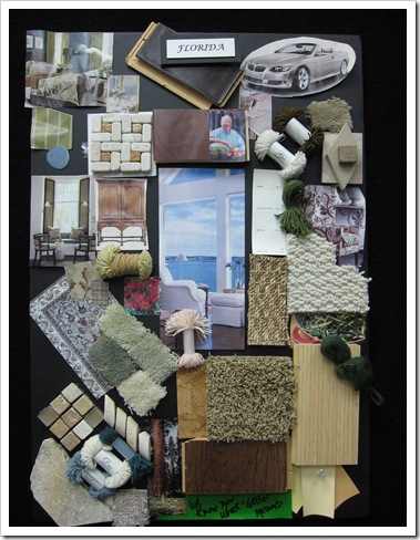
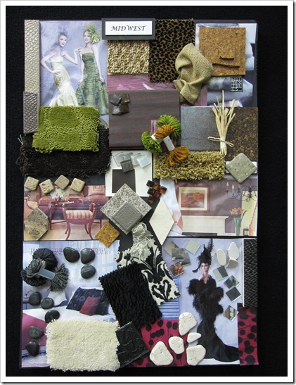
Day 2: We arrived at Shaw Headquarters where we created some of our own colour boards using Tigressa Carpet in their design center. I was fascinated by the regional colour boards they had displayed and I took some pictures for you:

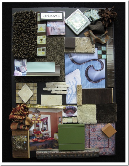
Picture 139

Picture 140

Picture 141

Picture 142 This is Taylor Wiegert who along with his colleague Ashley Walters with Empower Media, the media marketing group who coordinated this event.

Picture 144 Maria Killam and Taylor Wiegert

So here is the right way to clean spots in your carpet:

1. Spray Shaw’s R2X carpet stain and spot cleaner on the outside of the stain first (then the inside).

2. Take a plastic stick and agitate it (only inside the stain) just like you might wash your hair.

3. Take paper towel and BLOT the stain until it’s gone—DO NOT rub back and forth

4. If you would just like to avoid this aggravation, just install Tigressa Carpet into your home instead. Really.

Here we were in their R & D Department where they took regular carpet fibers and inserted them into the cool-aid tester (below) as well as the cooking oil. Along the way to the bottom of the jar they soaked up the liquid just like a sponge. Tigressa’s fibers just sat right on top of the liquid!

Picture 149

And here’s the best visual test:

Picture 155

Regular carpet- the stain soaks right in just like in this sample above. Picture 153

And here’s the Tigressa! You just blot it away and it’s completely gone. What is the number one complaint and objection about installing carpet? The fact that it easily stains. Tigressa is made of Type 6 nylon which is recyclable, very important to Shaw Floors (and the environment) which is already the world’s largest carpet recycler.

Shaw has also partnered with the Save the Tiger Fund and is contributing a portion of its Tigressá proceeds to the Fund. They have also set up a Twitter account and are donating $1 for each Tweet to Save the Tiger, up to $25,000.

Check out Tigressa’s website for a retail location near you!

If you would like your home to fill you with happiness every time you walk in, contact me for on-line or in-person consulting.

Related posts:

10 Steps to Selecting an Area Rug

The Right way to Create Flow using Colour

How to make your Old Carpet look new Using Colour

If you are new to this blog, click here to see the Best of Colour me Happy

LinkWithin