Sunday, May 31, 2009

The Best Exterior Trim Colours—NOT Cloud White

I realized this weekend that I am way overdue on writing this post for the exterior season! The first post I wrote on trim colours, The Best Trim Colours – NOT Cloud White is the second most popular post on this blog next to White Kitchen Cabinets. The reason for the 'NOT Cloud White' headline is a lot of people rely too heavily on go-to colours without first considering the important aspects of why you would choose a white-or-any-other-colour trim. And they are as follows:

image

Image source

The first thing you need to consider when picking a white for your trim is the ‘fixed white’ on the house already. These days a lot of people are specifying and installing white vinyl windows and although custom colours are always available, the standard 2 colours in trim are CC-20 Decorator White or HC-81 Manchester Tan (a greeny beige). Obviously these are not the standard colours of vinyl everywhere and also depends on which manufacturer you buy them from, but I have seen these colours in Vancouver a lot! Therefore, if your vinyl windows are already white, it may look better to repeat the white on the fascia and columns of the house (shown in above image). Otherwise it could scream – vinyl windows! Better to choose the colours with the windows in mind.

image

The other fixed element to consider are the gutters in determining the trim colour. They can be painted; however it’s better if they are already a colour you can work with, since obviously painted gutters (which I would still definitely paint if they were a bad colour) will eventually chip. A tip about gutters, never paint plastic ones black, they will warp with the heat from the sun!

White trim in general looks the best on fresher colours. like the yellow shown above, or a fresh green, or a fresh blue (below);

image The exception to this is navy blue which looks great with white trim but would also look just as good with the complement to blue which is a yellow cream colour.

And, I would never use white trim with a cold blue gray on a house. Okay, I admit I have shown a cute example here, with the shingles it does work, but this colour on a regular, boring box with white trim, way too cold!

image

Image source

Anytime I see a house that looks like it was painted that ‘pre-mixed’ gray I get the urge to knock on the door of the home owner and give them a colour like HC-36 to bring the house back to life!image And remember when you are viewing whites you must compare them to the whitest white in the deck (as described here) or you cannot see them. Some whites I like are OC-125 Moonlight White, OC-65 Chantilly Lace, Cloud white is fine here in this category, in addition to OC-117 Simply White.

Exteriors 026

Photo by Maria Killam

Sometimes people just pick the lightest colour on the chip (or a lighter colour) for the trim colour, as was selected here. This body colour is HC-94;

image

And the trim on this house is HC-96, which is two shades lighter on the Benjamin Moore fan deck.

image Here (above) there is not enough contrast and is a perfect example of what I talked about in my Interior Trim post, when you don’t go light enough, the trim just ends up looking dirty.

image Image source

Traditional English Tudor trim (seen above) is brown or black with white stucco. Here a non-traditional ‘green gray’ has been used instead of white. A lot of people here in the West Coast are opting to switch out the dark for a lighter shade as in the image below where the trim has been painted a greenish gray tone.

imageImage above and below; House Colors

When I was new at specifying exterior colour, I arrived for a colour consultation at a traditional tudor style house with black trim and white stucco. The owners were looking for something new, a non-traditional combination. At the time--this was during the GG trend (Green Grays), before the Brown Trend (BB) approximately 8 years ago-- I would say the brown trend started approx 6 years ago, I suggested a green gray shade. One of the historical colours. The problem was, even though I was enthusiastic about a change, I had not been specifying exterior colours long enough to sound like I knew what I was doing, so they did not follow my advice. Every time I drive by that house (which is close to where I live) in the original combination of black and white, I think about that consultation and how far I’ve come!

image

In the image above all the green in the landscaping was taken into consideration with the green colour that was chosen for the tudor trim with the stucco in the gold.

Cream or beige trim look the best with earthier shades although there are always exceptions, it’s hard to cover every possible colour in one post. Since the brown trend is still going strong if that’s the colour you are going for on the body of the building, a great trim colour that looks like a marshmallow you can just bite into is HC-174 Lancaster Whitewash. image How about Black trim? If you have a house with small windows, you might want to consider a different colour because the windows are like the ‘eyes’ of a house (which already look black in general when viewing from the street) painting the trim black could make them look even smaller. The black windows certainly look fabulous in this house designed by Bruce Wilson;

image

Exterior by Bruce Wilson

I have a pet peeve about trim on a white house (this includes shutters which are often the trim colour) painted any other colour than black. It just looks like “We can’t afford to paint the house so let’s just paint the trim a new colour”. In my world, a white house should have black trim, period. It just looks classier that way. And if you have a black roof to go with it, even better. Speaking of roofs, if you have a roof that is any other colour than black, I might re-think the black-on-black rule but still keep it neutral.

image Image source

There are always exceptions to this. Houses with a lot of character, details, and beautiful landscaping can pull it off or if you have a cottage or bungalow you can even have more fun with colours like this one in France:
image

Or this one in Ireland (below)

image or in Greece (below):

image

When choosing black, you can buy a pre-mixed black in the paint store, which is the blackest black there is but at least it won’t have an undertone. If you want to go lighter, black undertones are green (2131-10), blue (2129-10), or purple (2117-10) and sometimes it’s nice to pick a black with an undertone that changes with the different lights of the day, for added interest, depending on the style of your house and which features you want to highlight.

As Victorian style homes (below), have more than one trim colour, I recommend hiring a professional colour consultant if you want a colour combination that is really beautiful and will work with the style of your home. There are too many ways you can go wrong, if you need 2 or more trim colours (which is typically the case) and you get one wrong, it will ruin the entire effect!

This way you can also be sure that the undertones on your house are right. The one tip I have about picking darker trims are they can’t just be 1 or 2 shades darker. They must be several shades darker. If you have a green house and you pick a darker green for the windows or trim and you don’t go dark enough? It will be hard to tell the difference once the sun comes up.

image

Image source

If you pick a different shade for the trim, than the body colour (and make the mistake of going too light and not saturated enough) it will just look like something is wrong, it might even look like you tried to match it and failed. In the example above, the designer chose a green gray for the window trim, repeated the siding colour on the brackets and added a truer green for the fascia in addition to the orange accents. All 3 accent colours are much deeper than the field colour which has each feature stand alone for a finished look that is truly beautiful.

image

I had to end with this image I found on flickr a while ago and saved for an occasion like this post! Talk about creating colourful curb appeal! I would love to know if this is a residential or commercial building? It’s fabulous!

If you would like to schedule an on-line Exterior Colour consultation please email me at info@mariakillam.com or call 604.318.9725

Related posts:

Colour is Context

What’s an Undertone?

5 Steps to choosing the Right Exterior Colours

The Best Trim Colours—NOT Cloud White

Painting Black Trim - Before & After

New to this Blog? Click here ; Subscribe to my Monthly Newsletter; Become a True Colour Expert

Saturday, May 30, 2009

Outdoor Living Design

I must be on a roll, in regards to outdoor living! In my previous post, I chatted about some of the environmental considerations when planning your space(s). In this post, I wanted to share some really interesting, and, well . . . cool products. These should make your shopping experience a little more fun and hip.

110004_1 Chaise from Home InfatuationCurl up with some summer reading.

219069_1 Another Chaise from Home InfatuationWhat could be more sleek?

143025_1Yes, it’s another cool chaise, from Home Infatuation. I really do love it but the scenery doesn’t hurt, either!

219066_1This would make me feel like I would be in a big comfy “pod”. Very retro in an organic kind of way. Home Infatuation

122002_1 122005_1 122003_1 122019_1 122020_1

Some great outdoor dinnerware! Home Infatuation

696600e

Fab napkins and placemats. Cooking.com

629799e

629533e

And last, but not least, if you want to put your “foot” down when the winds try to blow away your table covering . . . just clip these little weights on the corners of the cloth. They just have to make you smile! Cooking.com

199561e

Some additional fun product can be found at: Givesimple.com

Outdoor Rooms and Entertaining

Memorial Day seems to be the kick-off date for the summer season, and along with that, is the focus on outdoor living and entertainment. Whether you have a manor house, complete with an outdoor kitchen or hearth area – or - reside in a high-rise with a balcony overlooking the city, utilizing these spaces will often allow you to extend the number of folks on your guest list, as you are also able to capture additional square footage for your living quarters.

backyard-retreat-l Courtesy of Southern Living Magazine

Outdoor living areas are often influenced by the climate zone. For example, I live in the southeastern part of the United States. There are many lovely evenings, with nice breezes. There are also some very humid evenings, fraught with pesky mosquitoes and other uninvited guests. Either a screened porch or planning for some methods of controlling the environment, (outdoor fans or citronella lanterns), need to be considered. Conversely, you may need an outdoor heater, for some of your early or late season entertaining. Hanging shades or patio umbrellas can help to control the glare of the sun. Others prefer full shelter, in the event of an afternoon sprinkle. These are just a few of the basics to consider when designing your space, as materials for furniture, outdoor rugs, or other accents will be impacted by exposure to the elements.
img_aeoniumslg_ss1 Courtesy of Traditional Homes Magazine

img_kaleidoscope_2Once your designated outdoor space has been chosen, you can decide if you want to create a true outdoor room, or if you simply want a specific function. In some of the photographs, I’ve shared, you can see how easy it is to pull in some exterior elements, which have an interior feel. In the porch above, not only is there a fireplace, there are pillows, curtain panels, and a lamp – all with special finishes, in allowing for the natural elements to come in.

ss_100020302In the deck area, above, a little built-in seat and a pergola, allows the focus to be on the plantings and natural materials, such at the stone wall and supports. Clustering containers can help to define a spot and bring color. This setting would work well on a city balcony, too.

There are wonderful resources for outdoor furniture, containers and accessory items. In my next post, I’ll share a few of those. Keep in mind, the most important element will be to keep whatever you do, fun, relaxed and friendly. This is the time of year to kick back and forget any serious and formal approaches to entertaining. The host or hostess deserves a little break, too!

Friday, May 29, 2009

5 Ways to Become a Better Speaker

Okay here it is, the play by play of my wonderful trip to Calgary as the Keynote Speaker for the House of Persian Rugs, Designer Event.  Here I am at the airport in Vancouver, another gorgeous day (we’ve had a lot lately, and that is rare in May!).Keynote 002 I sat beside Carley on the plane.  A lovely woman travelling to Saskatoon.  She looked so fabulous in her green suit, matching Coach purse, and 4” heels that I thought, please God let me look that beautiful when I’m 72 years old!! Which brings me to Tip #1 – Look the part (see my colourful outfit below :)!

Keynote 003 Amir was the MC of this evenings event, and he was waiting for me when I arrived--okay in actual fact my plane was early and he was 5 minutes late, but I made him pose for the photo holding the paper with my name on it anyways—he was such a good sport!

image

Amir and Emad (the owner's son) dropped me at my hotel and picked me up one hour later for lunch, they treated me so great, opening doors for me and everything—hey the small things thrill me!  As I mentioned in yesterdays post, I stayed at the Hotel Arts.

Keynote 023

It was a wonderful, contemporary room.  The headboard wall was covered in 12” x 12” mirrored tiles and dressed with a sheer chocolate brown drapery treatment, very chic!

Keynote 005

image

I had to take a photo inside the elevator of the  Cole & Sons Woods wallpaper.

image

Look at this shovel with a branch growing out of it!  There it was hanging on the wall and I’ve never seen anything like it, so I thought I’d share it with you!

Keynote 012

The lobby and the hallways of the meeting space wrapped around the pool--silly me didn’t take them up on their original offer to arrive the day before so I just looked longingly at it!

Keynote 013 Here’s the lobby, you can see the pool through the window.

Keynote 015

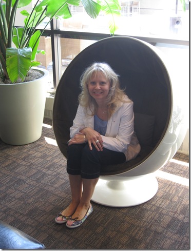
Here I am in the egg chair!

Keynote 016

They took me to a fabulous French restaurant called La Chaumiere where we sat outside in their lovely patio.

image

Amir & Emad (above) both ordered the same salad and it was so pretty, I took a picture! 

image After lunch we went to the Lougheed House, which is where it was being held to get set up and make sure my laptop had all the right attachments.  This grand sandstone prairie mansion was built in 1891 and enlarged in 1907; the impressive scale and the high quality of the design, materials and interior furnishings of the house reflected the wealth and prestige of the Lougheeds (Senator James Alexander Lougheed, Lady Isabella Hardisty Lougheed, their six children and staff). 

Keynote 028

Tip #2 – If you have a MAC (bring the right cable to connect to the projecter) in addition to a remote! 

Keynote 037

You can tell we were in oil country!  Some office buildings I snapped while walking around the grounds of the estate.Keynote 030 Next stop was the House of Persian Rugs actual showroom where I was given the best PK (product knowledge session) by Abbas Keshmiri (the owner) of Persian rugs I’ve ever had!  They often have designers fly up with their clients from Vancouver and Edmonton because they have the largest selection of  Persian Rugs in Canada!

image Wanna know what a $100,000 Persian rug looks like?  Here is one of them.  They keep them in a safe and pulled out two for me to see.  They are 100% silk and apparently silk lasts forever (which I didn’t know) while a wool rug lasts approximately 100 years.

Keynote 031 The evening consisted of authentic Persian music. . .

Keynote 040 and Persian cuisine. . . the food was so delicious!

Keynote 039

Here I am (below; in my favourite colours) with Abbas Keshmiri of the House of Persian Rugs.

Tip #3 – Give the people that hired you, permission to let you know (by sending a note) if anything is missing during the presentation. For example, they have had many clients arrive looking for very specific colours that are impossible to find (unless they commission a custom carpet) because everything has been selected EXCEPT the Persian Rugs!  This is very frustrating for everyone!

This should have been one of the most important points of my talk.

Keynote 043The first part of the evening was my presentation and the second part was centered around the beautiful rugs showcased in the reception area where I talked about which colours I would use with each individual area rug.

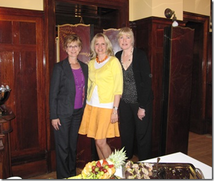
image Carol Ann from Camdesign Interiors (on the right, below) has been following my blog for a few months now and she was so excited when she heard I was coming to Calgary.  Carol Ann and her colleague Linda were my friendly faces in the crowd – they were so welcoming and I so enjoyed meeting them!

Tip #4 – Mingle before the presentation (if possible) and ask the attendees what they would like to get out of the evening.  It’s a great way to feel like you already have some friends in the crowd (Thanks Carol Ann :) and gives you an opportunity to address them in your talk before the question period!

image

Here I am flying over the Rockies on the way home!

Keynote 048

All images by Maria Killam

It was one of the best days I’ve ever had, although afterwards, of course I was just aware of the mistakes I’d made during the talk and how it could have been even better. 

Tip #5  - One big lesson I learned was;  never have the screen beside you when speaking—I had to lean around to see where I was when I would finish making a point so my transition from one slide to the next wasn’t always very smooth! 

That’s how we learn though (as I’ve mentioned in a previous post)!  And I look forward to doing it again very soon!

Related posts:

Happiness is. . . Being Uncomfortable

A light colour will never come to life in a dark room

The right way to create flow using colour (Washington Post Blog Watch)

Insider Secrets to Testing & Selecting Paint Colours

Colour is Context

LinkWithin